


It’s a fact: we live in a multi-device world. I’m currentlysitting at a desk with my laptop open, my phone next to me, and a tablet withinreach on the counter. What about you? How many devices do you have going atthis very moment? Chances are it’s more than one.
I might start an online transaction by looking up a productreview on my phone. Then I might switch over to my tablet or laptop to find outmore info and make the purchase.
Maybe you start reading an article on your laptop and thenmove over to your tablet for a cozy-up on the couch with a cup of coffee. Ifyou’ve got your browser set up to sync on both your devices, your tablet willeven have the article bookmarked for you, ready to read.
Sequential screening—when you start an activity on onedevice and then move along to another—is the new status quo. We unconsciouslymake the transition from device to device in our personal lives; increasingly,we have these same expectations for interacting with our work environments.With more and more organizations opening up to a “bring your own device” (BYOD)model, we no longer have the luxury of designing our eLearning and trainingcontent for one device and one device only.(Recent research indicates that 74% of organizations have either already adopted aBYOD policy or are planning to allow employees to bring their own devices towork.)
The new multi-device world order is here, and it means youneed to build and design content that will work on almost any device. Thismeans you need to rethink that fancy slide-based eLearning show that wasdesigned for a desktop and became unusable when viewed on a small tablet. It’snow a dinosaur, relegated to the forgotten corners of your LMS.
This is where the word “responsive” comes into the room,stands up, and makes itself known. Let me take a moment to give you some reallysimple definitions of “responsive” and “multi-device learning,” and then I’llshare a few tips for designing with this new framework in mind.
What is this word “responsive?”
Responsive website design is the current darling of the webworld and for good reason. Essentially, it means that content will respond to thescreen size it detects. So, if you’re looking at, say, bostonglobe.com on a desktop or a mobilephone, the content will automatically detect your screen size and adjust whatyou see. You can try this on a desktop—open a website in a browser and drag thebrowser size down. If content adjusts as you go, then it’s a responsive site.
You can even tag content on a responsive site—this meansthat designers can hide certain images and text strings on small phones andtablets, allowing them to tailor the user experience while only needing tobuild one version of the site.
Web designers whobuild responsive websites use, not surprisingly, web design tools like HTML,jQuery, CSS, JSON, and other tools that I don’t have the technical know-how toexplain. These may not be the skills that your current eLearning developmentteam has, but it’s likely that someone in your organization—maybe the website expertin marketing—does.
Responsive web design can take more time and budget, but itcan be worth it. Why more time? Well, one big reason is the testing. Just because a site is “responsive” doesn’tmean that it’s automatically going to work everywhere. You still need to testand adjust to ensure your site works well across different browsers and devices.
What are your use cases?
OK. So now you might be thinking that this responsive thingmay be something to start thinking about for delivery of eLearning content. Butfirst: Do you need to deliver eLearning that works on multiple devices? Perhapsthe audience for your eLearning content will only really be viewing it on adesktop or laptop computer, and you don’t need to think beyond that.
Here’s where it pays to know your use cases.
Think about how your people will be using and accessing yourcontent. Airline pilots in the cockpit access manuals and checklists on theirtablets. At a fast food restaurant, a new team member runs through eLearningcontent on a tablet while sitting at a table in the lobby. In the field, a salesperson looks up product details on her phone before going in to clinch the deal.A teacher prepares for a professional development workshop by running through alearning module on her tablet the night before while sitting on her couch. Betweenpatients, a doctor accesses a product tutorial from her laptop.
What matters the most is how we use these devices and when.Know your use cases. Ask yourself these questions:
- When will your audience access your content?
- What devices might they be using?
- Will they have different needs or use casesdepending on the answers to those two questions?
In Making mLearning Usable: How We Use Mobile Devices, Steven Hoober and Patti Shank shared some interestingstatistics around use cases in terms of our posture or stance when usingcertain devices (Figure 1):
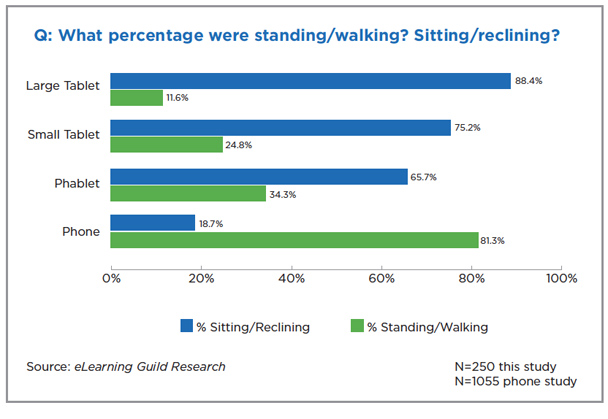
Figure 1: From Making mLearning Usable: How We Use MobileDevices
(Source:Steven Hoober with Patti Shank, eLearning Guild Research Report, 2014)
Does this data sound about right? It does to me. I mightlook up a quick fact on my phone while standing at the kitchen counter, but if Iwant to digest an article or watch a movie, I’ll probably sit down with a biggerscreen.
Imagine your audience. Do you really think they’re going torun through all of your eLearning content on their mobile phone while standingin line at the grocery store? Probably not. They may look up quick facts orwant a review of some key tips and information while they’re checking in at thelobby for a client meeting, but that small screen is not going to be used in thesame way for the same purpose.
Does this data change how you think about your audience andhow they might consume your eLearning content? Just because you can put yourcontent on a phone doesn’t mean you should. Consider your use cases and designwith the end in mind.
What about responsive eLearning? Is there such a thing?
Responsive eLearning defined: A single version of yourcourse delivered to multiple devices, built using everyday web technology(HTML, JavaScript, CSS).
So responsive sounds good for your eLearning content. You’vegot a need, and you’re ready. How can you build it? In this day of rapidauthoring tools, can we just turn a switch and go responsive? As it turns out,there is some good news.
Captivate 8 is billed as a responsive tool, allowing forcourse authoring in one place with output to multiple devices. At Kineo, wehave been doing a lot of client work using Adapt, which is an open-sourceresponsive elearning design and development framework. (Find out more aboutopen source Adapt at https://community.adaptlearning.org)
I expect other authoring tools will fall into the responsivecamp sooner rather than later; the tide has indeed turned.
Benefits:
- Oneversion works on all devices
- Oneversion to track and maintain
- Distributionfrom a single LMS or source
- Accessiblecontent
- Searchablecontent
- Morecost effective
- Allowssequential screening
Convinced and ready? Now let’s change how we think about eLearningdesign and run through a few tips and design shifts.
Put scrolling at the heart of your design
Users expect a different experience when they interact withonline content, and the slide-based eLearning program that’s been the standardfor the past 15 years or so is becoming, well, archaic. It’s time for a paradigm shift.
Back in the olden days of eLearning, a scroll bar wasconsidered a naughty thing to be avoided at all costs. We’re now liberated fromthis prejudice, with most of us scrolling an awful lot. Think about how youinteract with your Twitter feed, Zappos shoes searches, and Amazon productpages: scrolling is natural when swiping on a tablet or smartphone, and it’sexpected website behavior.
Plus, the scroll bar is not just a means of navigation. Smartdesigners use the scroll bar to their advantage, building the scroll right intothe story of their content. Check out how these web designers have transformedthe page by building the scrolling right into the design of the page itself,using the scroll bar to unfold a narrative and pull the user down the page.
https://www.dangersoffracking.com/
We can do the same with eLearning.
Liberating the scroll bars gives us some new ways to presentcontent. Imagine a course lesson that’s not locked down in a “click next tocontinue” slide show but that gives the learner the chance to swipe through andexplore the content. You can still set it up so the learner has to view allcontent for completion rates to ensure compliance regulations are met, and youcan even hide content blocks until the learner views previous ones. Scrolling providesa more organic, tactile, modern, and accessible experience in terms ofabsorbing the content.
Scrolling pages offers learning designers and users severalbenefits, namely:
- The removal of unnecessary navigation (click nextto continue) with pages being as long or as short as they need to be
- A more modern way of presenting information(learners are already scrolling when they’re on the web)
- More opportunities to present the learnerjourney in new and engaging ways
Control the scroll
As you can see, I’ve fallen in love with the scroll bar, butat the same time, I suggest being cautious. Avoid designing endless pages of scrolling content that go on forever,causing your audience to lose all hope of completing the experience. Instead,think about keeping a scrolling “page” to a single learning objective oractivity. As we work more with scrolling pages, we’re finding we can do quite alot in a page that has five to seven components that tell that part of yourcontent’s story. Building flexiblecontent in small blocks and components creates that more nugget-like, micro-learningexperience that we’re all aiming for these days.
For instance, you might create one page in your course thatfocuses on a particular customer service skill. For an instructional strategy,you choose an “observe and rate it” model. You open the page with a text blockand graphic that sets the stage for this little lesson, and then you show avideo scenario of this concept in action. Next, you ask the learner to rate theperformance of the character in the video with a slider bar component. Then,you follow up with an audio clip of an expert sharing his rating for the character’sperformance and why. You end by wrapping up the page with a short summary ofthe key points. One scrolling page, five components, one focused learningactivity.
Make the most of your graphics
Now that we’ve unlocked the scroll bar, we’ve got a wholeenvironment in the form of a page to work with visually. Think about how youcan use the layout and the visual treatment of the entire page to support thecontent.
Tell a story by weaving together the content, the graphics,and the navigation.
As you consider the visual elements in this learner journey,lead the eye down the page with the art direction.
Look for opportunities to tell stories, particularly whenyou can weave the graphical backgrounds and the component content together tomake the page a coherent and well-thought-out experience for the learner.
That said, take care with graphics and keep both the visualexperience and the download time in mind. If you shrink that image down formobile, will it still be meaningful, or do you need to create separate versionsof images for different devices? You may even choose to lose certain images asyour screen size scales down. But remember a crucial thing: no matter thedevice, a responsive site will download every image in the entire CSS file. Soif you’ve got a huge image that you want to display on a desktop version of thecourse but hide for the mobile version, a mobile user will still need to waitwhile his or her connection pulls down all versions of the image.
Respond to the people, man!
Some final parting words (and these won’t be my last wordson responsive eLearning design because I think it’s here to stay): stay responsiveto the people taking your programs and never forget that there will be a humanbeing sitting on the other end of that computer working through your content.
Just because you’re designing with a new page layout andparadigm in mind doesn’t mean that you can forget all that you know aboutinstructional design. We’re not looking to simply throw content onto a scrollingscreen and see what sticks. As with any eLearning program, you need to take thetime to create well-structured content that follows a solid learning model,maps your instructional strategies back to desired performance outcomes, andprovides a user experience that people will actually want to work through.
Editor’s Note
Check out Cammy’s presentationfrom DevLearn 2014 in the Conference Archive: Responsive eLearning Design Tips (also available on SlideShare).