By Aaron Barlin
Slide decks are one of the most commonly used visual aids in learning and development—yet they also commonly suffer from poor design.
You’ve likely observed these unusable visuals before: slides created with big blocks of text, with odd formatting of text and images, or with clunky templates that haven’t been tailored to the learning outcomes at hand.
These graphical bad habits impair learners’ ability to absorb the content and they represent information dumping and visual clutter, rather than information design and visual prioritization.
Thankfully, L&D professionals can blend two frameworks that already exist in the field of instructional design to level up their slide deck game.
By blending Bloom’s Taxonomy and Mayer’s Principles, we can better align our educational intentions with our graphic design choices. In other words, certain visual guidelines are particularly advantageous for helping learners engage in certain levels of cognitive activity.
Clarifying the usage of frameworks
For our purposes, mentions of Bloom’s Taxonomy refer to its revised version, published in 2001 by Lorin Anderson.
Mentions of Mayer’s Principles refer to the most current and comprehensive edition of Richard Mayer’s book Multimedia Learning, published in 2020. (The Digital Learning Institute has provided a publicly accessible summary of the principles defined in the book.)
Each level of Bloom’s is paired with its most aligned Mayer principle. This leaves seven principles unassigned, which is intentional: Many of those, like the Multimedia Principle (use images and text together), are inherent to slide-based learning and less directly tied to visual design strategy.
Finally, Level 6 (creating) is not matched to any Mayer principle, as generative tasks typically depend more on open-ended prompts, collaborative experimentation, and real-world sandboxes than on the kinds of visual guidelines that Mayer’s Principles provide.
Level 1: Remembering & The Coherence Principle
The Coherence Principle helps ensure learners are only exposed to visual cues that are absolutely essential to the cognitive activity at hand. This focus pares designs down to what makes the material clear, actionable, and, well, “coherent.”
The cognitive task of remembering—activating learners’ prior knowledge as a foundation for building new knowledge—leaves little room for distraction. Coherence is all about uncluttered visual cues that aid with the learning task at hand. By contrast, the overuse of visuals increases the risk of informational disjointedness, while lowering the chances of successful recall.
Let’s imagine that you are asking learners to recall a slide deck that they are proud of having created, in order to surface design principles that they already practice.
Do this!

- Focused: The graphic captures only the most essential anchor points for this moment of recall: 1) the context of eLearning, 2) the act of creation, and 3) the feeling of satisfaction.
- Simple: A single, full-screen image avoids distractions and lets you neatly overlay verbal instructions: “Think of a slide deck you created that you were deeply satisfied with. What about its visual design made you most proud?”
Don’t do this:

- Complicated: This slide tries to support recall with too many visual cues at once: layered questions, three logos, bold text, and a figurative illustration—all of which split the learner’s attention and blur the central task of remembering.
- Disjointed: Rather than reinforcing a core recollection from which more nuanced memories can branch, the slide lacks a unifying visual thread. And thus, the facilitator’s message and the learners’ task become incoherent.
Level 2: Understanding & The Redundancy Principle
The Redundancy Principle is actually about reducing redundancy, and thus preventing cognitive overload due to unnecessarily repeated information. Commonly, slide decks neglect this principle by combining images, text, and narration that all say the same thing. (You know the person who reads whole blocks of text straight off their slides? Well, they need to start adhering to the Redundancy Principle!)
The cognitive task of understanding—processing and summarizing brand new information—is already a large jump in challenge from the task of remembering. By avoiding redundancy, we reserve cognitive capacity for the new information itself, rather than for muddling through a messy delivery of that new information.
Let’s imagine that you are illustrating the Redundancy Principle, a concept that your learners don’t already know.
Do this!
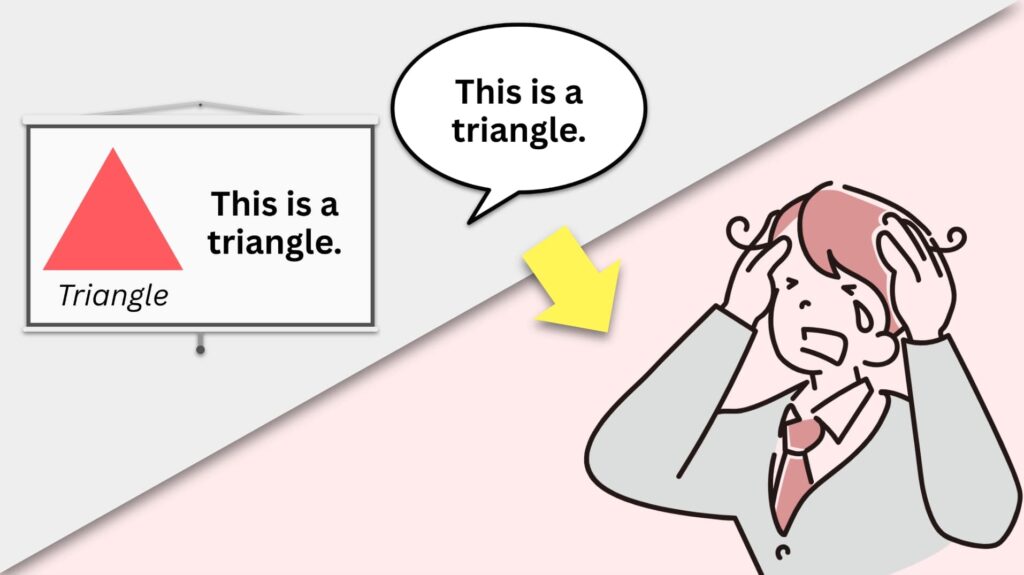
- Intentional: Every visual element adds new information. The only redundant details are the tongue-in-cheek repetitions of “This is a triangle,” which, together, lead to the stressed out and confused figure in the bottom right-hand corner—yet another visual element that adds new info!
- Illustrative: By engaging learners in the constructivist thinking on which comprehension thrives, the slide offers a graphic that requires learners to infer what the Redundancy Principle is (which checks for understanding can redirect).
Don’t do this:
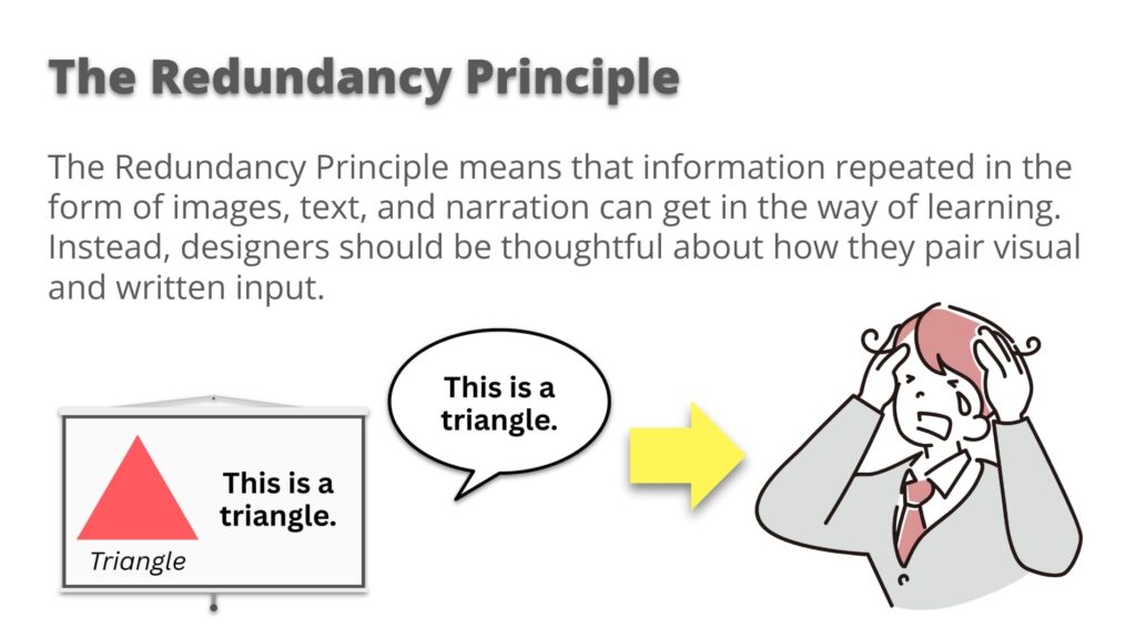
- Heavy-Handed: This slide presents the same idea in different ways. With this overabundance of cues, it is less clear for the learner where to focus their attention. Ironically, no matter where they focus, the learner will likely get the same idea anyway!
- Insistent: This slide tries too hard to make sure the message lands, as if one version of the idea wouldn’t be enough. This impulse is understandable, especially given the importance of new information—but by giving into this instructional insecurity, we tend to overwhelm rather than reinforce.
Level 3: Applying & The Segmenting Principle
The Segmenting Principle is all about chunking and pacing: that means breaking up larger pieces of information into more manageable bits, and presenting those bits one by one. If you’ve ever animated a slide so that text or images only appear when you need them, then you’ve practiced the Segmentation Principle!
The cognitive task of applying—using new information to carry out tasks, interpret scenarios, and solve problems—is often a step-by-step process. Naturally, we can associate the “steps” of application with the “segments” of visual pacing.
Let’s imagine that you are instructing learners to create a simple, single slide on their own that adheres to one of the prior principles we’ve discussed: the Coherence Principle, or the Redundancy Principle.
Do this!
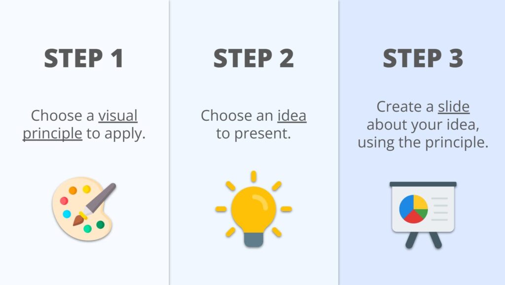
- Distinct: Each step is clearly sequenced and visually separate, thanks to the use of color, boxes, and horizontal spacing. The simple graphics further distinguish info; they support and symbolize their respective text without redundantly repeating it.
- Tidy: Even after each step would have been animated on-screen, the slide altogether remains legible. The “full picture” isn’t suddenly a cluttered mess; instead, it still allows learners to stay neatly oriented within the task.
Don’t do this:
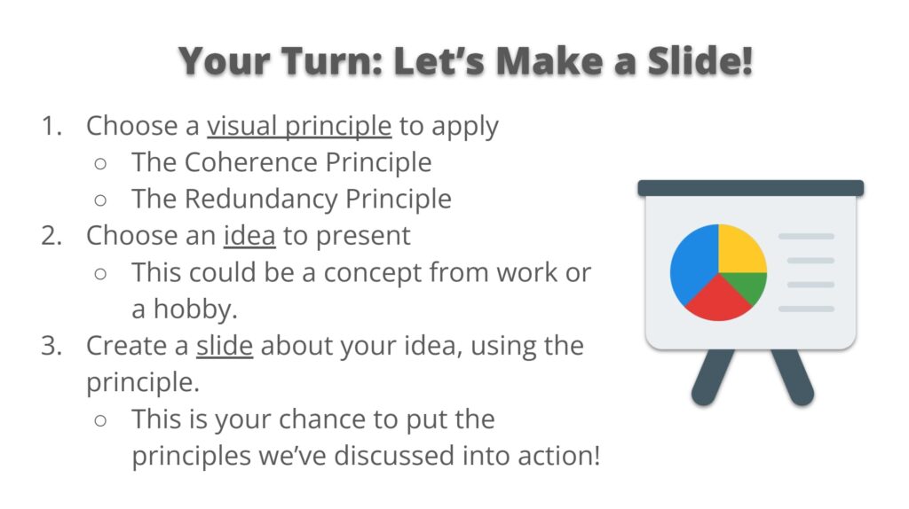
- Blobby: This slide is just that—a “blob” of text. Formatting the text as a list does not save the day: Without differentiated spacing, distinct visual anchors, or prudent use of color, every step easily feels the same and unsegmented.
- Puzzling: It’s hard to tell what belongs to what. Sub-points blur into main points, and the eye has a nonlinear path to follow. Instead of guiding the task, the layout makes learners work to decode the structure.
Level 4: Analyzing & The Signaling Principle
Another name for The Signaling Principle could be the “Pointing” Principle: it’s all about pointing to information that is vital and connected, using simple graphics like arrows, as well as simple formatting like highlighting and bolding.
The cognitive task of analyzing—breaking down information into parts to see how they are ultimately synthesizable—is all about relational thinking or about relationships. By adhering to the Signaling Principle, we can literally draw those connections for our learners.
Let’s imagine that you are guiding your learners to consider how our prior principles—the Coherence, Redundancy, and Segmenting Principles—come together to fulfill one unifying purpose: visual clarity.
Do this!

- Explicit: Arrows and lines make the structure of the sequence unmistakable. The viewer can immediately track what comes first, what follows, and how each step contributes to the larger whole, all while reiterating prior knowledge.
- Cohesive: The design highlights how each step functions on its own while still contributing to a unified process. Visual consistency across color, layout, and structure helps learners track relationships between parts without losing cohesion.
Don’t do this:

- Disconnected: Although the content is broken into columns, the slide lacks hierarchy or flow. Each section sits at the same visual weight, making the message feel static rather than structured. Even adding graphics wouldn’t provide much help here.
- Isolated: With no visual connection between the three principles, they read as unrelated facts. The alignment is consistent, and the colors help to distinguish those facts, but the relationships between ideas remain unnecessarily implicit.
Level 5: Evaluating & The Spatial Contiguity Principle
The Spatial Contiguity Principle is a fancy way of saying “place images close to their related text, and vice versa.” It’s one of the most practical, tactical principles for improving visual clarity—minimizing the mental effort it takes to match information across a slide.
The cognitive task of evaluating—assessing and improving situations or performances based on a holistic understanding of criteria—requires sound, informed judgments. Such judgments are easier to make when the criteria and the content being assessed are close together and clearly associated.
Let’s imagine you are asking learners to evaluate and suggest revisions to a weak slide design by using the principles we have discussed so far.
Do this!
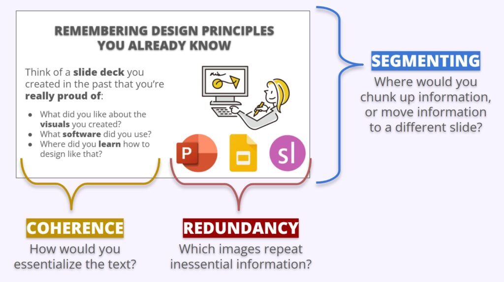
- Guiding: Taking inspiration from the Signaling Principle, this slide draws connections between criteria and the subject of evaluation using brackets. Learners can clearly trace which elements are being evaluated by which criteria.
- Adjacent: Criteria regarding text is placed near text; criteria regarding images is placed near images; criteria regarding the subject of evaluation as a whole is bracketing the whole. The slide positions criteria as “magnifying glasses” through which the learners need only look, think, and apply what they’ve learned.
Don’t do this:
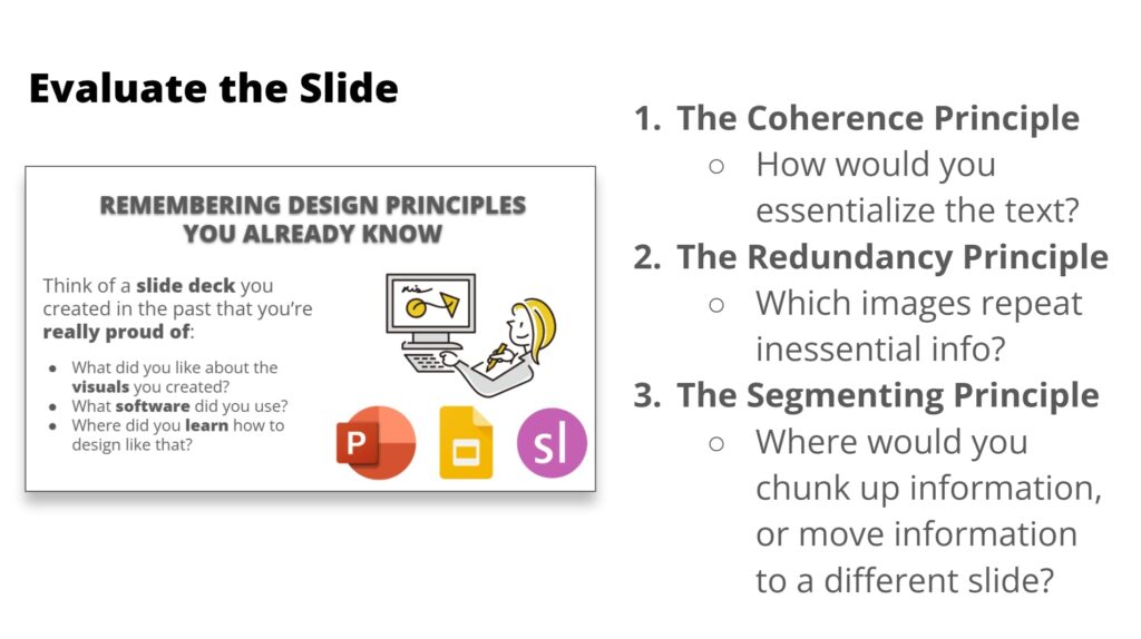
- Detached: Although the prompts and subject of evaluation are technically “next to each other,” learners have to visually leap back and forth between them to make judgments, which interrupts the flow of evaluation.
- Unprioritized: Each evaluation question is given the same graphic treatment, with no cues to highlight where learners should visually begin (other than the sequence in which the principles have been listed). Consequently, evaluation is less directed.
Sights for sore eyes
Essentially speaking, poorly designed slides are more than just eyesores: they unnecessarily get in the way of learning and higher-order thinking. We don’t need to become graphic designers to design better learning—but we do need to be more intentional about our visuals. Together, Bloom’s Taxonomy and Mayer’s Principles equip L&D professionals with a more comprehensive structure for instructional graphic design than either framework offers alone. When we approach graphic design not as separate from instructional design but as part and parcel of it, we not only make our visuals more attractive, but more pedagogically effective. After all, greater pedagogical effectiveness remains the guiding principle behind any framework we integrate into our work.
Image credit: VectorMine


