
A constant challenge with eLearning(and face to face) courses is managing “overwhelm:” too often the learner isinundated with content and ideas and bullets and more content. Here’s a realexample (no, really) once sent to me by an SME. What’s the slide in Figure 1even about?
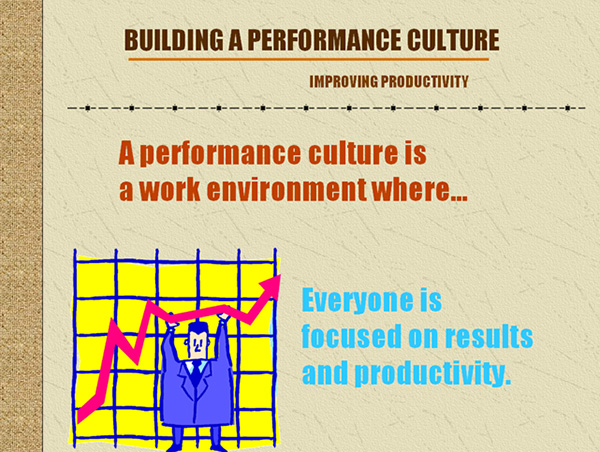
Figure1: SME-created slide
With fonts all the same size,irrelevant clip art, template elements like the sidebar (and why is there barbed wire on the slide?) thelearner doesn’t have a chance. The design makes it impossible for her to figureout what she’s even supposed to focus on, much less learn.
Manage your instructional messages
So how can we help learners accessand retain what matters? One of my own favorite tools for managing andstructuring instructional messages is Richard Mayer’s “SOI” model, whichsupports designing so that the learner can Select, Organize, and Integrateinformation. This month let’s look at what Mayer tells us about the “Select”component of the model. How can we cue learners to important information? Howcan we help them focus and make sense of what they’re seeing?
On the most bedeviling issue—extraneous information—Mayer reminds us that learners canfill in gaps. Look at Figure 2. Who do you see?
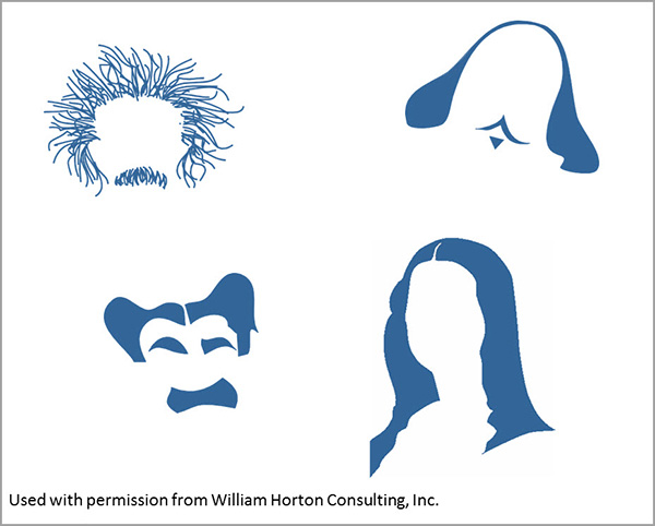
Figure2: Learners can fill in gaps
The images show Einstein,Shakespeare, Groucho Marx, and the Mona Lisa (OK, I can’t prove that isn’tCher, so will take it as an answer.) The message? Less is more. Learners can make sense of information when given afair chance. You don’t need to spell out “and” when an ampersand would do. Youcan abbreviate and edit and cut, and cut again. Essentially, design is done when there’s nothing left totake out.
Otherways to help the learner select:
- Use fonts, color, and highlighting to indicateimportant information
- Use white space
- Emphasize important information
The before-and-after example inFigure 3 shows how these ideas might be applied:
Figure 3: Eliminate extraneousinformation and make good use of fonts and white space
And Figure 4 shows a before andafter that resulted in a work example, much more useful and memorable to alearner than all the text on the “before” slide at left.
Figure 4: Why make it hardfor the learner to figure out what she is supposed to do?
We know that reducing extraneous information iscritical to lessening cognitive load. So when approaching a new design project,especially one in which you’ve been handed piles of source material and maybeeven slide decks developed by subject matter experts, take a step back and ask,“What is the most important information here? How can I help the learner graspthat critical content?” and start building from there.
Wantmore?
See also: “Find Your 20%” as well as these items from Mayer.Mayer, R. E. “Designing Instruction for ConstructivistLearning.” Instructional-design Theories andModels: A New Paradigm of Instructional Theory. Mahwah, NJ: LawrenceErlbaum Associates, 1999.
Mayer, R. E., W. Bove, A. Bryman, R. Marsand, and L. Tapangco.“When Less Is More: Meaningful Learning from Visual and Verbal Summaries of ScienceTextbook Lessons.” Journal of EducationalPsychology 88. 1996.
Some material originally appearedin Bozarth, J., Better Than BulletPoints: Creating Engaging eLearning with PowerPoint. San Francisco: Wiley, 2013.