


Robin Williams once said about hisacting career, “…there is still a lot to learn and there is always greatstuff out there. Even mistakes can be wonderful.” Mistakes can indeed bewonderful. Our adventures into designing mobile learning are fraught with them,particularly when we try to squeeze our eLearning modules onto a smartphone. Inthis article I’m hoping to pass on what I’ve learned from some wonderfulmistakes: how to best adapt your existing eLearning for mobile.
In a previous article, Ten Tips: Distilling Existing Content for Mobile, I gave some brief recommendations on how to repurposeexisting eLearning content. Here I’m digging a little deeper into the subjectand providing more detailed guidance on how to adapt eLearning content for useon smartphones.
For many companies such a project istheir first small step in providing learning content for mobile (mLearning).Once again my recommendation is to resist this approach if you can. Pushingcontent that was designed for a desktop or laptop onto a small screen is notthe best way to go about learning design. Use cases for accessing learningcontent on a mobile device are very different than those for eLearning on adesktop. (See Right Time and Place: mLearning Use Cases.)
Conversionconsiderations
I divide “mobile” into two categories,“phone mobile” and “tablet mobile.” When I speak of mobile devices in thisarticle I’m primarily talking about smartphones, not tablets. Designinglearning content for a tablet has more in common with laptop or desktopeLearning than with smartphones (Figure 1 is how I see it). These guidelinesare for “phone mobile” devices—those with a small screen that you typicallycarry with you everywhere.
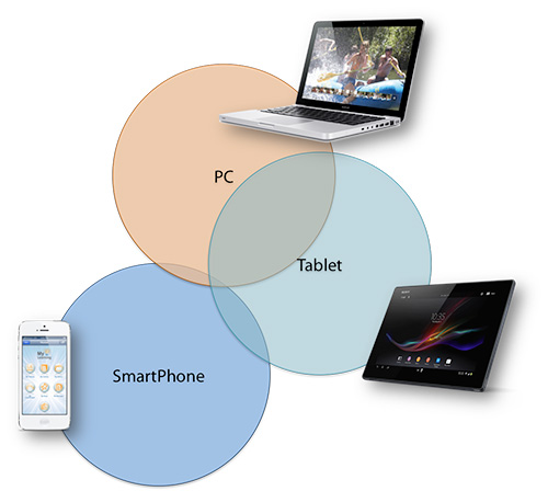
Figure 1:Content similarities between devices
There are several ways you can adaptyour existing eLearning content for mobile—from making a few small adjustmentsto completely redesigning it. Being able to view eLearning content on a smartphonedoesn’t make it mLearning in just the same way that throwing slides meant foruse in instructor-led training (ILT) onto a web page doesn’t make themeLearning. Redesign is always the best option.
Here are some levels of adaptation toconsider—depending on the format of the current content, on the time andresources available, and on your learning objectives. This list starts from therudimentary “low-grade” mLearning to the more appropriately designed mLearning.If your goal is to have the eLearning content “accessible on smartphones” thenthe first few will suffice. If your goal is to create effective mLearning, thenconsider those further down the list.
Levels of adaptation of eLearning for mobile
- Replicate the existing content as isand have it be accessible on a smartphone.
- Duplicate existing content and have itbe viewable on a mobile device using responsive or adaptive design techniques.
- Adapt the textual content for mobile,keeping the existing graphics.
- Adapt both the textual content and thegraphics for mobile.
- Convert content to a video or videos.
- Incorporate the content into a quiz orknowledge check.
- Completely redesign the content formobile.
- Create supplementary or supportivemobile content for the existing eLearning content.
- Createa learning game from the content.
AdaptingFlash-based eLearning
OfteneLearning is in the form of Flash, which cannot be targeted to some mobiledevices such as the iPhone. There are tools that can republish Flash sourcefiles as HTML5 or record Flash content as an MP4 video—however the problemremains that you are still left with content designed for the desktop butsimply view it on a small screen.
Anotheroption, if the interactions and animations are few, is to take screen shots ofthe graphic content and provide a sequence of relevant images along with textor narration.
Ratherthan attempt to replicate the exact format of the Flash eLearning on asmartphone it is better to locate the original text, graphic, and video sourcefiles and adapt them for mobile. Text can be rewritten, graphics adapted, andvideos edited so that they are mobile friendly. This takes longer but can bemuch more effective.
Rapid eLearning tools content
Youmay have eLearning that was created in Articulate Storyline, ArticulatePresenter, Adobe Presenter, or other PowerPoint-to-Flash tools that hasnarration and a sidebar of contents. If your text and graphics are large enoughyou can record just the content area of the screen along with narration. Withthis recording you can create a series of short MP4 videos of the whole modulewith narration. This is not the ideal solution—it’s eLearning on a smallscreen—but I have found this to be very useful when you need to access a largeamount of Flash eLearning content on a smartphone.
Ifyou have all the original source files for your content it is now possible inmost eLearning tools to publish to HTML5 and view it in a smartphone browser.You can remove any navigation sidebar and so get a larger image on the mobilescreen. Better still, adapt the source files for mobile by adjusting text andgraphics as I outline below and you’ll get much closer to an optimalexperience.
Text considerations
Theamount of textual content per screen in eLearning is generally too much formobile. You need to reduce it. This will mean paring down the text to theabsolute essentials and breaking it up into multiple screens. Do what you canto remove or simplify any introductory paragraphs or discussion. Cut to thechase—users will want to read and understand the information on one screenwithin about 10 to 20 seconds.
Textshould be easily readable on a mobile device without the need for zooming (Figure2). Use sans serif fonts—they look cleaner and are easier to read on mobiledevices. Helvetica and Myriad font types are two of my favorites for mobile.You may also want to consider increasing the line spacing so that the textlooks a little less dense.
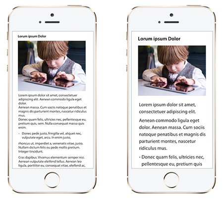
Figure 2: Text size toosmall (left) and about optimal (right)
Peopleare more inclined to quickly scan mobile content rather than carefully readparagraphs, so keep your explanations and guidance clear, concise, and try towrite in everyday vernacular. Consider using bullet points, bolding, orhighlighting to bring attention to important words or phrases.
Agreat way to determine the best text size and font style for your mobilecontent is to play with some of your favorite apps, particularly news,magazine, or learning apps and see what fonts and text designs appeal to you.It will also give you some great ideas and insights for utilizing text in yourmLearning content.
Graphics
eLearninggraphics are intended for desktop or laptop use. They generally don’t view wellon a small smartphone screen. Avoid the temptation to reuse these graphicsunless they are easily readable on your target mobile devices without zooming.
Redesignyour diagrams and graphics for mobile use (Figure 3). If you have the sourcefiles then this can be much quicker than recreating them from scratch. In somecases this may be as simple as increasing the size of the text on labels—inother cases it may mean redesigning and simplifying the graphic or breaking itinto multiple graphics. You can get an idea of what will and will not work bycreating a portrait screen size of the mobile aspect ratio, adding yourgraphics, and then emailing it to yourself so you can view it on the mobiledevice.
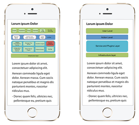
Figure 3: Desktopgraphic used for mobile (left) and mobile-friendly graphic (right)
Youshould design graphics so they can be quickly understood, so that theinformation they contain is uncomplicated and can be quickly absorbed.Remember, your users probably won’t be sitting still when they read yourcontent and may only be accessing it in sessions of a few minutes. Any graphicthat is detailed and needs careful study is probably not going to work formobile.
Graphicsthat are designed for eLearning are often in landscape orientation (Figure 4)as viewed on a desktop. The mobile user will probably be holding the device ina portrait orientation, so keep this in mind when you design or recreategraphics (Figure 5). Avoid requiring the user to turn the phone sideways toview content or a diagram because this entails using two hands and is poorusability design.
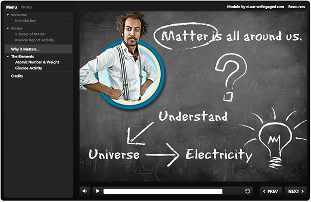
Figure 4: DesktopeLearning module layout
(Imagefrom module by eLearner Engaged)

Figure 5: Possiblemobile layout
Conceptual deconstruction
Aslearning on a mobile device does not lend itself to studying detailed graphicsor highly conceptual information, you must deconstruct such content for mobile.In your eLearning you may have a detailed diagram on one screen, where eachelement is discussed in detail via narration and animation. The equivalent formobile use must be distilled into simpler component elements that can beexplained relatively quickly—and the whole built up from these components.
Forexample, you may have an eLearning screen that shows the whole of the ADDIEprocess with descriptions for each phase (Figure 6). For mobile you need tobreak this down into multiple elements and discuss each phase separately. Youmight show a high-level diagram naming each of the phases and then havesubsequent screens detailing each phase in detail (Figure 7).
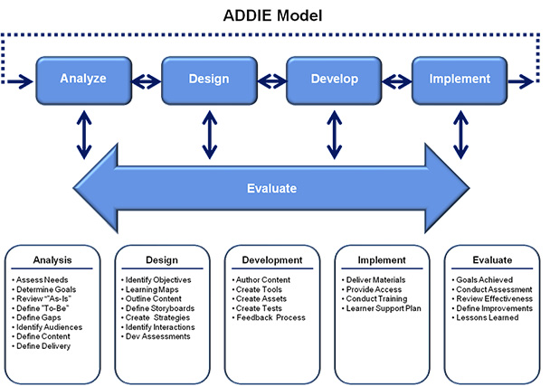
Figure 6: ADDIE graphicfrom eLearning module (Editor’s note: Readers viewing this article on smartphones may wish to rotate their devices to landscape orientation to easily read this figure.)
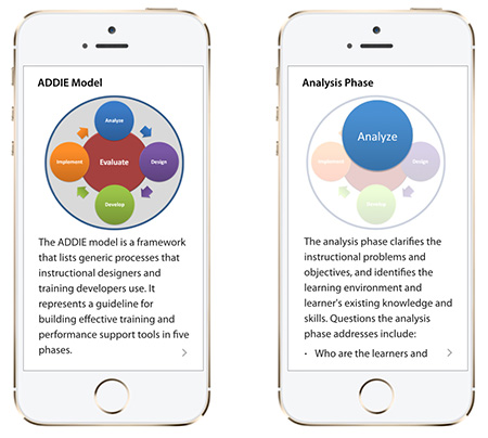
Figure 7: ADDIE graphicredesigned for mobile
Navigation
eLearningcontent often has a lot of complex navigation and interactions. Keep these to aminimum on a mobile device where screen real estate is limited and viewing timeis short.
Trynot to replicate in your mobile version the same navigation you have in youreLearning module. Desktop navigation elements are targeted with a mousepointer—mobile content on most smartphones is targeted with a finger or thumb.Target tap areas need to be much bigger. On a small screen you also need tothink about movement of the thumb so place navigation elements within easythumb stretch (Figure 8). For instance, placing a Next button top right wouldbe poor design on most smartphones.
Figure 8: Thumb stretchon an iPhone 5
Designyour navigation to be intuitive. Users shouldn’t need to think about how tonavigate or move from screen to screen—it should be obvious, and wheneverpossible it should reflect the standard navigation gestures of the operatingsystem of the target device. If it’s an iPhone keep it consistent with typicaliOS navigation—if it’s a Samsung device keep it consistent with typical Androidnavigation.
Ifyou have the UI development resources, then adding “hidden navigation” thatonly appears when you tap the screen is the way to go. This gives you themaximum area for your learning content—which is very desirable on smallersmartphone screens (Figure 9). As a general rule try to minimize the UInavigation “chrome” that surrounds your content. Giving the user access tonavigation only when they need it is good design.

Figure 9: Content view(left), and navigation appearing after a screen tap (right)
Narration and video
NarratedeLearning modules work well at the office with headphones or at home withspeakers. The user is usually sitting down and typically has at least 15minutes or so to spare. Not so with a smartphone. The user may be walking, at abus stop, in line at the supermarket, or grabbing a coffee at the local cafe.Narrated mLearning needs earphones or headphones and you need to think aboutthe convenience and practicality of this for the user. Would your targetaudience have these available at times when you expect them to be using yourcontent? You might have some great videos from your eLearning modules but wouldthey work in the mobile context?
Forthis reason it is often better to have textual content than narration in mobilecontent. You can open and read more information in thirty seconds from textualcontent than you can by having to find and plug in headphones to listen tonarration. Although narrated video may seem more attractive to the user, it canbe much less convenient or effective in many mobile contexts. If you want tosalvage any videos you already have in your eLearning, then consider creatingvideos with the option of turning captions on and off.
Keepyour videos short—in order to keep attention and account for connection speeds.If your users are not in a wireless zone and are connecting via the cellularnetwork then they‘ll get slow streaming or problematic downloads which willdetract from the mobile experience.
Consideralternatives
Ratherthan quickly jumping to adapt your eLearning modules for mobile, think of waysyou can supplement the eLearning you have rather than trying to duplicate it ona small screen. Having eLearning on the desktop and something different onmobile to support that eLearning is more powerful than duplication of content.
Hereare some examples of supportive or supplementary mobile content you mightconsider creating.
Knowledge checks
Createshort quizzes that are sent to a user’s mobile device after they complete aneLearning module. These can be used to help review and solidify the eLearningcontent.
Job aids
Createmobile job aids or mobile performance-support tools to help users apply whatthey covered in the eLearning modules. Something they can use on the job atwork.
Games
There’snothing better than playing a game on your smartphone to learn or reviewcontent. Check out some of the do-it-yourself mobile-game templates availableon the internet.
Reminders
Sendmessages to users’ smartphones reminding them of which modules they havecompleted and which they need to start. These reminders can include quickreviews.
Evaluations
Usemobile to evaluate an eLearning module a day after its completion. Mobileevaluations on average have a higher completion rate than desktop basedevaluations.
Spaced Learning
Usemobile to review the eLearning content at spaced intervals after itscompletion. Spaced learning is a highly effective way of improving recall.
Prototypefirst, then make your decision
Alwaysprototype your ideas before deciding on a specific solution. What seems like agreat idea on paper may look and feel very different when implemented on asmall mobile screen. For text and graphic layouts I often create PDF mockups ofpotential designs, email them to myself, and view them on some of the targetmobile devices. I also recommend creating mockups with wire-framing tools suchas Fluid UI or Proto.io which provide design and navigation elements forAndroid, iOS, and Windows phones. These are great for building interactiveworking prototypes.
Play around with your prototypes, try out different ideas and designs,improvise, and don’t be afraid to make mistakes—lots of them. In my experiencethey’ll probably end up being wonderful ones.