


Deliveringtraining through the iPad is a recent trend, which scores high incoolness but low in standards. While the instructional designcommunity is working hard to give us a set of rules to hold, and to break when appropriate, let’sborrow some tried-and-true conventions from other instructionalmedia that have been around for decades, such as e-Learning.
Manycriteria define online instruction effectiveness. For this article,I’ll focus on just one: the interface. Effective interfaces foronline instruction elegantly balance navigational and orientationdevices (such as headings and screen identification numbers) in sucha way that the flow between screens feels natural and users knowtheir options within the program at all times.
Effective interface design for the iPhone or iPad: Five questions
Ifyou are now transferring content from existing e-Learning to theiPhone or the iPad (or maybe designing from scratch), it is worthtaking the time to ask some serious questions about interface design.How do we create a learning mobile app so the interface istransparent and does not interfere with the learning process, butrather enhances it?
Effectiveinterface design implies deciding what you need to show at one timeand what you can withhold, de-emphasize, or obscure. Usingindustry-based standards for interface design (e.g., JakobNielsen’s design principles), the layout you buildfor your mobile learning app must enable users to answer these fivequestions:
Where am I? You should answer this question via clear screen titles and subtitles and by emphasizing menu items that were already clicked (either by changing the color or attaching bookmarks).
How did I get here? You should answer this question by enabling the presence of a visual trail between different content components. For instance, highlighting a section already clicked on a menu, or a screen that opens in a new window that still allows the previous window to be visible, or a “breadcrumb trail” to show the progress through several linear screens.
How can I return to where I once was? Enable movement between learning units via navigational links. Some navigational menus are visible all throughout the course. Other interfaces provide Back buttons or Menu buttons to return to a map of choices. A simple tap on the screen can also reveal additional navigation options.
How far have I gone? A screen ID such as “Screen 2 of 24” informs users how far they have progressed through a lesson and, even more important for some students, how much there is left to do. Refrain from using the word “page” as in “Page 3 of 15.” Pages are what you find in books; screens are what you offer online. Consider building small modules. Seeing “Screen 3 of 55” may be harder on the modern students’ gentle psyche.
Where else can I go? Navigational buttons, when labeled clearly and placed conveniently, will serve as orientation tools throughout the mobile app.
Examples from real apps
Thescreen shots below exemplify screens from mobile apps that have alearning tint (they are available either in the Educational orReference sections in iTunes). I’ve selected them with a simpleresearch goal in mind: given a random screen in a learning app, howwell (and how fast) could I find answers to the five navigationquestions. To stay focused on navigation and not distracted by thecontent, I even selected apps in languages I don’t speak.
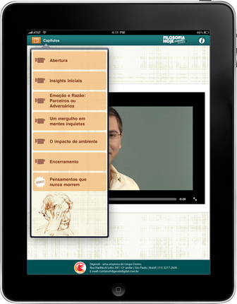
Example 1. Learning app on philosophy | |
(Editor’s note: Click on images to enlarge) |
|
Lessons learned: Keep the app simple, with few user-decision points. Title each screen with the exact title used in the navigational menu for consistency. | |
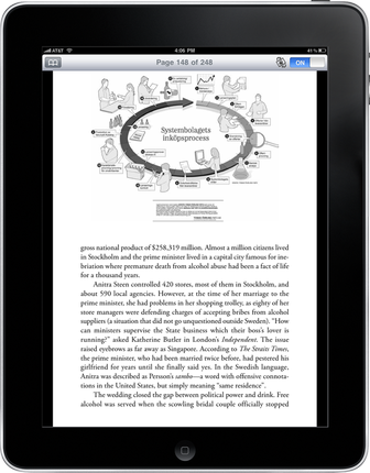
Example 2. Book app on Stockholm culture | |
|
|
Lessons learned: include at least a chapter title, if you’re creating learning apps in the shape of books (a trend I’ve seen increase lately). Include progress information (screen x of y). Design buttons so that they indicate whether they are depressed or have not been touched. | |
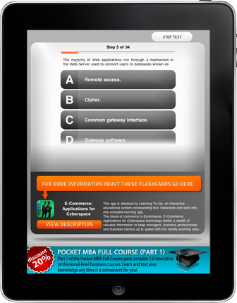
Example 3. Learning app on business and finance | |
|
|
Lessons learned: include a Back button or Main Menu option for all screens, and use an intuitive label. Reserve 80% of screen real estate for content and 20% for navigational options. In this instance, the navigation takes too much space compared to the content. If you click any of the answers in the question, you receive feedback for each of the four distracters in the same area, which means you have to scroll to view the feedback for option D. If you’re promoting your learning app by giving out free content (which is a great idea), ensure that the emphasis is on well-designed content and the navigation is transparent in the experience. | |
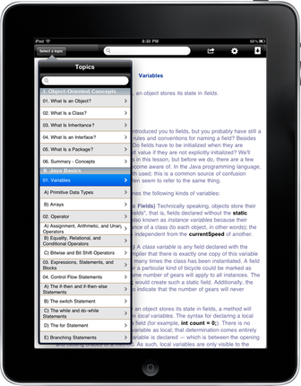
Example 4. Learning app on Java | |
|
|
Lessons learned: It is advisable that the title of each page match the title listed in the navigation menu (e.g. Variables at the top and Variables in the menu). When you have a longer menu, invest in better programming so that the hierarchy displays in a more visually appealing way. In this example, there are three levels in the menu, denoted first by Roman numerals (I, I, III, etc.), then by 1, 2, 3, etc., and then by A, B, C, etc. It would be nice if the design used indentation correctly to show that at least the A, B, C, D were sub-sets. In the current version, that indentation is not available and the formatting is not proper (hanging indentation would be best). To decrease psychological burden on the learner, consider building a collapsible menu so that the main sections display first, then upon selection of a main topic, additional ones display. The menu in this current app has seven main sections and tons of sub-sections. Scrollable menus such as these look more like an index than a manageable and approachable menu (Oh, and always check typos, the one in this app has two number “VI” sections). | |
Example 5. App on … something… | |
|
|
Lessons learned: Indicate visual progress. Let’s try harder to find ways in which we can show not only screen numbers within a module or a chapter but progress within the entire course or context. One of the frustrating things for many learners in the online space is physical orientation: the feeling you have when you enter a store and you can tell how much of it you’ve covered and how much more there is to discover. “Feeling” the volume of an instructional offering is an area of research opportunity for all of us instructional designers. | |

Compromise when necessary – but wisely
Asyou can see, some screens provide answers to all five questions andsome do not. Even if an app screen does not provide all the answers,it does not necessarily mean that the design is faulty. Remember:there is no such thing as an optimal layout. The ultimate interfaceof your learning app is likely to be a compromise between availabletime, money, content type, learner preferences, and design expertise.
Onceyou design an interface, it is wise to measure its effectiveness inquantitative terms. Gather a group of five to eight users (researchshows that feedback after the eighth user is redundant). Ask them touse your app and monitor their performance in terms of thesebehaviors:
Criteria for mobile app interface efficiency |
Time to complete a task |
Relative efficiency compared to an expert user |
Time to learn the navigational features |
Time spent on correcting navigation errors |
Repeat until finished
Fixissues that your feedback group reports and use an iterative designapproach: gather another group of five to eight users and test theapp again according to the same criteria; repeat until you’resatisfied with the progress and reaction.
Asyou embark on mobile app development, please treat any opportunity ofcontent conversion as a scrutinyopportunity. Refrain from merely dumping electronic content into anapp shell. This way, we all avoid betraying the mobile app’spotential as an instructional medium.