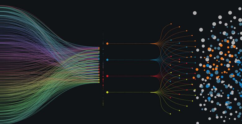
Collecting data is all the rage these days. But massiveamounts of data in spreadsheets or tables won’t necessarily tell learners whatthey need to know. To thoroughly understand and tell stories with data—tocommunicate the importance or meaning of data—it’s necessary to use datavisualizations in eLearning.
Understanding how to interpret and share the informationthat analytics data reveals enables eLearning developers to add impact and clarityto training tools.
What is data visualization?
Data visualizations display abstract information in visual,graphical formats. Statistical information, test scores, and other datacommonly gathered about learners and their performance is abstract, but whenanalyzed and presented effectively, it can communicate detailed and relevantinformation about an individual employee’s or a department’s performance, aboutthe effectiveness of training, or about how one person or training course isperforming when compared with others.
A data visualization maps numbers—data points—onto spatialproperties, such as lengths, heights, colors—hue or shade—positions, area, orsize. Some visualizations enable readers to see a big-picture perspective,while others are better at showing precise comparisons and differences betweenvalues.
A single data visualization is rarely sufficient to describeand explore a dataset; often multiple visualizations, presented in differentformats, are needed to fully illustrate a dataset. Hundreds of types of visualizationsexist; common types include bar charts, pie charts, box-and-whisker plots, andbubble charts or maps.
It’s easy to get started: eLearning developers can createdata visualizations using free or very low-cost tools, such as iNZight or Tableau Public. Dataskills, such as knowledge of coding and statistics, enabledevelopers to create more sophisticated visualizations.
Using data visualization in eLearning—and beyond
Exploring data and helping learners understand the storiesit tells are clearly useful objectives: An L&D team with data visualizationskills can add infographics, charts, and tables to eLearning courses and performancesupport tools to help learners understand the material. Data visualizationsalso offer a “plusone”—an additional format to consume and improve understanding of complexcontent.
Data visualizations also aid developers in achieving goalswithin the larger organization—outside of eLearning courses and tools—that arevitally important to many L&D teams. As companies increasingly seek tounderstand how eLearning and training add value, and L&D teams attempt tomeasure outcomes and determinethe effectiveness of their training, enlisting data visualizations is an obviousstep.
L&D teams routinely collect data on course completions,quiz results, activity performance, and content consumption. A datavisualization that compares these metrics with key job-performance metrics willshow how training correlates with improved results, for example. Clear,engaging, accurate visual representations of learning and performance data canhelp L&D teams “make their case” with managers far better than a verbalexplanation alone ever could.
To further explore the use of data in eLearning, downloadThe eLearning Guild’s research report, Putting Data to Work, and registerfor the Data& Analytics Summit, August 22 – 23.

