


With all of the hoopla surrounding HTML5, designers often forgetanother big step forward in browser-based delivery: CSS3. The appearance layerof the HTML5 development stack offers some new tricks that are visuallyinteresting and easy to code. The downside? The browsers still haven’t caughtup with the code – and different browsers often provide different results withCSS3 techniques.
To get started with CSS3 here are three techniques that you can adaptquickly and use in your browser-based presentations.
Technique one: roundedcorners with CSS3
Rounded corners allow you to seta radius to each corner on what was – before CSS3 – a square or rectangularobject. Let’s start with some simple – and typical – HTML5 code:
<!DOCTYPE html><html><head> <title>Rounded Corners</title></head><body><div id="box1"> <p>Nullam id dolor id nibh ultricies vehicula ut id elit. Fuscedapibus, tellus ac cursus commodo, tortor mauris condimentum nibh, ut fermentummassa justo sit amet risus. Duis mollis, est non commodo luctus, nisi eratporttitor ligula, eget lacinia odio sem nec elit.</p></div><div id ="box 2"><p>Nullam id dolor id nibh ultricies vehicula ut id elit. Fuscedapibus, tellus ac cursus commodo, tortor mauris condimentum nibh, ut fermentummassa justo sit amet risus. Duis mollis, est non commodo luctus, nisi eratporttitor ligula, eget lacinia odio sem nec elit.</p></div></body></html>
If we take a look at this in thebrowser it won’t be very interesting (Figure 1). The content has no style atall, because we haven’t added any CSS code yet. The display is based on thebrowser’s default style sheet.

Figure1: UnstyledHTML code
Now we’re going to add some CSSto make the boxes stand out a bit more. We’ll adjust the font, the font size,and the background color of the divisions. Right before the closing head tag(</head>), add the following code:
<style> #box1, #box2 { border: 1px solid black; font-family: Arial, Verdana, sans-serif; font-size: .85em; background-color: rgb(215,215,215); }</style>The divs now look a little moreinteresting, but aren’t quite there yet (Figure 2).
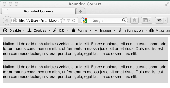
Figure2: Logicaldivisions with styling added
Now we’ll employ some CSS3 toround the corners of the logical divisions. Right below the background-colorentry in the CSS we’re going to add the border radius code. Enter thefollowing:
-moz-border-radius: 15px; border-radius: 15px;
This is rather strange-looking CSScode! The -moz preceded CSS is designed to communicate specifically withMozilla-based browsers. As I mentioned earlier, the browsers are still not 100percent consistent when it comes to interpreting CSS3, and this is where westart to see some of those issues exposed (Figure 3).
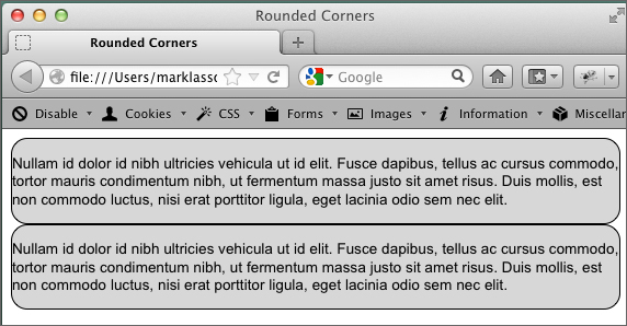
Figure3: Divs styledwith border radius
Technique two: gradientswith CSS3
Gradients are a gradualtransition between colors – and they are all over Web-based materials andeLearning designs. Up until now, creating them with HTML and CSS alone has notbeen possible. With a few lines of CSS3 code, however, you can create smoothgradients to help make your designs current and engaging.
Let’s start with a logicaldivision:
<!DOCTYPE html><html><head> <title>Gradient</title></head><body><div id="box"> <p>Nullam id dolor id nibh ultricies vehicula ut id elit. Fuscedapibus, tellus ac cursus commodo, tortor mauris condimentum nibh, ut fermentummassa justo sit amet risus. Duis mollis, est non commodo luctus, nisi eratporttitor ligula, eget lacinia odio sem nec elit.</p> <p>Nullam id dolor id nibh ultriciesvehicula ut id elit. Fusce dapibus, tellus ac cursus commodo, tortor mauriscondimentum nibh, ut fermentum massa justo sit amet risus. Duis mollis, est noncommodo luctus, nisi erat porttitor ligula, eget lacinia odio sem necelit.</p></div></body></html>
Again, we’ll add the CSS code tothe head of the document – just after the closing title tag and just before theclosing head tag. Again, browser incompatibilities complicate the code.
#box{ background-image: -webkit-linear-gradient(top, #2F2727, #1a82f7); background-image: -moz-linear-gradient(top, #2F2727, #1a82f7); background-image: -ms-linear-gradient(top, #2F2727, #1a82f7); background-image: -o-linear-gradient(top, #2F2727, #1a82f7); }You may already be familiar withthe background-image CSS style. It’s used on a number of elements to display agraphic image in the background. However, with CSS3 we’re using this style in abrand-new way. You’ll notice that we used the background-image style four times.In the first line we’re targeting WebKit browsers. The second line addressesMozilla browsers, such as Firefox. The third and fourth entries targetMicrosoft Internet Explorer and Opera respectively.
Once you have the code correct,you will see a strong black to blue gradient in the div (Figure 4).

Figure4: Gradientdisplayed in the div
Looking at the background-imagestyles, it’s fairly easy to determine how the code applies the gradientpatterns. The very first argument in the parentheses is “top,” which means thegradient starts from the top. The second and third arguments are hex colors,indicating the starting and ending color for the gradient.
Technique three: CSS3columns
Creating newspaper-like columnshas previously been a laborious and difficult process. New features in CSS3allow the browser to display and balance columns automatically. Since thisexample requires a lot of dummy text, I’m providing the starter file as a download.The starter file has all of the HTML code you will need – we’ll just add thenecessary CSS3 code to get going. Figure 5 shows what the content looks likewithout the CSS3 code.
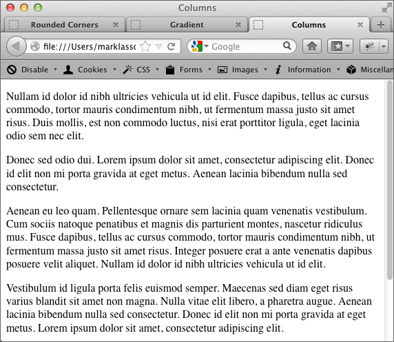
Figure5: Contentbefore column code added
In between the provided openingand closing style tags write the following CSS3 code:
-moz-column-count: 3;-Webkit-column-count: 3;-moz-column-gap: 1em;-Webkit-column-gap: 1em;
When you test in your browser youshould see three distinct columns (Figure 6). As you can see from the code, weare targeting Mozilla and WebKit browsers. The column-count style determineshow many columns will be displayed, and the column-gap style determines howwide the gap between columns should be.

Figure6: Contentdisplayed in columns in Firefox
In this short tutorial we havejust scratched the surface of the power of CSS3. With this newer Web technologywe have the ability to make more powerful, more interesting layouts for ourWeb-based (and mobile-based) learning materials!