You’re buildingPowerPoint slides to pull into a rapid e-Learning project and youneed images. Clip art? Nah. Everyone knows that clip art sucks. Or … wait a minute, does clip art always suck? Clip art = sucks isthe same thinking as PowerPoint = sucks. It’s not the images ortool that sucks but poor usage.
In this article, I’mgoing to discuss using a few basics of selecting and using clip arton the slides you intend to pull into a rapid e-Learning authoringtool. There are numerous considerations when using clip art, so I’llstart today with some fundamentals. I’ll add on to these in futurearticles.
Selection
What image shouldyou use? Start by considering concept and style. Pick an image thatmatches the concept you are trying to convey and that conveys it inthe right way. For example, let’s say I’m building aworkplace safety course. Which of the images below do you think worksbest for the starting slide, the top one, or the bottom one? (Allimages shown in this article are PowerPoint clip art images.)

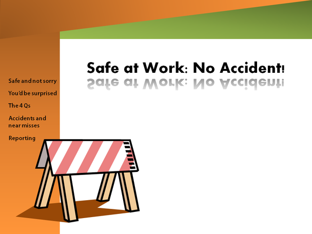
The top one conveysfear. Do I want to convey fear? No, I don’t think that’s what I’maiming for. Caution is more appropriate. Can you tell what else Ithink is wrong with the top image? If you guessed that I think thestyle is too cartoonish and therefore the wrong style for a serioussubject, we’re on the same page. The bottom one works better, Ithink, because the clip art conveys a sense of “hazards ahead”and that’s more appropriate for the topic. You may choose otherclip art, of course, and your needs and audience may demand adifferent tone altogether, but the decision process should besimilar:
Does it convey the right concept?
Does it convey the concept in the right way (e.g., the right tone for the topic and audience)
Style
Once you havedetermined that a certain style or tone works, you may want to findother images to use that all use the same tone. Otherwise, clip artimages can look like a mishmash of dissimilar images. And thatscreams “clip art.”
In PowerPoint, youcan often find a group of images that share a common look. Using clipart images that have a common look makes your content more polished.For example, here is a series of clip art buttons obviously designedto fit together.


You can downloadloads of additional clip art images from Microsoft(https://office.microsoft.com/en-us/images/)and quickly find images that belong together by finding clip art inthe same style (the syle number is circled below).
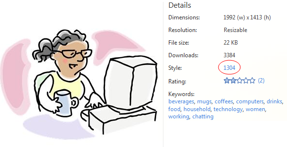
When you click onthe style number, you’ll see images in that style (you can see someof the other images in the 1304 style below). You can then choose theones that are useful for your content. And by using images with thesame style number, you’ll be helping to unify the design of yourmaterials. Note: Not all clip art images belong to a style group, sothis works for some but not all images.

Placementand Scale
Clip art can looklike clip art or like design elements, based on how you place them onthe slide and how big they are (the scale). For example, let’s lookat two alternate placements and scale for the hazard image that Ichose.
The top examplebelow shows the image’s original scale (when PowerPoint insertedit), placed in the middle of the white area of the slide. The bottomexample shows the same image, made larger, and moved to the side.
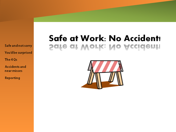
The problem with thetop example is that it looks like typical clip art, plopped downrandomly on the screen. In the bottom example above, I increased thesize and moved it to the left to tie the white space to thenavigation area. It now looks like a part of the design, rather thanlike a plopped-down image. Look at the clip art placed on so manyPowerPoint slides and you’ll begin to get a feel for how oftenpeople plop images on the slide. Too often! The problem with thatapproach is that doing this screams “clip art” rather than“design.”
When you enlargesome clip art images, they begin to get fuzzy looking. The type ofimage that gets fuzzier when scaled is a bitmap image and bitmappedimages are based on pixels. Vector images, on the other hand, aredefined by mathematical equations rather than by pixels so they canbe scaled without getting fuzzy. If you want to scale your images,use vector images. How can you tell? The easiest way to tell is toenlarge them to see how well they scale.
I’m not a graphicartist and I don’t play one on television, but I do take everyopportunity to learn how to make my materials look better.Attractiveness is truly important. Decisions about selection, style,placement, and scale can make clip art look like part of the designand not like an I-need-an-image-here afterthought.