


Information graphics,or infographics, include a wide-ranging category of visuals intended to presentdata and information in an accessible format. Quantitative infographics represent measurable data in formats likedata visualizations, graphs, charts, statistical maps, and numeric tables. Whensuccessful, these infographics serve as cognitive aids to enhanceunderstanding, assist in problem solving, and support decision making. Effectivevisual design is a key consideration in creating datavisualizations or infographics for eLearning.
Why data visualization works for eLearning
Quantitative infographics are effective foreLearning because they condense and organize—visualize—large amounts of datathat would otherwise overwhelm the human mind. By transforming abstractdata into a concrete form, infographics help an audience detect patterns, makecomparisons, track changes, and see relationships. In addition, effectiveinfographics clarify ideas, inform, and tell stories with data. Interactiveversions allow for exploration and discovery. All of this serves to enhancethe appeal, comprehension, and retention of information, ideas, and concepts.
Encoding and decoding
A quantitative infographic encodesthe data values into visual attributes, such as color, shape, angle, size,and position. For example, the shape and length of a bar in a column graphindicates its value. The color of the column represents the category of data.
In a reverse operation, learners use these visual attributes to decode the infographic. They perceivethe shapes, colors, and sizes of the visual elements and translate them intothe values they represent. An effective infographic, therefore, must have a visualdesign that can easily be decoded by the audience.
12 tips for better infographic design
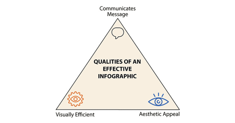
Any visual communication can be improved with anunderstanding of design principles that help ensure viewers correctly perceiveand interpret the elements of a graphic. To be effective, an infographic shouldaccurately communicate its message, attract attention with its aestheticappeal, and be visually efficient so it is easy to scan and perceive. Let’slook at some ways to accomplish this in infographic design.
Figure 1: An effective infographic accomplishes three goals
- Find your focalpoint: Just as with instructional design, youneed to know the instructional objective of the infographic, your purpose orgoal in using this format, and what you want your audience to know or do. Thiswill help you identify what is most important in the infographic, which willbecome your focal point.
- Establish avisual hierarchy: When youidentify the focus, you can determine the order in which the infographicelements should be viewed. Establish what youraudience needs to see first, second, and third. Then make the most importantinformation visually prominent.
You can direct learners’ eyes to the focal point through positioning(place at the top or top left of the screen), using a bright color, scaling theelement so it is larger than everything else, or using a visual cue like anarrow. If you want learners to notice the title of an infographic first,position it at the top in large, boldface text. If you want one bar of a bargraph to be the key for comparisons, color the bar in a bright, contrastinghue. - Choose the bestchart type: When selecting the mosteffective type of graph or chart, consider:
- The formatthat best fits the data;
- What youwant the audience to interpret from the visualization; and
- A format that is familiar to your audience.
The most familiar formats are those you consistently see in the mass media. - Provide context: Learners are more likely tounderstand an infographic when words provide the context of what the data isabout. Conventional ways to do this are by including any of the following:title, subtitle, data labels, descriptions, and explanations. This accompanyingtext clarifies the data and points the viewer in the right direction from thestart.
- Optimizevisual discrimination: Makingit easy for learners to discriminatebetween visual elements helps them accurately interpret the infographic. To show a differencebetween two sets of data or to make one element stand out, selectcolors that are well separated on the color wheel. For example, blueand purple may be difficult for some to discriminate. Blue and orange are not.Another way to improve visual discrimination is to use a clean and legibletypeface with letters that are easy to differentiate from each other.
- Designfor accessibility: To ensure yourdesigns are accessible to all, do not rely only on color as a visual cue. Rather,use an attribute in addition to color, such as shape or shading marks, todifferentiate between visual elements. Labels may also work. The goal is toensure that the infographics can be understood by those with color visionimpairments.
- Supportquick scanning: How can you reduce the time it takes forlearners to visually scan an infographic? One way is to avoid splitting theirattention between the graphic and the legend. Whenever possible, place labels within the infographic so that learners canhave all the information they need in one place. For images, use icons ratherthan photographs to promote quick scanning. Simple icons have less visualinformation than photos, so they take less time to perceive.
- Representonly the data you need: Consider whethervisualization is necessary. If you want viewers to compare individual values,it’s possible that a simple table with numbers will be more effective than agraph. A table is an organizational tool rather than a new visualrepresentation that needs decoding. On the other hand, if you are dealing witha large dataset, visualization is probably best.
An adjunct to this is to consider the amount of data you need to show. If youhave access to an overwhelming amount of data, go back to the root purpose orgoal. You may be able to enhance the meaning of the data by limiting how muchyou represent. - Be accurate:When designing a quantitative infographic,you will be interpreting numerical data. In the translation process that wecall design, the data can get distorted. Check with others to make sure yourinfographic is not unintentionallymisleading. Provide viewers withan inconspicuous scale in the background to support accurate interpretation of graphs—andwhen using a scale, ensure it starts with zero.
- Design in 2-D, not 3-D: In general, avoid three-dimensional design formats for two-dimensionalgraphs. The third dimension does not represent an additional value, so itbecomes a distracting and unnecessary visual cue. In fact, the perspectivedisplayed with a third dimension can distort accuracy, as shown in Figure 2, apie chart, where every wedge represents 25 percent, but the ones that appearcloser also appear larger.
Figure 2: In this pie chart, the closer wedges appearlarger, even though all four segments are the same size
- Use piecharts to represent relative values: A pie chartshows the proportions of each part to the whole. But there is a problem withasking viewers to accurately judge the wedges of the chart. People havedifficulty accurately judging area and angles, skills needed to correctlydetect the value of a wedge. Even when the value is placed directly on thewedge, it may not look correct. Therefore, use a pie chart only when you needto display approximate or relative values.
- Order thedisplay to promote meaning: The order in whichyou present data affects how audience members interpret it. When the visualelements of a graph are in a random order, it is more difficult to detectpatterns and understand relationships. But when you present data in a logicalarray, such as least to greatest or chronologically, it’s easier to interpret.
Information graphics have the potential to support eLearning byclarifying ideas and concepts, providingaccess to large sets of data, and engaging the audience. It’s worthtaking the time to plan your infographic designs carefully—and take other stepsto improveyour infographics. Determine your objective and identify what youwant the audience to do with the information. Then translate the data into avisual representation that will help the audience achieve your goal throughexcellent design choices.
Connie Malamed is the eLearning Coach. Visit herwebsite to download a free visual design checklist and access more visualdesign and eLearning resources.


