“Helvetica is the sweatpants of typefaces.” —John Boardley
Thefirst computer I owned that supported real typography was a Mac Plus. In 1988,fonts were fun and I might have used them all. The dawn of the “desktoppublishing” revolution was upon us, and as users we had more control overtypography than ever before. With serious typography comes seriousresponsibility—and some of us are still using type like it’s 1988.
Inthis article I’m going to, first, discuss the technical aspects of typographyso that you can better understand how digital typography works. Then, I’lldiscuss the usage of typography so that you can avoid the major pitfalls thenext time you work with type.
Typographical terms and conventions
I’vefound that typography is often best understood by examining the vocabulary usedto discuss the craft. I’d like to start by looking at some of the most commonterms and how you would apply them using typical digital design software. Anote here: While the software you use may be different from the Photoshoppalettes pictured here, it is likely that your software has all the sametypographical features and adjustments described.
Thisis by no means meant to be a comprehensive glossary of typographical terms. Thisis a sampling of terms that will help you understand typography in general. Herewe go:
Baseline andleading
Thebaseline is the imaginary line onwhich your type sits(Figure 1).

Figure 1: The baseline is visible below the text
Toadjust the space between baselines, you need to adjust the leading (pronounced “led-ing”). Leading, the space betweenbaselines, is something you can control in all contemporary digital designsoftware and word processors. In Photoshop, for example, you’ll find theleading control grouped with other typographical controls on the characterpalette (Figure 2).
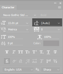
Figure 2: Photoshop groups typographicalcontrols on two palettes. I’ve highlighted the leading control here. Itcontrols the space between baselines.
Adjustthe space between baselines to allow less type on a page to enhance readability,or more type on a page to conserve space.
Kerning
Kerning isthe act of adjusting the spacing between two individual letters. Especiallywith larger “display” typefaces, you may find that it is necessary to adjustkerning between letters to enhance readability and visual appearance (Figure 3).
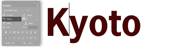
Figure 3: Adjusting the space betweenthe “K” and “y” using kerning in Photoshop
Tracking
Tracking refers to how tight or loose type is generally throughout a document. Youcan make tracking adjustments for the purpose of type fitting (fitting typeinto a specific amount of available space), but, as with most things, extremesare not recommended(Figure 4).
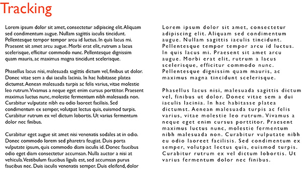
Figure 4: Normal tracking on the left and loose tracking on the right.You can see that the text becomes hard to read if tracking is too loose.
Font versustypeface
Ihear these two terms being confused all the time. Once you understand thedifference, you can happily correct others as you approach typographicalsnobdom. (Not recommended).
Typeface refersto the design of a set of letters, numbers, symbols, and related variations. Youmay refer to a typeface by its name, such as Times New Roman. Variations of thetypeface may include Times New Roman Bold or Times New Roman Italic. There aretens of thousands of typefaces available for your use. Some are free, but manyincur a charge from the type foundry that owns them.
Onthe other hand, a font is a computerfile that holds the information about a typeface. You would install a font ontoyour computer so that you may display a new typeface. “Font versus typeface” isgreat family dinner conversation(Figure 5).
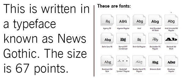
Figure 5: Typeface versus font
X-height andcap height
Thesetwo terms refer to the size of specific aspects of different typefaces (Figure6). It is best to define these terms visually:
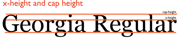
Figure 6: X-height and cap height
Usingthe typeface Georgia Regular as an example, the x-height of a typeface is the height of lowercase letters above thebaseline. The cap height is theheight of the tallest letters in the typeface. Both x-height and cap heightmeasurements vary from font to font.
Pixels
Apixel is the smallest unit of visualinformation a monitor can display at any given time. You’ve likely heard aboutHD or 4K displays. These classifications refer to the number of pixels that ascreen can display at one time. The more pixels the monitor can display, thegreater the resolution. This is germane to typefaces because resolution canaffect the quality and readability of text displayed. You actually can increasethe magnification of text so that you can see the individual pixels (Figure 7).
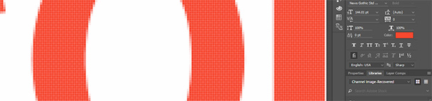
Figure 7: You can see the individual pixels that make up these glyphs (letters). The different coloralong the glyphs’ edge is called anti-aliasingand makes letters appear crisper when you view them at their usualmagnification.
Points andpicas
Points and picas are the measuring system traditionally used by typographers. Thereare 6 picas per inch and 12 points per pica. This yields 72 picas to an inch (Figure 8).
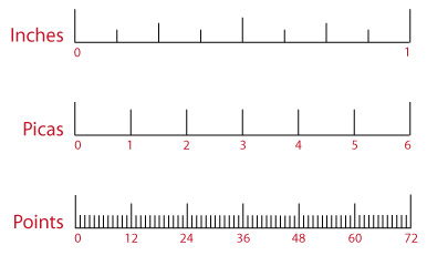
Figure 8: Points and picas are the measuring system traditionallyassociated with typography. This system is still used by Microsoft Word, Adobe Photoshop,and most digital authoring programs.
Serif and sansserif
Serif typefaces have tails onthe ends of each letter. These tails appear along the baseline, the x-heightline, and often at the top of the letters. These aren’t merely decorative; itis often said that serif typefaces are easier on the eyes in large reading passages.Some popular serif fonts include Times, Georgia, and Garamond. Popular sans serif fonts include Arial and Verdana (Figure 9).
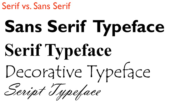
Figure 9: Sans serif, serif, and other popular categories of type
I’dencourage you to learn more about typography, as we’ve only scratched thesurface with the vocabulary presented here. Once you know how type is discussedand measured, you’ll have a better idea of how to adjust and tweak your type inyour learning presentations and courses.
Typographical usagetips
I’mnot a trained graphic designer—but I am visually literate. I’ve found thatfollowing a few “rules” when it comes to typographical decisions will greatlyenhance the quality of your typographical design overall. This is one of thosesituations where simplicity is often better than complexity. When in doubt,simple typographical solutions work best.
Hereare a few tips to help you improve your typographical usage:
- Useonly two (at most three) typefaces in a document.You’ll notice that professionals limit their font selections in a singulardocument, and you should too. The presence of too many fonts looksunprofessional and makes it difficult to establish a visual hierarchy usingtype.
- Ifyou’re using different typefaces, use VERY different typefaces.When you use typefaces that look similar, it looks like you’ve made an error. Usetypefaces with a good deal of contrast to create maximum visual impact.
- Avoidcenter alignment. It seems that many eLearning developershave a micromanaging boss who tells them to center type. Don’t do it. Whileyou’re at it, use a single alignment per page. It will make your content appearcleaner and more uniform.
- Don’tright-justify text. The uneven right margin (“ragged right”)helps readers track from one line to the next.
- Kernyour larger type. The larger type in a document orpresentation augments any flaws in the natural spacing of the type. A littleadditional attention to the space between letters in your larger type will makea significant difference in appearance.
- Createa visual hierarchy. Use size and typeface variations tocreate a visual hierarchy with your type. This will make it easier for viewersto navigate your content.
- Don’tuse the defaults. Just because your software defaults toTimes New Roman doesn’t mean you have to use it!
- Keeptrack of trends in typeface usage. You don’t want to be the last designerusing Helvetica. Trust me. We will make fun of you.