I love conferences.
I speak at several in thelearning industry and several in the software development industry each year. Ilove to speak and network, and I’m always anxious to see what leaders are doingin the field. I come seeking new ideas and energy that I can apply to my ownbusinesses.
A few years ago, I was atan eLearning conference and went to a session led by someone I did not know andhad never heard of. It was a session on graphic design. I’m always seeking tipsand techniques I can use to make content more visually engaging.
Before starting, the presenterstood at the front of the room chatting with some people in the front row. Andthen she turned on the projector.
It was ugly.
Never before had apresenter so quickly undermined her entire presentation. It was one of thePowerPoint templates that makes me scream because not only is it ugly—it’sbanal.
Don’t be this presenter. Createslides that engage students, whether they are sitting with you in a classroomor watching your presentation in a virtual environment.
There are two skillsinvolved here—creativity and production. With a little of both, you can greatlyimprove the quality of your presentation. Here are five techniques to get youstarted.
Technique 1: Integratethe unseen instructor
People often relate tocourse material through the instructor. That’s why I like to make courses withinstructors who act like they are in the classroom with the student—versus adisembodied “announcer voice.” If you’re creating a class with videos, it’seasy to integrate the instructor. However, if you’re creating courses withvoice-over and more traditional slides, it’s more difficult.
We try to avoid the “instructor in the box.” Butwe do integrate the instructor into our slides. For this technique, you’ll needseveral pictures of your instructor in different positions (Figure 1). Theseimages can range from serious to silly.

Figure 1: We take 10 to 12 photos of theinstructor in different positions to use in our course slides. These are photosused in my current online courses. Integrating a visual of the instructor helpsforge the important instructor-student relationship in online courses. Hopefullyyour instructors are better looking.
We’ll integrate thesephotos into a series of slides or even screencasts. It’s important for theinstructor to be seen as well as heard. Make sure that your instructor photosare taken against a transparent background so you can integrate them into justabout anything (Figure 2).
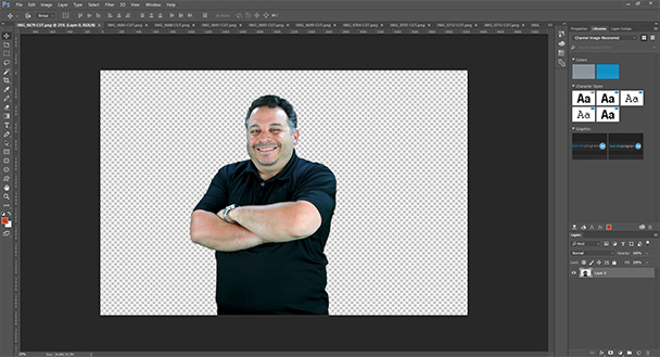
Figure 2: When you produce images with atransparent background, you will see a checkerboard pattern behind them inPhotoshop. You can store these images in PSD format (the default Photoshopformat) or PNG format.
Integrate your instructorinto your instructional slides in an intentional way. Try not to make the imagegratuitous; rather, have the instructor’s reaction communicate something aboutthe material.
I like to think of it asmaking the instructor the “star” of your course (Figure 3).
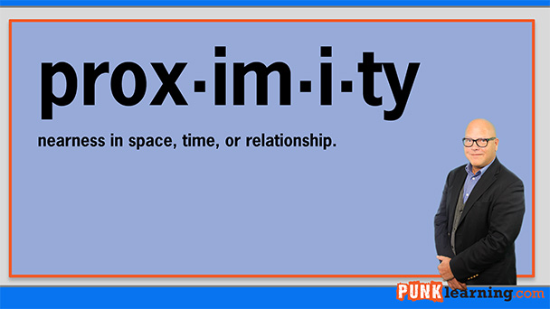
Figure 3: Instructor Jon Secor integrated into aslide
Technique 2: Usetelevision-style lower thirds
I know that lower thirdshave been a bit overdone on television. Some news stations include multiplecrawls, weather information, and viewer polls, all on the same lower third. However,if done tastefully, the lower thirdcan add a degree of visual interest and additional information to your learningcontent. These are relatively easy to create.
If you do a Google imagesearch for “lower thirds,” you will have hundreds of templates to work from. Ibring one I like into Photoshop and use it as the basis for creating my own (Figure 4).
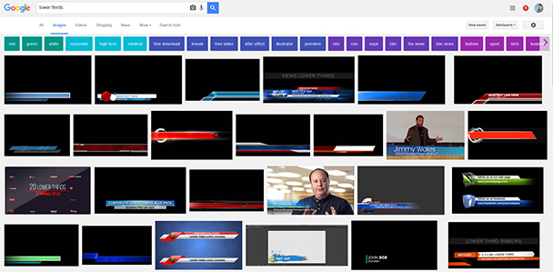
Figure 4: Lower thirds from a Google image search.There are hundreds of these if you need ideas!
When we use lower thirds,we often use them to communicate additional information to the learner (or addsomething we forgot to the voice-over!), or to set a context for the voice-over.The good thing about lower thirds is that, unless you use them constantly, theyare very likely to get read.
Technique 3: Makeit a movie poster
Everyone loves the movies. Iuse this technique a lot for cover slides or handouts that are associated withslides. There’s nothing stopping you from making your slide look like a movieposter. If you look at photos of movie posters online, you’ll notice they allhave a number of similar elements in their layout. Choose one that you like,and imitate the style using Photoshop (Figure 5).
I’ve found that if you usethis technique well, it can become a motif that will pull your whole coursetogether. This takes some work, but is well worth it!
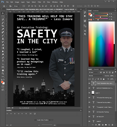
Figure 5: Look at some movie poster samples onGoogle Images, and create your own movie poster. If you do this right, yourlearners will read every word. This example is the cover from a safety trainingcourse.
Technique 4:Edit your stock photos and clip art
It’s amazing how often Isee stock art in learning content and can tell you which library the stockphotography came from (Figure 6).

Figure 6: Know this guy? Search your stock artlibraries for “Millennial with computer.”
With a little editing, youcan make your stock art look less like stock art and better integrate it intoyour presentation (Figure 7).

Figure 7: I made a few edits to make this imagemore interesting. First I desaturated the background so the central figure“popped” more. I also cropped the image into a more interesting shape. Finally,a splash of orange—congruent with my branding—adds additional visual interestand hides more of the background.
Think of your stock art asraw material—not a finished product.
Technique 5: Animatethe background
This one is a bit of aprocess. Animation is visually engaging and—if subtle—can add life to dullerlectures. You can output the animated background you create in the steps belowas video and embed it into just about any learning presentation.
1) Open Photoshop and create a newfile. Name the file Background andset a width of 1920 pixels and a height of 1080 pixels. Use a resolution of 72PPI. Make sure the background content is white. You can leave the rest of thesettings at their default values.
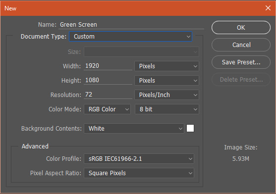
Figure 8: Create a new Photoshopfile
2) Using the Layers palette, click the“new layer” button twice to create two new blank layers. When you’re done, the Layerspalette should look like this:
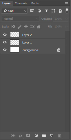
Figure 9: Create new layers
3) Make sure Layer 1 is selected from your Layerspalette. From the drop-down menus, choose File → Place Embedded. Place start image.jpg, which is provided on thelayer. You’ll need to adjust the position of the graphic so it fully covers thelayer and press enter to fully place the image on the layer. Once you’ve donethis, your Photoshop interface should look something like this:
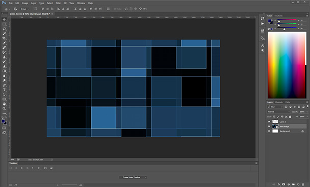
Figure 10: Your Photoshopinterface should look like this
4) Use the magic wand tool to select the bluesquare directly in the middle of the layer. A highlight marquee should appeararound the square. Select Layer 2 and fill the square with white using Edit →Fill. In the Fill dialog box, make sure the Contents drop-down value is white.
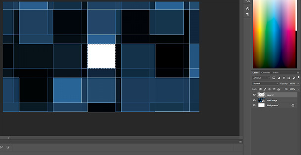
Figure 11: Fill the square withwhite
5) Create a new layer, select adifferent square, and fill it with black or white. Be certain that each layerfills only one square in the original image. Do this until you have five layerswith squares filled.
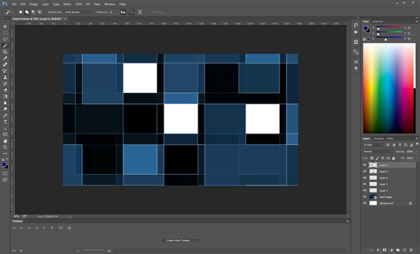
Figure 12: Do this until you havefive layers with squares filled
6) Using the Opacity slider on the Layerspalette, change the opacity to 0% for all of the square layers you justcreated. You shouldn’t be able to see any of the black or white boxes you justcreated.

Figure 13:Layers palette
7) In your Timeline panel (if it’s not visible,choose Window → Timeline), click the “Create Video Timeline” button. Thetimeline will appear. Drag the timeline upward so that the window expands andyou can see your start image and all the layers you created on the timeline(Figure 14).
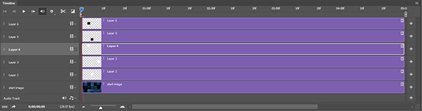
Figure14: Note that the timeline is showing 5seconds of time at the moment
We’regoing to make each of the layers we created fade in and fade out for a subtleanimation effect that wouldn’t distract from a speaker or other material onscreen, but would still provide additional visual interest for the viewer. Let’sstart with the top layer, which is “Layer 6” in my interface. To the right ofthe Layer 6 label is a pointer. Click it to expose the separate Position,Opacity, and Style timelines. With the playhead at 0 (all the way to the leftrepresenting 0 seconds), click the stopwatch to the left of Opacity. A diamondappears on the timeline representing a first keyframe.
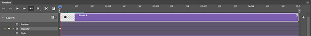
Figure 15: A diamond appears onthe timeline
8) Move the playhead to approximately 2seconds, 15 frames. This will be about in the middle of the visible timeline. Clickthe diamond to the left of the word Opacity in the timeline. This will dropanother keyframe where your playhead is now located. Without moving theplayhead, set the opacity in the layers palette to 80%.
Move the playhead to the 5-second point on the timeline and drop anotherkeyframe. Now set the opacity back to 0%.
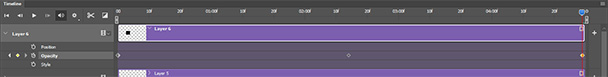
Figure 16: Dropping keyframes into timeline
9) Press the space bar and watch theimage carefully. This effect is subtle by design. We don’t want to distractfrom the speaker on screen or other material.
10) At the bottom of the timelinedisplay, there is a slider that you can use to increase and decrease themagnification of the timeline. Decrease the magnification so that you can seemore of the timeline. Drag the right edge of the next layer on the timelinetoward the right. Drag it all the way to the 10-second point.
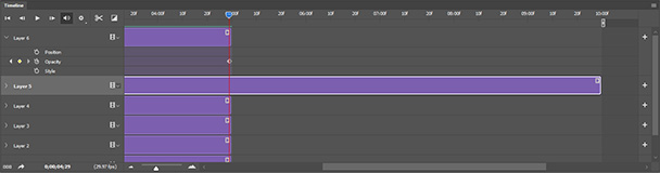
Figure 17: Drag all the way tothe 10-second point
11) Open the next layer you just draggedso you can see the Opacity timeline. Drop your first keyframe at 5 seconds. Dropthe next at about 7 seconds, 15 frames, and set the opacity of that layer to80%. You will also need to drag the bottom layer—the one with the image westarted with—to the 10-second point. Press the space bar and review your workso far.
12) Repeat the process with each layer. Atthe end you should have a 25-second timeline, each fading part of thebackground in and out for 5 seconds. Zoomed out, your timeline should look likethis:
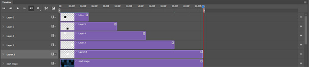
Figure 18: Your 25-second timeline
Press thespace bar to test your animated image in Photoshop. If everything looks OK, clickFile → Export → Render Video. This will render your green-screen background asa video file that you can import into Camtasia or Adobe Premier (or other video-editingsoftware). Use the settings in Figure 19 for the Render Video dialog box. (Ofcourse, for the folder, choose whatever is convenient for you).
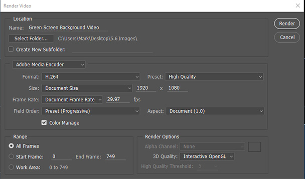
Figure 19: Render Video dialog box
Click theRender button. Depending on the speed of your computer, it may take up to 10minutes to render your video. When the video has been rendered, check out thefile and watch the video.