A little-known fact is that Microsoft Word includes severalfeatures that make creating accessible Word documents easy. Many of the stepssimply incorporate principles of good design; better yet, most only requireknowing how to use basic Word features. Here are five ways to make your Worddocuments more accessible. Follow these suggestions, and you’ll be well on yourway to more accessible documents—which, ultimately, become more accessible eLearningcontent!
1. Use templates and styles
Be honest: How many of you use spaces to indent text, ormanually bold and enlarge your section headings?
Manually formatting text trips up screen readers and oftenleads to inconsistent formatting. And it is much harder to update thesedocuments. Using a template allows you to create structured documents.
The first element of an accessible document, and the onlyway to create content that a screen reader—and other assistive technologies—canread, is building in consistent structure. That means using HTML tags. Buthere’s the great part: If you use a Word template, the styles include the HTMLtags.
With a template, you set up a style for the document titleand headings at different levels, maybe Heading 1, Heading 2, and Heading 3. Whenyou create lists, use the ordered (numbered) or unordered (bulleted) liststyles, rather than numbering manually. Create or adjust the styles for body text,lists—bulleted, numbered, both, different levels of lists, whatever you need. Ratherthan create a template from scratch, you can change the characteristics ofstyles in an existing Word template to achieve the look you want. Once yourstyles are defined, you simply apply the right style to the text and, when youconvert the document to a PDF or use it online, guess what? The HTML tags arethere automatically.
Any time you want to update the look of your content, yousimply change the styles—and everything tagged with the changed styleautomatically and instantly gets the new look. Styles can set the typefaceand size; stipulate whether text is bold, italic, or roman; and set indents,line spacing, and space above or below a paragraph. They determine the hierarchy(heading level or list level), text color, and more.
2. Choose colors carefully
Two main accessibility issues arise with the use of color in content: contrast and conveying information.
Most people can see and distinguish high-contrast colorpairs, like black text on a white or yellow background. Design palettes thatveer into shades of blue or gray often use colors that are too similar and canbe harder to read. Check color choices and combinations with an online contrastchecker (like this one from WebAIM) or use the MS Word Accessibility Checker. Note that if theAccessibility Checker does not appear in the Review toolbar, you can add it bycustomizing your ribbon or toolbars.
To improve accessibility, you should never use color aloneto convey information. For example, if you have a chart with bars or lines ofdifferent colors to represent different departments or pieces of information,in addition to the colors, use a different shape (dashed lines) or fillpattern, or include clear text labels. This allows people with color blindness todistinguish the elements, even if they cannot distinguish the colors.
3. Describe images
Images—photos, graphics, charts—often have captions, which ascreen reader will read. But captions often place an image in context or labelit; they generally do not describe what the image shows. For readers who arevisually impaired, a description of the image is essential if the image includes importantcontent. Graphics that are decorative, like page borders or a cover photo, donot require descriptions.
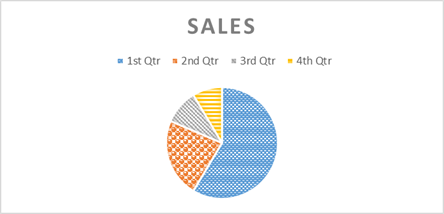
An image description uses an HTML tag, <alt text>. It’svery easy to add alt text descriptions in Word. Let’s say you wanted to inserta pie chart. You’d insert the image, then maybe resize it or adjust the textwrapping. At the same time, simply write a concise, clear description. Notethat each segment of the chart has both a different color and a different fillpattern, which makes the chart more accessible to learners who have colorblindness.

Figure 1:Charts and graphics should not rely on color alone to convey information
In the Format Chart Area dialog, click on the Layout andProperties option.

Figure 2: TheFormat Chart Area and Format Picture dialogs make it easy to add alt textdescriptions
Write a short description in the Description box. You canadd a title, but that is not required. For the pie chart above, the descriptionmight be something like: “The pie chart shows that first quarter sales were 59percent of the year’s total; second quarter sales were 23 percent; thirdquarter were 10 percent; and fourth quarter sales were 9 percent of the year’stotal.”
Your alt text description should include any informationthat sighted learners will glean from the chart that is not already included inthe text content.
The Format Picture dialog includes an identical alt text entryarea in the Layout and Properties option.
If you enter a title, it will be used as hover text or a“tooltip” on web pages that support that functionality, but not all browsers(or screen readers) will use the title attribute. The alt text description isthe essential piece for accessibility.
4. Tag tables for accessibility
Tables present information in a logical visual format—butthey can be very difficult for people with disabilities, particularly peoplewho rely on screen readers, to understand. An accessible table has to usetagging to clarify the data relationships that sighted learners understand fromthe visual hierarchy a table establishes.
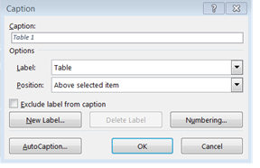
If you do use tables, keep them simple. Avoid complexformatting, such as headers that span multiple columns or merged cells. Be sureto give your table a caption or title. A table caption is essentially a titlefor the table that provides some context. When the screen reader reads it, thelearner will know what information the table presents. Along with properly formattedheaders and data cells, the caption helps visually impaired learners understanddata tables. Word has a macro for inserting a caption on the Referencestoolbar:

Figure 3: Theoption to give your table a caption is part of the References toolbar
When you run this macro, a dialog box appears; enter thecaption or table title here.

Figure 4: Thetable “caption” is a title that describes the content of the table
As with other text, when creating a table, use properformatting rather than tabbing or entering spaces to line up elements ofcontent. Using the Insert Table macro that is built into Word will create atagged table that is correctly formatted for a screen reader or other assistivedevice. Be sure to include a designated header row; header rows use differenttags than data rows, and Word will only tag them correctly if you designatethem accurately.
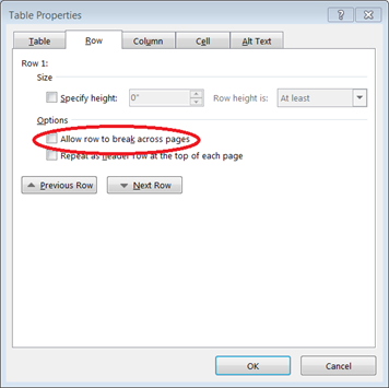
Do not allow table rows to break across pages. Thischaracteristic can be set in the Table Properties dialog box; Word allows linesto break as a default, so you’ll need to uncheck that box:

Figure 5: Inthe Row tab of the Table Properties dialog, be sure that the “Allow rows tobreak across pages” checkbox is not checked
5. Use readable link text
Hyperlinks are a ubiquitous and useful element of eLearningcontent. To be accessible, the “link anchor text,”—the text on the screen thatis usually underlined and colored to show that it is a link—should make senseto readers. It should describe the target (or destination) of the link. Forexample, “click here” is not helpful link text. “Try WebAIM’s contrastchecker,” where the link is on “contrast checker,” tells readers—andlearners using a screen reader—exactly what they will get if they follow thelink. While readable, comprehensible link text is the most elemental way tomake hyperlinks more accessible, it’s not the only one. Additional tips areavailable in “Ten Ways to Create Useful Hyperlinks.”
But here’s a final tip that helps turn text content intoaccessible web content: If the content is going to become part of a long orcomplex web page, build in “skip navigation” links. Learners who can see the page and use a mouse can easilymove past content like logos, icons, navigation bars, and other contentelements that are not actually part of the eLearning content but occupy spaceon the page. Learners who cannot use a mouse, and those who use screen readers,might have to endure (on every page) their assistive device’s laborious wadingthrough these elements, though some screen readers “know” to go straight to thefirst heading tag.
Adding a skip navigation link allows learners usingassistive devices to jump past the logo and navigational elements, as all theother learners do. A skip navigation link is like a bookmark; it’s a link tothe first real content item on the page. You can build it by placing an anchoror bookmark at the beginning of the eLearning text, and then linking to itusing an <a href=“”> link.
Conclusions
Much of the advice provided about making Word documents moreaccessible simply applies sound design and suggestions for creating well-structureddocuments. Accessibility is useful not only to learners who have disabilities;all learners benefit from accessible Word documents because they are easier tounderstand. They are the foundation of clear, navigable web pages and eLearningcontent.


