


This article picks up where we left off in Is Microlearning a Concept, Method, or Product? It’s all 3!, where I shared a foundational understanding of performance-driven microlearning as not only a product, but as a concept and a method as well. In concluding that discussion, I pointed out that microlearning has design principles that assist in creating these products and that creation for performance is one of greatest challenges our L&D teams face.
Microlearning can really shake up the way an organization approaches engaging employees on performance and behavior. As you may guess, it can do the same to your L&D team and their capabilities in using it, as designing for this new format does not necessarily take the same approach as designing for facilitated instruction or eLearning.
Let's take a look at seven microlearning design principles by showcasing an awesome (in my opinion) case study that embodies the application of these principles and highlights challenges and opportunities I have shared previously.
Microlearning design principles
The beauty of microlearning is that it's not just eLearning—it can be so much more than that! These design principles reflect creating microlearning products for any format, whether an infographic, as we will see here in our case study, a podcast or, yes, even an eLearning piece.
Now, I will not stand ground and say the only way these principles apply is if you are creating microlearning for performance. Perhaps you will see another application that will benefit your organization (and I admire your savviness)! Remember, design principles are decision-making tools for your team. As your team designs, they should refer to the principles to see if they are being upheld.
The principles I advocate and briefly define here are:
- Tool capacity – Identify the limitations and opportunities of the L&D team’s tools. These include authoring tools, delivery systems, and data-gathering and analytical tools.
- Context – Create a compelling story that all participants will find relatable. Think "Day in the Life of" or "Let's Shadow" or "What Would You Do?"
- Global equity – Design a product and story accessible and relevant to every participant. Exclude jargon, slang, or references to contexts that are not relatable to everyone. Ensure product can be delivered, accessed, and viewed by all participants.
- Conciseness – Present one objective or outcome and its associated content succinctly. Enough said.
- Meaningful media – Only use media to extend, reinforce, augment, or convey the idea or message. Think purposeful, not “pretty it up.” Exclude media that is “just there” and does not build context.
- Elicit action – Participants perform an action or activity outside of the product itself. For example, reflection with an action plan or application in the intended environment.
- Overuse – Use the other principles to design meaningful variety to minimize desensitization. Refrain from creating page-turner eLearning, sage on the stage experiences, or generic templates.
Examining application
An important aspect to note is that many of these principles interrelate. We wouldn’t design a podcast that is partially concise and somewhat contextual. It may seem obvious, but recognizing the application of these principles in the work created, especially by the creator, takes time.
For example, the microlearning product may have concise content, but the context lacks and there are pop culture references that don’t globally or equally relate to all recipients. Once your team begins recognizing this in their work or in their teammates’ work, they can refine the application of the principles.
Let’s take a look at this through the work of Gwen Mottern, an L&D specialist and enthusiast of performance-based solutions!
The challenge
Gwen created a microlearning campaign to address a costly issue for her organization: Medical staff responsible for checking in patients were struggling to comprehend new workflows related to an upgraded registration and scheduling system. The information from that system feeds to an electronic medical records and billing system.
The errors created a loss of revenue due to incorrect selections during patient check-in. This resulted in missing deadlines to submit claims for reimbursement. It also caused increased work for those managing the claims as they attempted to correct the issues in enough time to submit the claims.
The solution
Gwen’s campaign consisted of several infographics, to be used as job aids, that targeted the most common errors in the workflow. These post-instruction, performance-based products were released over six weeks. An email was sent each week with an explanation and link to the infographic, located on the company’s SharePoint site.
The infographics were intended to be printed and placed by the workstation to reference during the check-in process.
Design principles in action
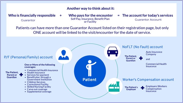
For this article, we’ll look at screenshots from two of the infographics: selecting the correct Guarantor account and applying the correct coverage to the Guarantor’s account.
Tool capacity, overuse & global equity
From her analysis, Gwen knew that she needed a solution that fit the day-to-day workflow of the staff members while quickly helping them make decisions. Her organization’s authoring tools were geared for eLearning or instructor-led courses using branded templates. That meant she had limitations as to what capabilities could be used within those tools. (Principles: Tool Capacity/Overuse).
She determined that an infographic would be the best solution for presenting the concepts in a quick, decision-based manner at the time of need. For example, in the screenshot below, you can note in the white box a quick method the staff member can use to assist in determining the Guarantor Account. Also note that the wording is free of jargon and uses common language (Principle: Global Equity).

Additionally, she recognized that delivery through the LMS was also not going to ensure the best accessibility for reference if the staff member chose not to print the infographic but preferred to keep it open in a digital format (Principles: Tool Capacity/Global Equity). SharePoint provided the ability for the staff member to download the infographic as a PDF for printing or viewing digitally.
Context, conciseness, meaningful media, and elicit action
With respect to the product and content itself, we see evidence of eliciting action by the nature of the infographic itself. The design of the infographic relates to a critical first step in the workflow for the staff member, determining the Guarantor Account. What Gwen created were performance-based microlearning products for purposes of remediation/reinforcement; these were meant to be used while performing a task or activity.
With respect to context, we can note from this snippet of the infographic the use of an analogy of credit cards to explain the concept of a Guarantor Account and why a patient might have more than one. This context was used as credit cards are a method of payment for services received, and it helps the staff member recognize that their choice relates to payment (it also demonstrates the principle of Global Equity).

It's concise, as it avoids discussing credit card accounts for various needs, like clothes, travel, or dining. That is nonessential information and doesn’t help the staff member quickly decide. (Which also reinforces the context principle.)
The use of media was incorporated to help elaborate concepts and assist workers as they quickly scanned and to delineate the correct category of account. For example, if a patient was hurt in a car accident, the staff member should be verifying the type of No Fault coverage for the visit. A car icon provides a visual cue to the staff member to quickly identify the type of account; it also helps build an association between the car and the term “No Fault.”
A final note on the infographic and the principle of eliciting action is the ability of a single microlearning resource to provide multiple actions, whether passive (offering additional support to staff) or direct (resource is easy for staff to use while performing patient check-in). Gwen knew that most staff members would use the infographics throughout the day, and she realized that they might have questions. She wanted to ensure that staff members had options for what action they wanted to take based on their need for comprehension.

Tying design to performance
This article offers a glimpse of the design principles at play in a microlearning campaign that was meant to remediate and support. What we didn’t discuss is the why and how that led Gwen to her decisions. Her goal was to improve performance—the why—but how did she know which topics to target for detailed support?
The staff had a six-week workflows and systems training. Gwen developed a competencies survey, which was conducted three months post-training. This survey helped to determine whether staff had understood essential concepts from the training and to identify any challenges, issues, or opportunities the staff were facing around the new workflows and systems.
The survey found that 11% of those trained were misunderstanding six specific key concepts; these were directly tied to revenue loss and overburdened staff in the claims department. Part of the findings also indicated that the staff needed more time with the new workflows and that their clinical settings and the volume of patient check-ins impeded their mastery. This was compounded by the new system itself throwing errors even when the workflow was being followed, adding to confusion on what was "right."
Now, the solution cannot resolve the volume of patients to check in, the work environment that the staff contends with as they master this new skill, or system errors. But its design and implementation do factor in and consider all of these challenges.
This microlearning campaign had established goals, and each product had an outcome. This helped Gwen map out decisions about the overarching campaign, the products and their design, and the evaluative plans.
We will take a deeper dive on these topics in our next article to tie everything together!