I love scavenger Photeo, and I like vintage pictures and vintage footage (when I can legally find it and it fits). Not only can you convey new information with vintage images, but you can also give a sense of the history we came from. That gives your learners a bit of an extra visual bonus, which always helps retention.
- Pt. 1 - Photo + Movement = Photeo
- Pt. 2 - Putting a Photeo Together
- Pt. 3 - Photeo Tutorial 1
- Pt. 4 - Photeo Tutorial 2
- Pt. 5 - Photeo Tutorial 3
For this project, I wanted to create a Photeo to take the place of the traditional “housekeeping” slide that almost all presentations have as the second or third slide. I also wanted it to demonstrate that using the tools is simple. I used several media programs to create the Housekeeping Photeo: Photoshop, After Effects, Premiere Pro, and my favorite sound editing program, Adobe Audition. (I could have used Flash, but it would have taken longer.) The basic skills are easily learned, and if you already know how to use Photoshop or Photoshop Elements, you’re halfway there.
In this article, I’ll explain how I came up with the ideas to illustrate the thought process that supports creation of small Photeos. I’ll also show how to deconstruct images using Photoshop, and how to use those deconstructed images to create compositions with After Effects. There are two videos linked to this article, showing how to do these steps.
The history of Housekeeping
Yes, “Housekeeping” is media and not training per se (although it is a behavior modifier), and it’s applicable to many training situations. If you follow along on this project and have never worked with After Effects, you’ll have a great introduction to the program. WARNING: AFTER EFFECTS IS ADDICTIVE!!!
I’ve included the resource files that I found on the Web. You can download them here. However, you might find it more interesting if you went out and “scavenged” for files yourself. I’ll show you the original image files first, then I’ll show you how I manipulated them in Photoshop to make them ready for After Effects, so I could put them in the Photeo timeline in Premiere Pro. I’ll also explain how I found the sound files.
Sketches and scavenging
The first thing I did was draw a little sketch of the timeline. It looked like Figure 1.

Figure 1: The timeline sketch for “Housekeeping” was simple.
There’s not a lot of visual information in the sketch, but there’s enough to keep the ideas flowing.
Scavenging for vintage looks
I was thinking I’d like to have a vintage look, and I thought of the name “Housekeeping” because that’s what the header on that slide usually says, so the first thing I thought of was a 1940s or ‘50s housewife with a vacuum cleaner. Then I found an old picture of a housewife with a mop and I thought about juxtaposing the vacuum cleaner sound with the mop. The picture has a Creative Commons license without attribution when used in a mashup, which this certainly is. The animation would be basic, but the idea would get across.
Then I wanted to convey that this was a housekeeping movie, so I went out and grabbed an old (and out of copyright) version of the Good Housekeeping Seal of Approval.
Tip: If you’re scouring for images online, try to select images that have a single color background. White is best, but it can be almost any color. It’s easier to extract images in Photoshop when they have a solid color in the background. If not, you can still do it, but it takes more time.
Scavenging for sounds
The next thing I scavenged for was a picture of toilets. I also scavenged for sounds at the same time. If you do a search for “free sfx toilet flush” you’ll find a lot of them. I auditioned several and used the one I liked best. You can make your own sound effects easily enough too.
I couldn’t find a cell phone ring sound that was recognizable and different from the ring at the end in the video, so I just recorded my own cell phone standard ringer. I also scavenged the thump of the “seal,” and it’s really two different sounds that I put together so the effect of the “seal” bouncing and hitting the background again had a bit more reality to it.
Creative license
I looked for pictures of cell phones, and someone showed me a video on YouTube of a violin player reacting to someone’s cell phone going off while he was playing a serious classical piece. It was perfect (in a way).
So I collected all my scavenged parts in a folder on my desktop (where everything seems to go!) and got to work actually making the Photeo. Including your Web search and creating the content with a reasonable amount of competency, you should be able to do this whole project in less than two hours. If you don’t have the exact images you want, you can always go back to the Web to find more.
The first program we’ll use is Photoshop.
Fun with Photoshop
Photoshop is fundamental to Photeo. I use Photoshop all the time when I make and edit video, and I can think of no substitute for it … yet. You need images for your Photeo and you need to edit them in Photoshop, usually because you don’t want any interference from a background. Although called various things, extraction and deconstruction are the terms I use. You’ll learn how to extract the main part of an image from the rest, in order to use it later in After Effects and Premiere Pro. It can be a very useful technique.
To follow along, you will need Photoshop Normal or Extended, or Photoshop Elements.
For a previous reference, go to Part 1 of this series and look at “Laughing at the Darkness.” Many of the still images in this movie trailer are deconstructed.
Here is a video that demonstrates what these instructions describe.
Deconstructing images in Photoshop
Step 1: Start Photoshop. Open your image (Cntrl+o in Windows or Cmd+o Mac). It doesn’t matter whether it’s an image you shot or one you downloaded. You’re going to prepare it for inclusion in your Photeo project. Figure 2 shows what the whole screen looks like when you first open the file. (Note: I’m using Photoshop CS6 for this, but there’s nothing in these instructions that you can’t do in any version of Photoshop from CS3 onwards, or in Photoshop Elements.)
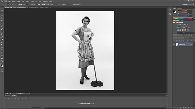
Figure 2: The image open in Photoshop CS6.
After your image is open, check its size and resolution (pixels per inch) by using the keyboard shortcut (in Windows, use Cntrl+alt+i, or on a Mac use CMD+Alt+i). You can also go to the image menu and select image > image size. The Image Size box will appear (Figure 3).
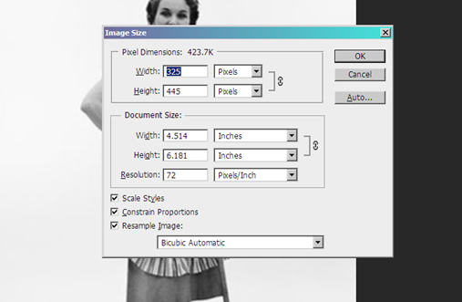
Figure 3: The Image Size box.
You’ll see that the image in its native state is 325 X 445 pixels, and is at a resolution of 72-pixels/inch, which is fine for Photeo. The Photeo we’re making is going to be in a standard definition NTSC TV format, which is 720 pixels wide by 480 pixels high, so the 445-pixel height is tall enough for our purposes, even though we’ll be cropping the image.
Now you’re ready to extract the image of the housewife with the mop and leave the background blank for the Photeo.
Step 2: Select the magic wand tool by pressing “w” on the keyboard, or click on the wand-like icon on the toolbar on the left side of the main Photoshop window (Figure 4). In Photoshop from CS3 onwards there’s a second wand-like tool called quick select. In some instances quick select works great and in others … well, sometimes you have to back up and make a hard selection manually. We’re going to use the regular magic wand. After you select the wand tool, you’ll see this on the menu bar at the top of the page.
![]()
Figure 4: The menu bar.
Notice that below the menu bar, there’s a context bar and on the far left, there’s a representation of the wand tool. To the right, there are four boxes. The box that’s second from the left is “add to selection.” Choosing that box, I selected a 3 by 3-pixel average, and to the right of that I set the tolerance to 12. When a background is as plain as it is in our image, you can set the selection tolerance lower, but the woman has pretty high contrast against the background, so I felt comfortable with a higher number. You need to experiment for yourself to find what works best for you. Now you can move to …
Step 3: Click the magic wand tool anywhere in the white area around the woman. You can see the area where the wand “saw” the similar color. (Note: Even though this a grayscale picture, I’m just using the default Photoshop RGB/8 settings) Click again in any area that wasn’t already captured and you’ll see almost the whole image with a marquee (the mouse track moving lines) around it.
Step 4: Refine the image. Click again in smaller and smaller areas the wand didn’t capture. Zoom into the image if you need to see the unselected areas better. Remember to click under the arm on the left side, and if you really want to be exact, select the tiny little area under her right arm. It’s 9 pixels wide (I counted) at the widest spot, but it makes your selection even better.
Now the image will look like this. (Figure 5)
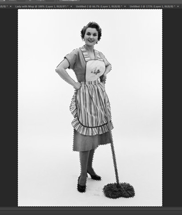
Figure 5: The initial selection after refining it.
Step 5: Select the image of the woman. No, you haven’t selected her image yet, though it might look like it – you’ve only selected the background. So invert the selection by pressing Control+Shift+i (Windows) or Command+Shift+i (Mac) to invert the selection. Now she’s selected.
Step 6: Copy the image and make a new image of just the woman. Press Control+c to copy the selection, then Control+n for a new file. Now you’ll get the New dialog box. (Figure 6.) There are several things to note here. It will open with an untitled name in the new dialog. But directly under that is the preset; note that since I copied something, Photoshop assumes that I want to paste what I copied into a new image that’s that size. They guessed right this time, but you’ll always want to check on that as well. Since we’ve cut out all the white the size has changed; significantly in the width, but not so much in the height. That’s the true size of the image. The only other part of this to note is the background contents. Make sure that’s set to transparent.
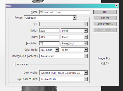
Figure 6: The New dialog box.
Step 7: Paste into the new image – Control+v (Windows) or Cmd+v (Mac). And now all you need to do is save it. Make a new folder inside your Photeo Folder. Call it AE Assets and then save it as a Photoshop or PNG image.
Tip: If you think of the computer screen as a proscenium, then there are ways to break through the edges of your stage. There are only two image types that can display a transparent background: GIF, which is limited to 256 colors, or PNG-24, where you can have millions of colors. Since most computer monitors can display 32-bit color, you may as well use a PNG. For this job, create PNG-24 images. You can also use a black background as an alpha channel, which you can make drop out in video, but that’s far more complexity than we wanted here. We only needed to remove the background.
You’re done. Proceed to all your other downloaded files, do the same thing to the backgrounds of each, and save to your folder as PNG files so you can find them when working in After Effects or Premiere Pro. Now we’re ready to go to the next phase.
Next: After Effects
The second step of the process involves creating several compositions in After Effects. This tutorial will show how to change tracking and make individual letters and lines move. You will need to have Adobe After Effects (V.3 and up will work).
Letters and lines and words and spaces
Using After Effects is my favorite part of the Photeo creation process because we really can create and hone content. The AE files are easily modifiable, so you can always go back and change them. This is about giving life and movement, not just to words but to the letters themselves. After Effects gives you absolute control over each letter and the spacing between the letters on the screen.
Words are made of letters. Duh. Really, they are. And sentences are made of words and lines. For this tutorial, we’re going to concern ourselves with the spacing between letters, words, and lines.
Words and letters by themselves are boring on a screen. There’s nothing in a static word on a screen that will keep the learner/viewer looking at it. That’s why movies use word effects, like crawls; probably the most famous crawl is in Star Wars. But we’re not going to do that kind of movement here.
About After Effects
After Effects is a unique program. In one way, it’s like Photoshop on steroids. In many other ways, it’s something unique. Both After Effects and Photoshop complement each other, and it’s a piece of cake to use them together. In fact, they were designed to work with each other, and with Premiere Pro as well.
In After Effects, I started by creating compositions for the words I’d use on the screen. One After Effects project can have many compositions inside it, and you can nest compositions inside of each other, so the timeline itself doesn’t have to be complex. Each element can be its own composition and nest inside a larger composition. If you need to make changes in one sub-composition, you tab to that composition and make your changes. The changes then immediately reflect in the master composition.
When you want to move the composition to Premiere Pro, you can insert it as a dynamic link and go back to After Effects to make changes. When you save the file in After Effects, the changes will appear in the timeline of Premiere Pro. The best practice here is to think of creation (and it doesn’t matter if you’re developing in Flash, Articulate, or whatever) as an iterative process that you do again and again until it looks and feels right. You cannot create any work in any program by simply going though it once. You go through the work again and again until it’s correct. Then move to the next thing.
The written tutorial begins after the video below. Both the video and the written tutorial show how to make letters and lines move.
Changing tracking in After Effects
Computers seem to have taken away the art of kerning (adjusting the spaces between letters). Now called tracking, it’s not true kerning, but it’s what exists in computing these days. Tracking, as opposed to kerning (look both terms up on Wikipedia), is what we deal with when we look at the spaces between words on a display screen. What is this: “rn”? Is it an “m,” or is it an “r” and an “n”? You can probably tell, but it is not good kerning because the letters are just a little too close together. In a Word document, this could be confusing. On the screen, it could change the meaning.
I’ll try to explain the AE terms as we move through this short tutorial, but you’ll get up to speed very quickly even if you’ve never used After Effects before. Remember, the first time takes a half hour, the second time takes 15 minutes, and the third time takes only a few minutes. Here we go!
Before we open After Effects, start a new folder (I usually put folders for current projects on my desktop, but you can put the folder anywhere you want). Now open After Effects. The whole project will go into this folder. Now we go to …
Step 1: Open AE and start a new composition. When you open AE, you’ll see the startup screen. Click on new composition, and the Composition Settings dialog appears (Figure 7). For purposes of this project, make the dimensions NTSC DV widescreen (1), which happens to be 720 X 480 standard-definition TV picture. Leave the frame rate where it is (it really doesn’t matter), the duration at 00:00:30:00 (2), and the background color white (3). Now save the project (the composition is saved with the project) in the folder you set up. We’re going to put everything into one composition. (If there are enough requests, I’ll put more advanced information about composition in future articles.)
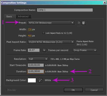
Figure 7: The Composition Settings dialog.
Step 2: Select the type tool from the toolbar at the top.
The type tool looks like a “T” (Figure 8); “T” stands for type. The default is horizontal type and that’s what we want.

Figure 8: Location of the type tool in After Effects.
Step 3: Move the cursor to any point in your composition – the white square in the Composition window. (Figure 9)
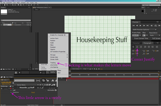
Figure 9: The Composition window in After Effects (with the grid turned on in the composition square itself – see the tip below).
Tip: You can easily tell where the exact center of the screen is by going to view and clicking on “Show Grid” or ctrl/cmd+’ (single quote).
The default type color selection is black, and for now we’ll leave it. Once you move the cursor and click on the screen, you’ll then have the type window (it’s in the lower left corner of Figure 9). Type in the words “Housekeeping Stuff.”
Move your cursor to the Type dialog panel on the right side of the screen and click on the Type panel selection “Small Caps.” You don’t have to do this, but I like this small caps type on the screen. I think it’s easier to read when you’re creating on-screen titles.
There’s one more thing to do here: we don’t want the type to run for the whole 30 seconds of the complete composition, so mouse over to the end of the timeline and over the salmon (OK, call it pink or magenta) bar. At the very end of the bar, your cursor will turn into a double-headed arrow. Click and move the salmon bar to the left to about 6 seconds. You don’t have to be 100 percent accurate here either.
Step 4: Go back to the toolbar and click on the far-left tool that looks like an arrow tilted to the left; this is the selection tool. On the left-hand side of the Timeline panel at the bottom of the screen, notice that “Housekeeping Stuff” shows as words and partial words, and there’s a “T” (as in “type”) next to that selection. Click on the selection with the salmon-colored box next to it and you’ll see the red bounding box around the type. Use the selection tool to drag the type (or the arrow keys to move the type) to the middle of the screen for now. Make sure the grid is showing in the Composition panel. If it’s not, you can go to the view dropdown at the top of the screen and select “Show Grid.” You can adjust the grid size in the preferences menu accessed at the bottom of the Edit menu.
Step 5: Notice that one of the squares has a little crosshair near it (usually the lower left; it can be very hard to see). (Figure 10) This is the anchor point. If it is on the left, go to the paragraph tab next to the character tab. If you don’t see it, go to the menu bar and select window and then paragraph, and you’ll see it on the right. Then select center justified, just like in Word. The type may move over, usually to the left, but you can use the arrow keys to re-center it or drag it with the selector tool. You do this because of the way the type will track. For this exercise, the type spreads from the middle. If you had left justified, then it would spread to the right.
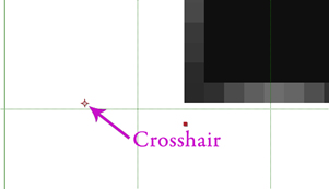
Figure 10: The crosshair marks the anchor point for the type that you enter.
Now the fun begins.
Step 6: Let’s make the type appear to move. Select the type so you see the red bounding box. (Figure 11) Go down to the timeline and click on the little arrow to the left of the colored box (the default color is magenta) and click on that. The arrow is called a twirly (I didn’t make that up!). Now you’ll see two more twirlies. To the right of the text twirly, you’ll see a little drop down menu that says “Animate.” Click on the animate dropdown and you’ll see the word tracking; click on that. More stuff will appear below the words “Animator 1.” Ignore the “Tracking Type.”
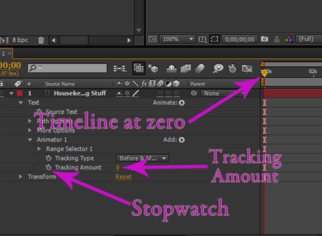
Figure 11: This is the area where you will be doing steps 6 and 7 to make the type appear to move.
Step 7: Be sure that the timeline to the right is set at the zero point (Figure 11 again). Click on the little stopwatch at the left of the tracking amount. On the timeline at the zero point, you’ll now see a little yellow diamond.
Step 8: Click on the numeric “0” on the right of the tracking amount. The number changes to a window. Type -4 (minus 4) in that window and hit enter. Note that the letters move together immediately. Drag the timeline cursor (the little gold arrow at the top of the timeline) all the way to the right (end) of the composition, click on the minus four, and enter 4 (four without the minus sign). The letters will now move far apart – not too far. If it seems too far for you, adjust the amount. Now drag the cursor back to the left and you’ll see the letters move together.
That’s it. If you want to see the animation, type “0” on the keypad; the animation will render and play. Save the project and close the twirly because in the next tutorial, we’ll have another layer in the composition.
We’re done for now!
That’s all there is to this part except for fine tuning at the end of the project, when we’re in Premiere Pro. This will use the dynamic link part of CS5 that works very well for us to create the final Photeo.
In the next article I’ll show you how to use Premiere Pro and After Effects together to create dynamically linked objects, along with movement and easy 3-D effects.


