


A lot of eLearning would look better if it looked like C.R.A.P. Really. No, I’m not making a scatological reference – I mean the four overarching principles of visual design: Contrast, Repetition, Alignment, and Proximity.
- Part 1
- Part 2
People form opinions about what they see very quickly, and that goes for eLearning visual design as well. If your eLearning looks like something that belongs on a pathology slide, consider using the C.R.A.P. principles to help learners form a better opinion of your eLearning.
Robin Williams described these four visual design principles in her terrific book, The Non-Designer’s Design Book. After discussing alignment in last month’s article, I received a few e-mails asking me to explain these principles and how they relate to eLearning screens. Yep, I can take direction, and that’s a good idea.
It’s important to note that I’m not a visual designer by training. I’ve just learned over time that it’s critical, and have taken the time to learn a lot (especially from visual designers), read a lot, and make it my business to learn more and more. I’m an instructional designer, so my explanations in this article are trainer- or instructional designer-oriented. If you’re a graphic designer and want to add to these explanations, please feel free to comment and link in the comments area following the article!
The purpose behind these design principles is to make what people see in front of them aesthetically pleasing. That may seem like a bunch of mumbo jumbo but think of it this way … perception is reality. If learners think it looks bad, you may have lost a good percentage of the battle in getting them to pay attention. It may not seem fair but that’s reality.
This month I’ll discuss the first two elements, Contrast and Repetition. Next month I’ll talk about Alignment and Proximity. Remember though, the four elements work together, so next month I’ll also tie them together (so y’all come back!).
Contrast
Contrast, according to Williams, is the single most important element of design, and we need to regularly employ contrast to make a page visually appealing. Contrast helps to create a focal point for a page. For example, Figure 1 shows a PowerPoint slide used in an eLearning course. Figure 2 shows the exact same slide with a contrasting color placed behind the critical statement and the text in white for better contrast. Notice how the contrast draws your eyes to the statement and adds visual interest to the page.
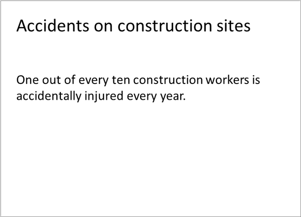
Figure 1. Page without contrast
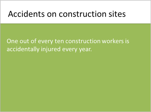
Figure 2. Page with contrast
Our visual apparatus perceives the difference in high-contrast elements as something to investigate. Because of this, we can use contrast to pull learners’ eyes to where we want them to gaze. What kinds of contrasts can you play with? Here are a few obvious choices:
-
Size
-
Color
-
Location on the page
-
Spacing
-
Shapes
We can use contrast to organize items on the page, too. For example, we use headings in contrasting colors, which, contrasted with black text, help readers differentiate sections.
One of the warnings Williams provides about using contrast is that if you are going to use it, don’t be wimpy. She says: If two items are not exactly the same, then make them different. Really different. (My emphasis.)
Here’s a technique you might want to try. Pull reader’s eyes to an empty space on a page to have them read some small print.
Repetition
You need repetition of specific design elements to make your design look polished. For example, all first-level headings should be the same font and color. You will also want to use the same type of bullets, spacing, logo, horizontal rules, and fonts throughout to look professional and polished. These repeated design elements pull the document together into a cohesive whole.
Repetition doesn’t mean that you can’t have variability within the repetition, however. Figure 3 shows a repeated lesson introduction element for an Introduction to Social Media course where Twitter, Facebook, and LinkedIn elements are switched out to show the name of the lesson.


Figure 3. Repeated module introduction elements with slight variation
Repetition is useful for helping the learner know where they are within a module. The elements shown in Figure 3, for example, let the learner know that they are at the beginning of a new lesson and what they are about to learn about (Twitter, Facebook, etc.). Certain design elements, such as a question mark, for example, can tell the learner that they are at about to start a quiz. Placing the navigational elements in the same place on every page helps the learner not have to search for them.
These suggestions may seem obvious, but it’s amazing how often I see where the designer should use repetition but doesn’t. So, as a pragmatic reminder, make sure that if your authoring tool allows you to build templates that you can reuse for various page types, you take advantage of that feature. For example, build and reuse templates for the following (and other) types of pages so that you can standardize location of repeated elements:
-
Module introduction
-
Lesson introduction
-
Page with scenario
-
Page with media
-
Pages with image
-
Page with interaction
-
Lesson wrap-up
-
Quiz instructions
-
Quiz page
-
Module wrap-up
More C.R.A.P. next month.