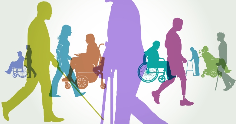
In eLearning, accessibility means that content is designed and implemented in a way that ensures equal access and participation for all learners. Yet, one of the most common questions about accessibility in eLearning is: “Where do I begin?” In this article, I share five essential practices that enable you to create more accessible digital content, starting today! These practices can be seamlessly integrated into your design process without adding unnecessary work, and will enhance the learning experience for everyone.
#1: Add alt text to images
Alt text, short for “alternative text,” refers to an image description used by screen readers to provide accessibility to individuals. Everyone can benefit from alt text—not just those that use a screen reader. For instance, any time there is an issue with an image loading on a page, this is an example of what might appear with and without alt text:

Figure 1: Alt text was entered for this image, so you can identify what the image is even though the page did not properly load
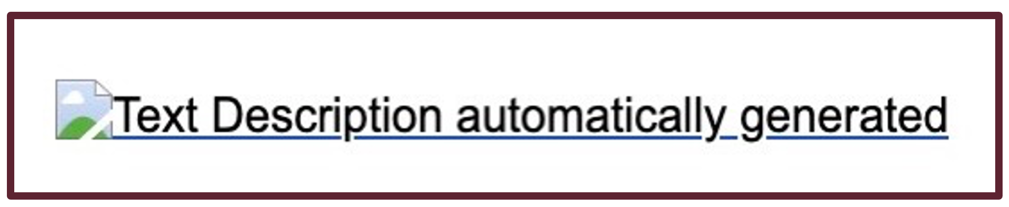
Figure 2: Alt text was not entered for this image, so placeholder alt text is populated
How do you add alt text?
The settings to add alt text will vary depending on your authoring tool. Typically, you will select the image and then enter the text into a designated field.
This is an example in Articulate Rise.

Figure 3: First, select the “Edit” option for the image and select “Edit alt tag”
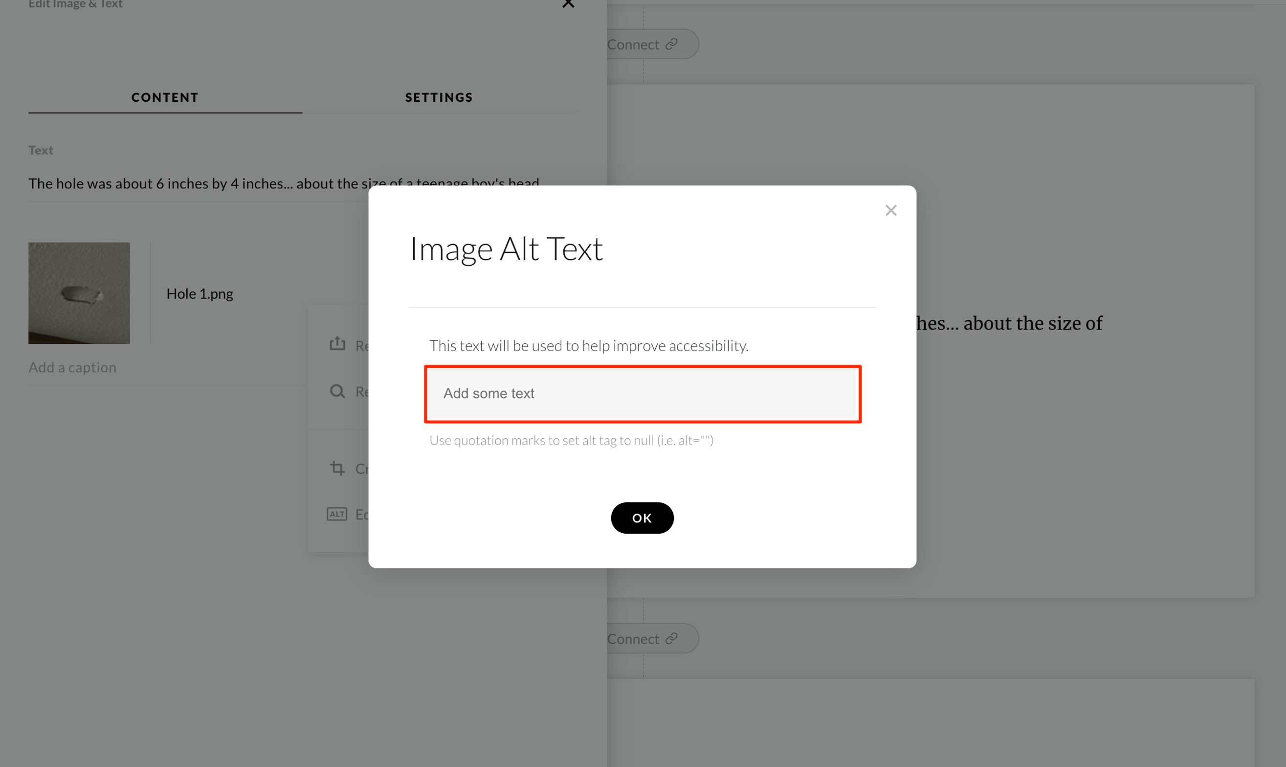
Figure 4: Next, enter the alt text for your image in the “Add some text” field and select “OK”
I like to keep a placeholder for alt text in my storyboard so that I can plan for this early in design. It is a fantastic way to figure out whether an image truly adds value. If you’re having a tough time describing an image it may not be the right image for your instructional content, or you may not need one at all.
Tips for writing good alt text
- Be brief but specific, describing exactly what you see in the image.
- Never start alt text with “image of …” or “picture of …” but do add the type of image such as “screenshot” or “icon.”
- Include any text that is in the image in your alt text. For example, describe the labels and how they overlap in a Venn diagram.
- Don’t repeat text that is already on the screen, such as when you have already described the image in the content or caption.
- Some authoring tools will allow you to skip a decorative image such as a page divider or background. Alternatively, you can tag it as “decorative.”
#2: Check color and contrast
One of the most common ways to ensure clarity for people with color blindness is to avoid using only red and green as indicators or differentiators. For example, a stop light in most parts of the US has red at the top and green at the bottom, so even if an individual cannot differentiate between the two colors, they can still identify which light is stop (top) or go (bottom). In some cities, however, the stop lights are horizontal. If you are color blind and do not know that green is on the right and red is on the left, you could be in trouble!

Figure 5: Vertical stop lights have the green light at the bottom
Photo credit: https://www.pxfuel.com/en/free-photo-juuyi

Figure 6: Horizontal stoplights have the green light on the right
Photo credit: https://www.rawpixel.com/image/3299132/free-photo-image-traffic-light-background-cars
Let’s compare this to a simple eLearning example. You are designing feedback screens for a knowledge check question. It may seem simpler to use green for correct and red for incorrect, but those with colorblindness won’t be able to differentiate the two. Instead, you may choose to include the word “correct” or “incorrect” and a “checkmark” or “x” icon.
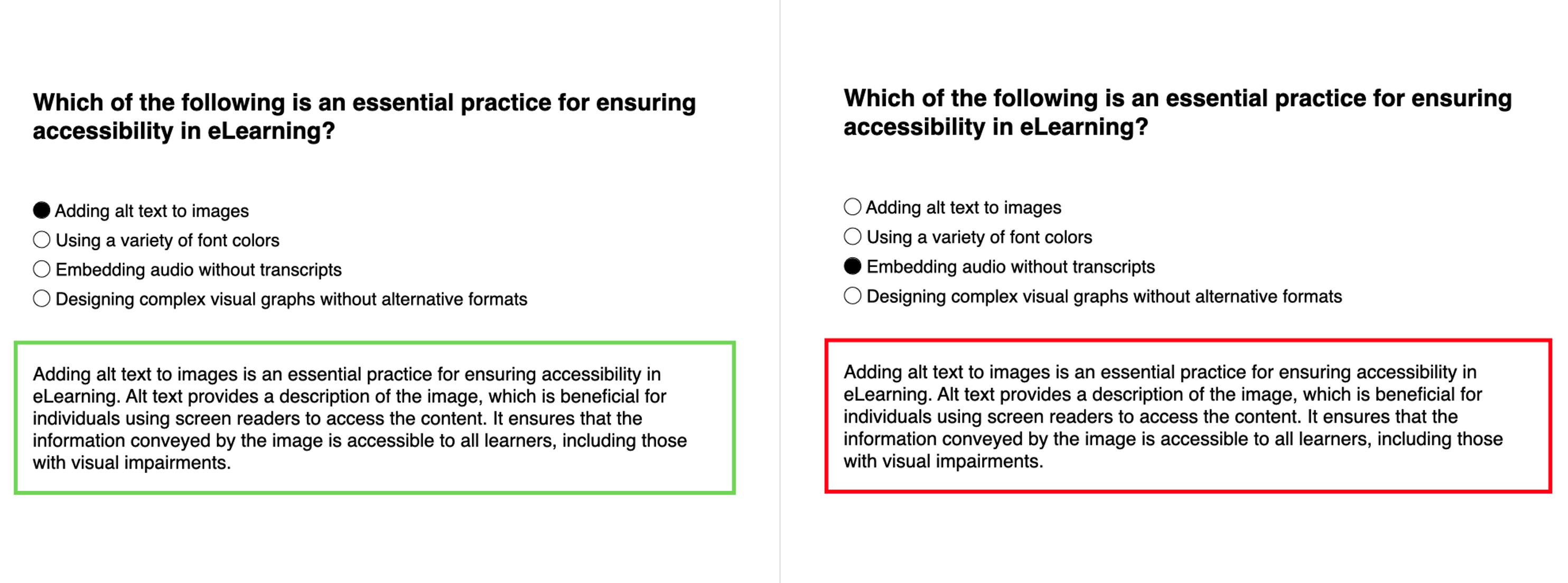
Figure 7: An example of correct and incorrect feedback without accessibility changes
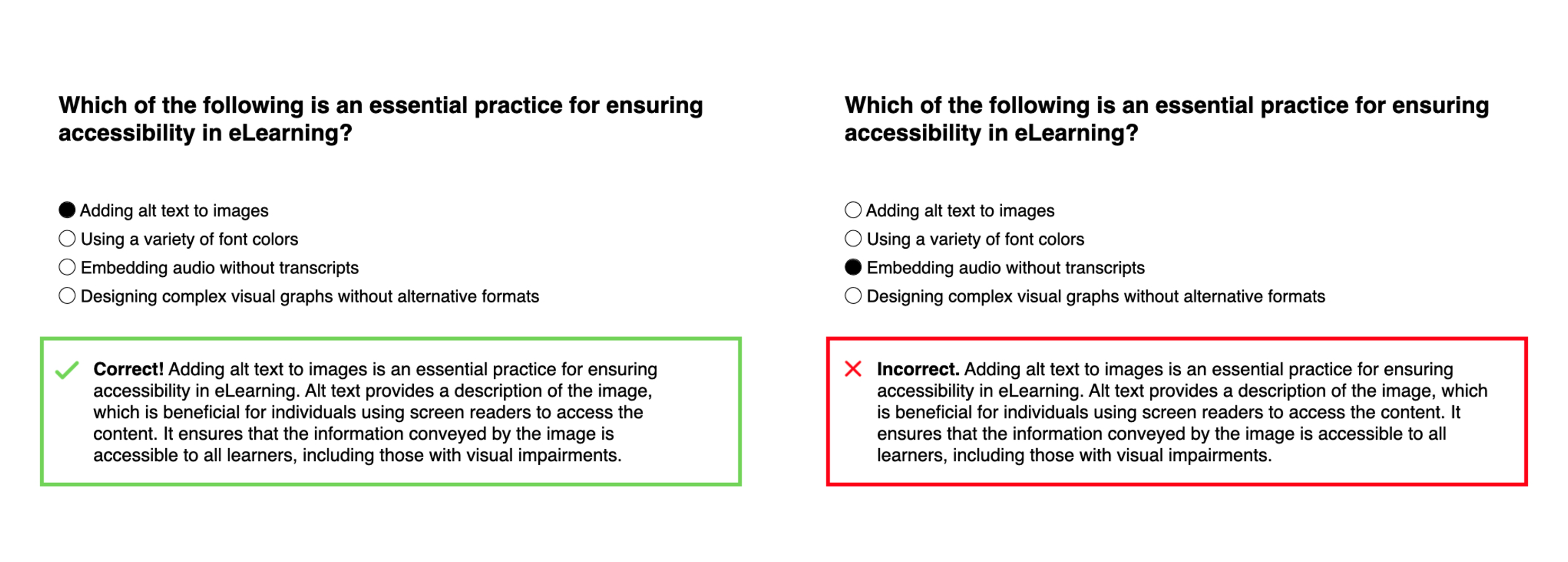
Figure 8: An example of correct and incorrect feedback with accessibility changes
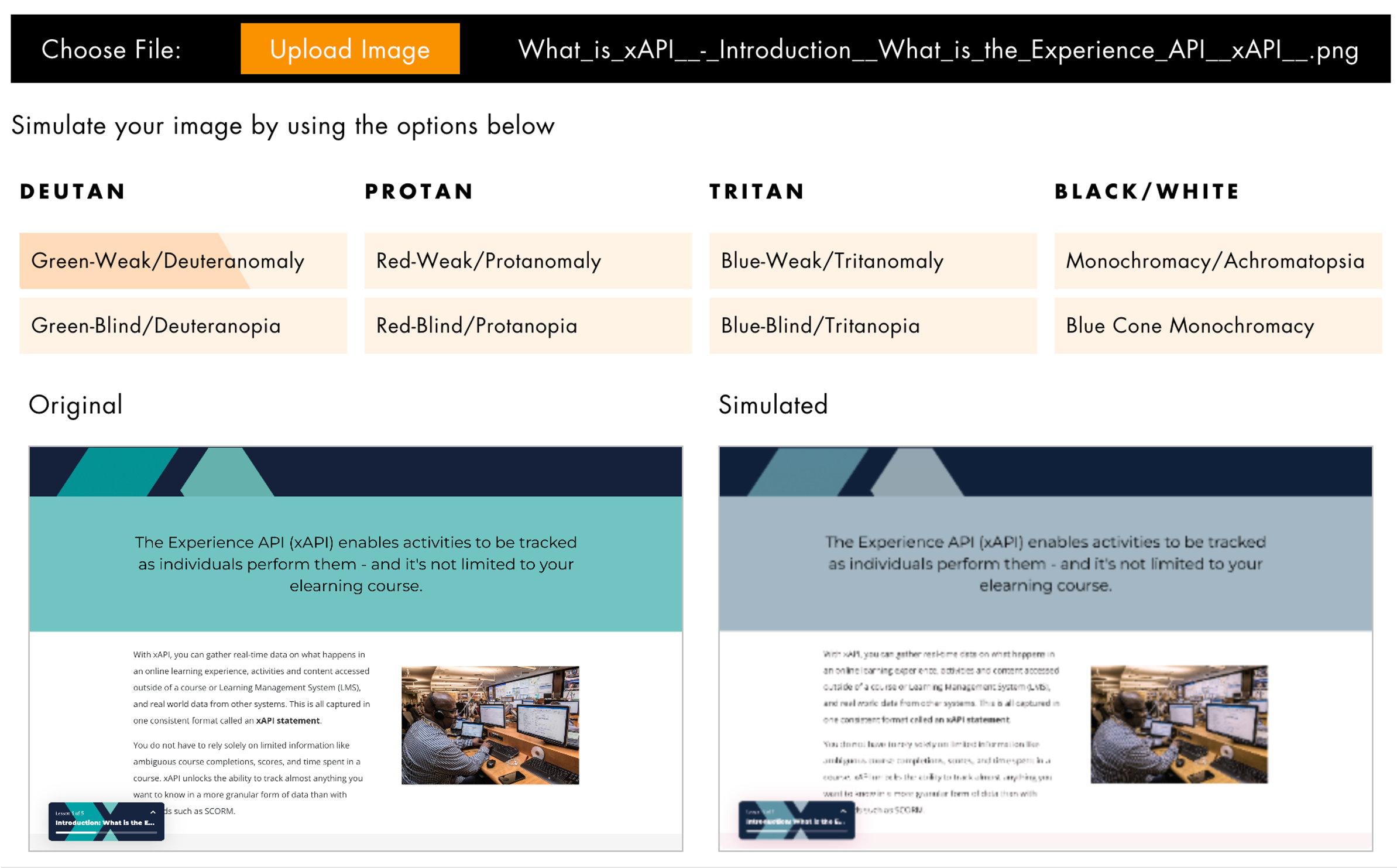
This is not the only example of how color blindness can be a challenge for your learners. There are several types of color blindness such as deuteranopia (green, yellow, and red), tritanopia (blue/yellow), protanopia (red, orange, and yellow), and achromatopsia (grayscale). Fortunately, tools are available to quickly check your content and verify whether it is appropriately visible to individuals with distinct types of color blindness. Here are a few:
- Colorblind Web Page Filter (provide link to your content): https://www.toptal.com/designers/colorfilter
- Pilestone Color Blind Vision Simulator (upload image of your content): https://pilestone.com/pages/color-blindness-simulator-1
- Color Oracle (download): https://colororacle.org/
Before
After
 Figure 9: Course examples before and after color blindness filter applied in Pilestone Color Blind Vision Simulator
Taking this further, it is common to find poor color contrast in eLearning. Often text is added to a background where color choice and/or the text size makes it difficult to read. You can use the WebAIM: Contrast Checker to find whether your color contrast passes WCAG (Web Content Accessibility Guidelines) AA and/or AAA. Your goal should be to pass all levels.
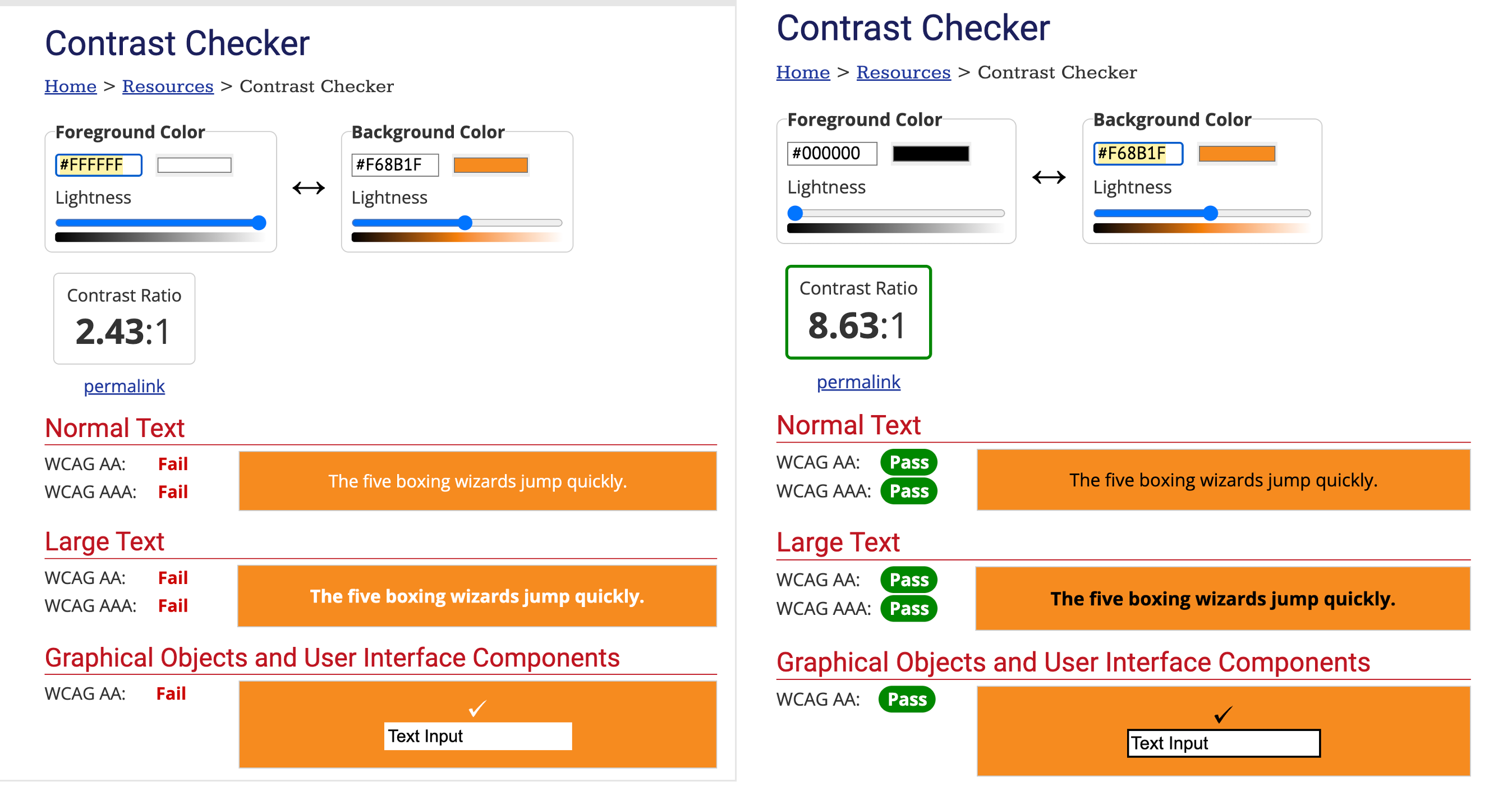
Figure 10: Notice how white text on top of this orange background fails, while black text passes all levels
Here are two additional contrast checker tools that will allow you to upload a screenshot of your image rather than manually picking the foreground and background colors:
https://colourcontrast.cc/ and https://contrastchecker.com/
#3: Test content using a screen reader
I recently worked with a company that provides braille training and other learning opportunities to individuals with vision loss or blindness. Our goal was to address technology challenges identified during accessibility tests for eLearning modules they created in Articulate Storyline.
As each fix was implemented, an essential step in testing was verifying the tab order, or the sequence in which content is read by a screen reader. To ensure compatibility with the learners’ predominant use of Apple devices, I used VoiceOver. The process is simple: long press on the power button and tell Siri to activate VoiceOver. Navigate through the module and check for proper order. Then, repeat the long press and ask Siri to turn off VoiceOver. (Learn more about using VoiceOver)
Since I use an Apple MacBook Pro, I am also able to use VoiceOver to test on my desktop. However, there are many screen readers available today for free, such as the Google Chrome browser plugin Screen Reader.
Pixie is another great Google Chrome plugin for testing, as it allows you to toggle controls such as speed and highlighted text.
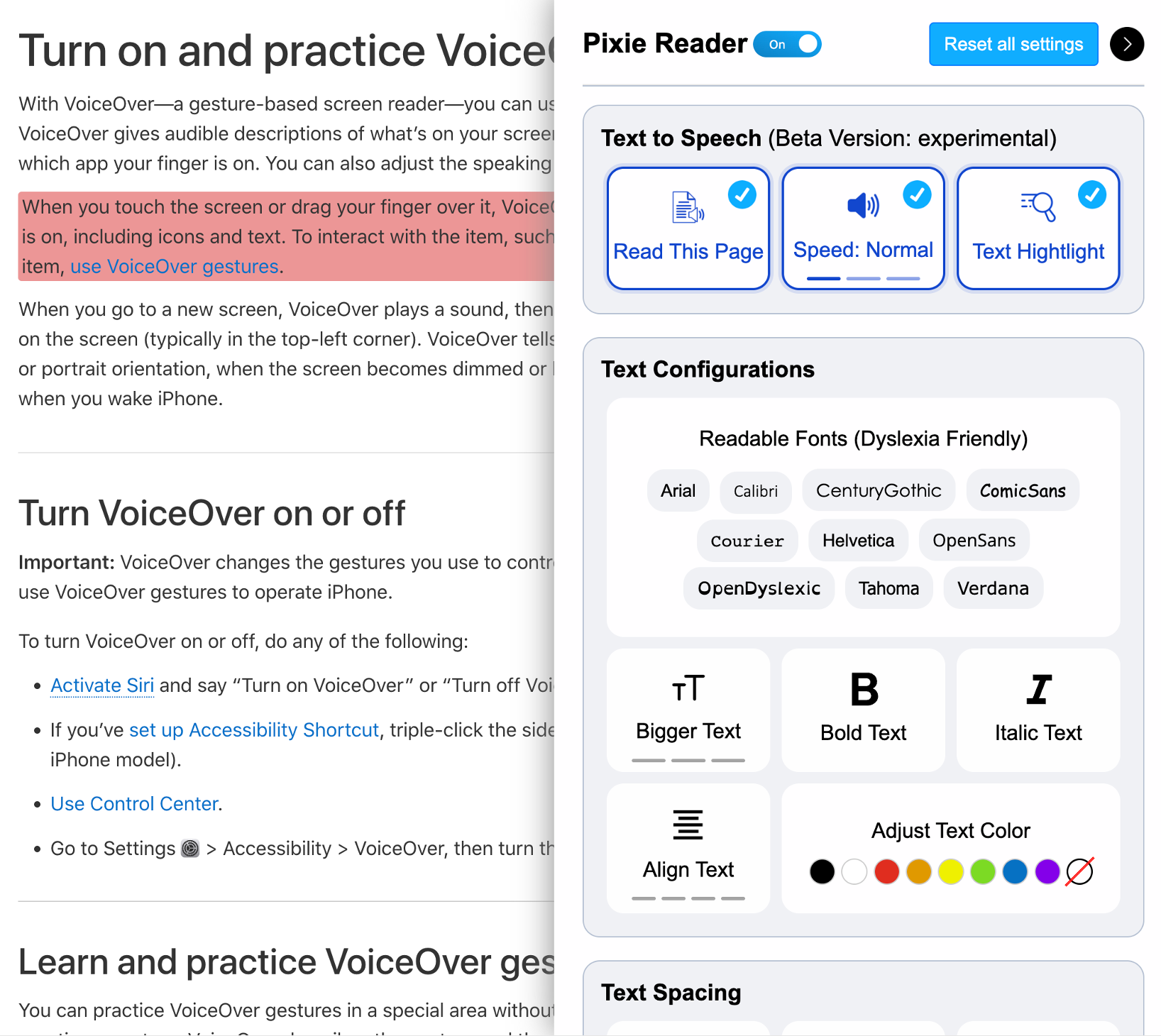
Figure 11: Pixie allows you to control many accessibility features by toggling them as needed
Important: Ensure that you do not have competing screen readers running at the same time. This can cause the functionality of one to interfere with the other. If you try one and it doesn’t give you good results, uninstall it and try a different option.
By testing with an actual screen reader, you can quickly and easily verify that your eLearning will be read in the appropriate order and that no information is skipped. It also helps you identify missing or oddly worded alt text for images.
#4: Provide closed captioning and audio scripts
In developing an eLearning course on PTSD for police officers, I ensured that audio clips had transcripts and videos included audio scripts and captions. Although officers are typically required to pass vision and hearing tests, accessibility features like captions and audio scripts still benefit them. For instance, they may be in a noisy environment without access to headphones. It’s easy enough to include both to ensure you are being as inclusive as possible.
To meet this need I used a tool called Descript to transcribe the audio files and create closed captions for the videos. To learn more about creating closed captions, check out this article: How to Add Closed Captions to Your Videos.
During this project something unexpected happened—one video was not producing a transcript. I watched the video and discovered that the reason there was no transcript was that there were no spoken words in the entire video. The effects of PTSD were demonstrated in the video through sounds such as sirens, a door slamming, the sound of fireworks, and other noises that can trigger someone suffering from PTSD. I learned an important lesson that day—the difference between closed captions and subtitles.
While they may seem similar, closed captions and subtitles serve distinct purposes. Closed captions provide a transcript of the audio, including spoken words and sound effects. They can be particularly useful for viewers who are deaf or hard of hearing, as it allows them to understand the content and context of the video. Subtitles solely transcribe the spoken words and are typically used for translation purposes.
When creating instructional videos, closed captions are the better choice. They make the video more accessible and inclusive to a wider range of viewers.
What did that mean for my PTSD video? I needed to create closed captions that described what could be heard throughout, keeping in mind the relevance of those sounds to the content.
![Screenshot of the PTSD video with a closed caption that reads, “[flashback: announcement coming over a radio]”](https://www.learningguild.com/wp-content/uploads/Fig-12.png)
Figure 12: Screenshot of the PTSD video with a closed caption that describes the background noise to the learner
#5: Avoid use of all caps in titles and text
When writing titles and text in your eLearning content, various case types may be used. Let’s examine each case type using the example title “alt text for accessibility.”
All caps: ALT TEXT FOR ACCESSIBILITY
Mixed case or sentence case: Alt text for accessibility
Title case: Alt Text for Accessibility
A common accessibility error in eLearning is the inappropriate use of all caps in titles and text. When you use all caps, some screen readers may assume it is an acronym and read every letter. It’s also more difficult from a readability perspective, especially for those with dyslexia, ADHD, and individuals on the autism spectrum. Besides, is yelling in all caps really the tone you want to set for your eLearning?
Instead of all caps, consider using title case or sentence case for headings. Keep in mind that your organization may have style guidelines around the use of titles, so this may be something to discuss with those individuals responsible for applicable company standards.
Accessible design practice
By incorporating these five essential practices into your design process, you can help improve accessibility in eLearning. But I hope your learning journey doesn’t end here! Explore these accessibility resources to take your accessible design practice even further:
- Design for All: Creating Accessible, Inclusive Learning – This free, 15-day text course is a primer on designing inclusive, accessible eLearning. It contains resources and practices for creating a more inclusive design practice to ensure everyone can learn from your content.
- Curated list of resources, including a free, downloadable accessibility primer.