


Mistakes that designers make are often “smart” mistakes. These mistakes are made not by accident, but because we reason at first that they are good and appropriate things to do. They appear to be smart things to do at the time, and then we learn otherwise. On reflection, they look not so smart, and we wonder how this happened.
- Is Your Learner Interface Smart?
- Classic Learner Interface Errors
- Screens With a Clear View
- The Garden of Good and Media
- Learner-interface Design: Recognizing Learner Gestures
There are many criteria to meet and many pressures to manage during the development of e-Learning projects. In addition, a team usually undertakes design and development, with individual members focusing on different aspects. Finding solutions is always a compromise along many fronts. All of this increases the odds that design faux pas will happen, and they do happen with alarming frequency.
My objective in this installment of the Learner Interface Design series is to sensitize you to some of the worst, most frequently occurring, and clearly avoidable design mistakes. When they are presented in a cold light, as they are here, they may seem like things you would never do or let happen. But they do happen, and they happen in almost everyone’s work from time to time. It’s truly necessary to be vigilant.
A word about e-Learner anxiety
Anxiety tends to go up when learners are working with computers. This isn’t only because of the frustratingly poor learning applications confronting them. Many other factors contribute to learner anxiety. For example, learners get anxious when they fear the screen will suddenly change before they’ve finished reading. They might worry that it will not be possible to get back to a page that later (and unexpectedly) turns out to be important. They might be anxious about not knowing if a test is about to appear, whether personal performance is being observed or recorded, and so on.
We also know that reading comprehension is lower for on-screen text than it is for printed text. It’s not fully clear why, but it’s probably a combination of many factors: the resolution of text is poorer on screen than on paper; the screen emits light, but paper reflects light; you can’t adjust the screen and hold it as comfortably as you can printed material. Whatever the cause, designers need to minimize dependency on displayed text as a means of transmitting information to e-Learners.
And it’s circular — anxiety interferes with comprehension; poor comprehension increases anxiety. Whatever the root cause, it isn’t smart to further aggravate learners through poor interface design. They have enough challenges to deal with. You can begin by avoiding each of the following “Terrible Things.”
Terrible Thing #1: Make active and inactive elements look alike
It seems obvious, manifest, inviolable. One shouldn’t run over pedestrians, put poisons on the spice rack, or make active and inactive screen elements look alike.
This clearly has to be said, although I don’t understand why. Designers frequently make this obvious and grievous error to the frustration of every user. Many web sites, for example, whether instructional or not, underline some inactive headings just to set them off. The underlining makes them look like hypertext links. Bad! Sometimes there is even underlined hypertext in close proximity. How confusing this is!
The reverse is also problematic. Some designers avoid underlining because it’s ugly typography. It is ugly, I agree. Underlining is an unfortunate hypertext convention to have inherited. Maybe it will die out.
But underlined hypertext is a widely recognized convention. Departing from it means giving up the advantages of quick understanding. But with the challenges we face with on-screen text comprehension, it makes little sense to exacerbate the problem by making text less legible (as underlined text is).
Avoiding the underscore is perfectly fine and suitable alternatives do exist; however, in departing from established conventions, some designers fail to establish a unique look for click-activated items. This is not fine. Too often you can’t tell which items are clickable and which are not unless you test them by rolling your mouse pointer over them to see if the cursor shape changes. In Figure 1 only the subheadings are clickable. The main heading (“Acme News Online”) looks like it might be a clickable button as well, but it is not. Why burden learners with such hide-and-seek games? Hopefully, you have learners thinking about more beneficial things.
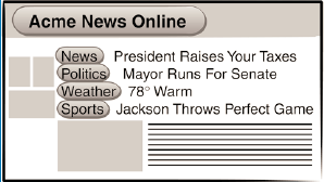
FIGURE 1 Can you tell by looking which of the buttons are clickable?
If a display element is clickable, it should be distinguishable from non-clickable elements. Period. Almost any consistently used convention will work. For example, you might make clickable items:
- shadowed
- raised
- embossed
- italicized
- labeled with bracketed titles ([research reports])
- placed in a reserved area.
It’s not at all difficult to create instantly recognizable buttons. 3-D button images are extremely effective in terms of recognition. Often worth the development effort, 3-D buttons do consume space and tend to become strong visual elements that may dominate a design. Simpler button styles can work well in cramped quarters. But if the button look is rejected, other effective conventions can be introduced. You must be sure, however, that your conventions are understandable and understood, because you can’t necessarily count on prior familiarity. Above all, don’t apply the same conventions to clickable and non-clickable items just to make everything symmetrical or pretty — or for any other reason.
Terrible Thing #2: Redecorate constantly
Good screen design is difficult. No doubt about it. Each screen layout presents unique challenges. You can move things around a bit to accommodate the specific contents of each page. Different background, border, or font colors might look better with different content elements. It’s easy to make these changes with today’s software.
But don’t! Instead, try to establish positive screen inertia. Positive screen inertia is a designer’s term for maintaining a meaningful framework that is carried forward from one interactive instance to another. Positive screen inertia means you avoid changes in display attributes unless the changes have a specific significance. The framework becomes a recognized context that helps learners understand which rules of engagement are in effect without having to continually reassess the situation. It also helps learners notice exactly what has changed from a previous screen and thus should not be overlooked.
When we move from one place to another, whether physically, such as in an office building, or perceptually via computer software, we are somewhat ill at ease until we get our bearings. In both physical spaces and software application spaces, we scout around to see:
- where the exits are located
- what things might happen here
- what probably wouldn’t happen here
- what might be expected of us
- what dangers there might be
- what options we have
- whether curious objects are around
There is a certain anxiety about such scouting; we may run out of time or even do something embarrassing because we have failed to survey our surroundings accurately. Once we know a place, we can usually relax a bit and focus. If we can’t make sense of it, we have difficulty getting comfortable. Lack of focus and discomfort with the context is not good for learning.
Many e-Learning designers work hard to invent an innovative environment for learners. It’s fine to welcome the learner into a fascinating space, but don’t keep rearranging the furniture while learners are trying to sit in it. Establish places for permanent fixtures and spaces for transient items to be placed when they are present. (See Figure 2.) Don’t put other things in these reserved places just because they fit or because reserved spaces might be empty from time to time. A momentary aesthetic imbalance is much more acceptable than lack of helpful consistency. As learners progress, many things should stay exactly the same on the screen. The positive inertia of the design framework lets learners know that their options and capabilities aren’t changing
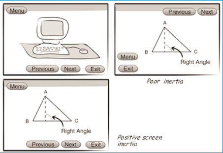
FIGURE 2 Establish places for permanent fixtures that are uniform from page to page.
They don’t need to reassess the space to see if it is functionally the same as it was a moment ago. They can safely assume it really is the same and can stay focused on the content and interactions taking place in the space.
Decide when enough of the rules of learner engagement will change to merit a different environment. Then purposely change the look. Don’t move or redesign things that continue to be available and function the same, such as EXIT, HELP, BACK UP, or GLOSSARY. But deliberately change such things as background colors, space division, and even text fonts to help make a new space distinguishable.
When learners switch back and forth between established frameworks, they will quickly note the familiarity of the surroundings, dispense with a detailed examination of the space, and continue to work comfortably.
Please note: If you randomly change just a few things here and there, or even only one, you may completely thwart the positive inertia you have otherwise established. A single case of a temporarily unnoticed change can put learners on edge. Learners will feel they need to recheck every screen detail carefully to be sure some important detail hasn’t changed. Wasted time. Needless frustration. Potentially harmful learner anxiety.
Terrible Thing #3: Completely erase the screen
Positive screen inertia is pretty much destroyed when the screen is completely erased. Our confidence that we know what is and isn’t in the space becomes uncertain. Even if what appears after the erase seems just like the screen on display a second ago, we instinctively and appropriately begin a search to see if anything changed. If anything has changed, every screen erasure is a signal to learners that they should carefully review the entire layout before going on.
If you avoid erasing the screen when the learner’s options, resources, and requirements are not changing, you can then intentionally erase the screen to signal when things do change. Other transitions can help reinforce the change as well, such as switching background colors or graphics. When the context is changing, it’s better to use highly visible contrasts, even including full screen erases, than to subtly remove, add, or re-label a few buttons or options. Changes made in an instant easily escape the learner’s notice.
No one is trying to trick the learner. In reality, however, many basic principles and even points of common sense are set aside as projects evolve and designers struggle to stay within their many constraints. Inappropriate full screen erasures happen quite frequently for understandable reasons, perhaps most often to ease development programming. For example, depending on the tools in use, it’s often easiest (if not necessary), to program discrete, independent interactions, then completely erase them in transition to the next one. If response-sensitive branching is being used, a transition may need to apply to a variety of subsequent screens. Looking ahead to keep items that will be reused and remove others can get messy, so full screen erases may look like an attractive solution. This is especially true when we’re restricted to web-native capabilities that unfortunately have a very strong page orientation.
In fact, maintaining display inertia has proven a formidable challenge for many developers and interactive systems over the years. Authorware® (if you’ll forgive the reference to a previous endeavor of mine) was designed to make positive screen inertia very easy to maintain. Not all tools make this simple, but regardless of the effort some technologies require, common sense and good learner-interface design require you to keep the environment stable and persistent when it isn’t changing. And make sure that when things do change, the learner won’t fail to notice.
Terrible Thing #4: Change or mix conventions (your own or common ones)
This is yet another common practice that shouldn’t have to be mentioned. Mixing conventions seems so obviously deleterious. But it occurs with alarming frequency.
Apple Computer is known for the excellence of their interface designs. When they introduced the Macintosh computer, they provided a carefully delineated set of rules for software developers. The rules promoted strong consistency among applications, such as having a FILE menu at the top left corner of the screen followed by an EDIT menu, and so on. Many of these conventions continue today even on other computers because of the logic of the arrangement and the advantages of consistency — most notably, the ease of use.
But even the best designers and organizations willing to strongly enforce consistency rules slip up now and then. Consider the notepad design shown in Figure 3.
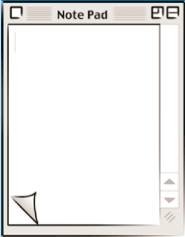
FIGURE 3 How do you move forward one page?
The question is, how do you go forward or back up a page? The convention well ingrained in today’s computer user is that you click partially hidden objects to bring them to the front. Following this convention, clicking in the lower left corner should take you to that page by bringing it forward. It doesn’t. Not in this widely-distributed utility. Rather, clicking the up-turned edge of the top page takes you to the underlying page.
There is a conflict of metaphor and convention here. If the paper were in your hand, lifting the turned corner would reveal the underlying page. Clicking it would seem similar to lifting the page, so everything is relatively intuitive so far. But how do you go back a page? The designers decided you should click the corner of the underlying page. But conventional user interface says that should bring the clicked page forward. Users now don’t know whether to apply the paper pad metaphor or the computer window metaphor.
Learner interfaces contain much more complex controls than this simple page-forward, page-backward control. But if such simple controls can be difficult to design well, it’s easy to understand how more sophisticated features can present challenging design problems. It is easy to fall into the trap of mixed conventions. So keep a sharp eye!
Terrible Thing #5: Overfill the screen
White space is important. When designers refer to white space, they actually mean the empty space used to separate items and to help draw attention to important elements. White space doesn’t have to be white, although white and black are often good color choices for it. It can be any color — even a gradient or pattern. But it should contrast strongly with other display elements and allow the eye to focus comfortably on display elements. Effective white space is usually a visually inactive or quiet background with much less information density than the objects it sets off.
Density, complexity, color, shape, and space are all factors visual designers work with to achieve desired effects. Experienced designers of printed materials know that spacing helps draw and focus attention. For effective advertisements, designers must often severely limit the amount of information they present in order to draw attention to any of it. They don’t cram in everything that can possibly fit on the screen. Less is often better. The same is true of screen displays.
White space is a powerful tool for focusing attention. White space is important to use purposefully, however, it may work against you. A single item floating in a void instantly draws attention. Conversely a void floating in a sea of stuff also draws attention away from the things you probably want learners to study.
A very ineffective tendency, especially among novice e-Learning designers, is to fill the screen with stuff — every nook and cranny. (See Figure 4.) The eye gyrates in search of a place to land and, finding none, continues to dart about. Learners sometimes have to force themselves (uncomfortably) to focus on certain elements and ignore others, in a fight against a jumbled pile of stuff — sometimes irritatingly animated stuff! Usually there is a combination of too much information, decoration, and unneeded clutter.
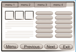
FIGURE 4 A “busy” page gets in the learner’s way.
When designers realize what they’ve done, they often try to create white space by drawing lines or boxing selected elements. This usually makes things worse. White space demands free space. You don’t get it by drawing more things. Put less on the screen and it will probably have more impact. Less is more.
An interesting exercise based on an idea in Edward Tufte’s book, The Visual Display of Quantitative Information, is to begin stripping things away from an overfull screen — or any screen design, for that matter. Keep doing it until you would be forced to delete something truly essential. It’s amazing how many unnecessary and even detrimental things creep into displays. It’s junk. Pitch it.
Terrible Thing #6: Even worse: fill the screen with text
Lots of words. Remember, people don’t like reading text on the screen and, what they do read, they read with reduced comprehension. Learners generally want and expect action-based encounters when using a computer.
Eyes glaze over when they see large blocks of text, and learners are likely to exercise every option you give them to skip past the text. Figure 5 demonstrates a terrible layout and an improvement.
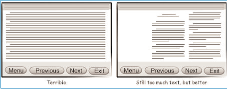
FIGURE 5 One method of dealing with too much text is to use short lines and blocks.
There are two basic ways to improve a screen filled with text. The first is to use short lines and blocks. When presentation of text is necessary, try not to use columns wider than 40 characters for monotype fonts, 50 characters with variable spacing. Don’t justify the right margin because ragged margins help align the eye. It’s best to leave a blank line after every five lines, although allowing up to seven-line blocks may be acceptable, especially if they are surrounded by shorter blocks.
The other method is to make judicious use of scrolling text. Scrolling text has advantages for designers. With scrolling text, designers can use as much or little space for the text as is convenient for their screen design. The learner then scrolls the text within the established boundaries.
Unfortunately, scrolling text has some disadvantages for learners. For example, learners are sometimes allowed to see too few lines at a time, making it hard to maintain context. Depending on where scrolling happens to stop, text may divide at awkward points requiring learners to jostle everything around with all the attendant distraction. As text scrolls, readers often have a hard time focusing on their current position. After scrolling, they may have to begin reading at a somewhat random point to see if they have scrolled too much, not enough, or as far as they actually intended. Rescanning is disruptive, tiring, and bothersome. It can definitely sap the learner’s motivation.
If you can keep the amount of text to a minimum, and you really should strive hard to minimize text in e-Learning anyway, you may be able to avoid scrolling text all together. That’s often best.
Terrible Thing #7: Use all the colors
There are lots of colors to choose from. Hundreds, thousands, millions. The more the better, right? No. Almost the reverse.
About midway through my work on the PLATO system at Control Data Corporation, there was serious concern about color. Color display capabilities were new and very expensive. Was color important for learning? Could monochrome displays support learning just as well as color displays? Should PLATO support color display terminals, or was black and white sufficient?
Through some research studies sponsored by Control Data, we found that color made a measurable learning outcome difference only if color were used in a meaningful and very specific manner. Otherwise, beautifying screens made no difference. Black and white displays were just as effective as color displays and didn’t put color-blind learners at a disadvantage.
Of course, people who had color monitors, such as those using the then newly introduced Apple computers, used color extensively — all of the seven displayable colors — everywhere. There were rainbows of color everywhere. And they were pretty... pretty distracting. Even so, everyone was clearly drawn to and preferred to have color. That became sufficient justification in itself.
After creating quite a few grotesque designs based mostly on freedom from the bondage of monochrome, and seeing the disastrous results, we learned that color has learning value only when it systematically highlights or classifies selected objects (i.e., the color has meaning), creates helpful realism, and harmonizes everything to enhance focus and legibility. Displaying all seven possible colors at one time made none of them valuable; they just fought with each other for attention. None of them won it.
We have many, many more colors now — almost an infinite array. And it’s as important as ever to use color purposely. Too many colors: none of them have much impact. Inconsistent use of color: noisy, confused message. No meaningful use of color: missed opportunity.
Terrible Thing #8: Use all the fonts
Oh, please. Don’t use them just because they’re there, because you like so many of them, because it’s possible, or for any other reason. We are not writing ransom notes or creating walls of graffiti. A jumble of fonts makes reading screen text even more difficult and unpleasant than it normally is. (See Figure 6.) Severely restrict the number of fonts you use. Just as with the application of colors, change fonts only when there is a clear reason to do so. Then, define the rules you are going to apply, and stick with them.
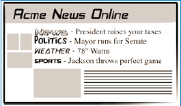
FIGURE 6 “Ransom note” typography makes reading screen text very difficult.
Some guidelines will help; check out these resources:
- Robin Williams and John Tollet, The Non-Designer’s Web Book.
- John Lenker, Train of Thoughts —Designing the effective Web experience.
- Kevin Mullet and Darrell Sano, Designing Visual Interfaces.
Two fonts may well enhance the look and readability of your content. You are likely to be safe selecting one font that has serifs — those fine little lines at the end of strokes on characters like those found in the Times New Roman font. The other font should not have serifs. The ubiquitous Arial and Helvetica fonts are called “sans serif” because they have no serifs. (See Figure 7.)
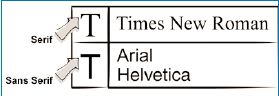
FIGURE 7 Serif and sans serif typefaces are different for a reason.
In print, it is often
preferable to use a sans serif font for headings and use serif fonts for blocks
of text. In print, serifs help guide the eye, so they work well for longer passages
of text. (Editor’s Note: Outside the
However, on a computer screen, the resolution may make serifs look a bit fuzzy. Therefore, many screen designers prefer to use serif fonts for headings and sans serif fonts for blocks of text. (Editor’s Note: This tends to be true for screen designers world-wide.)
You don’t have to use a serif font at all, of course, but you’ll find it easiest to pair fonts effectively if you use one with serifs and one without. You should almost never use two different fonts with serifs, although two fonts without serifs can work well as long as they contrast sufficiently with each other in size, weight, or other characteristics.
Although Times New
Roman (PC) and Times (Mac) are commonly-installed serif fonts, and Arial (PC)
and Helvetica (Mac) are widely available sans serif fonts, all four of these
were designed primarily for print applications. Similar fonts designed for
greater legibility on the display screen are Georgia (serif) and Verdana (sans serif)
for the PC, and
Finally, use contrast — it creates interest and appeal. Just make sure you get effective contrast when you intend to have contrast. If you want to contrast by size, contrast enough so that the difference is unmistakable. Similarly, if you contrast via color, font, spacing, or weight, make the differences strong and clear. But don’t contrast everything or you’ll only create a muddy mess.
Terrible Thing #9: Nauseate with eye candy
Yet another type of distraction that happens primarily, I suppose, because it has become possible, is extravagant visual adornment. Glitz. Eye-candy. Pretty. Fun... but, like chocolate caramel ice cream sundaes... bad for you.
It’s hard enough to convey messages of any complexity accurately, let alone do it while nearby icons twirl in “isn’t-this-cool” dances. The learner receives mixed messages: “Don’t look at that button that’s pulsing with readiness to jump somewhere else. Don’t look at that header that’s itching to show you what other things you could be doing. No, concentrate on the static stuff, because that’s where your attention should be for now. These ornaments are just here to make your experience more pleasant!”
Give me a break. Glitz is there because someone wanted to show off their ability to create it or because everything else they were doing was boring. (See Figure 8.)
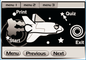
FIGURE 8 Glitzy screens contribute nothing to learning.
Glitz has appeal, even to those serious about obtaining a good return from their e-Learning investment. But, if resources are diverted to ornamentation instead of to quality interactions, the payoff in behavioral change is not going to be what it could be.
Although eye candy may be instantly appealing, humorous, or fascinating. It can easily lead to an invalid conclusion about the true value of an e-Learning application. Unfortunately, learning designs can take time and effort to evaluate. Good design is appealing and fascinating. It is often humorous or dramatic too. But most importantly, it gives lasting benefits to the learner. This deeper value may become evident only after working through applications and seriously trying to learn from them.
Learning experiences don’t take on quality through association with eye-candy. The adornment rarely contributes to the quality you care about. On the contrary, it most likely degrades it and, perhaps more devastatingly, obscures faults in instructional design that need to be remedied.
All this being said, our applications cannot be successful if they don’t attract initial interest or if they become boring. There are times to do something fun just to break the tension, the repetition, the tedium of concentrated work. In fact, our work as instructional designers is about building experiences. Theatrics, surprise, drama, conflict, and humor are important tools for building memorable experiences. They are not superfluous.
Good design judgment and balance are critical. The objective is not to build just any experiences, but productive learning experiences — meaningful and memorable experiences. Not memorable because of a clever but disassociated animation — an event you can remember, but you can’t remember what it taught. Memorable, because both what you learned and how you learned it came together in an effective, valuable experience that sticks with you.
Next time
In the next installment, to be published July 7, we’ll turn to some things you can and should do to communicate effectively with learners. As we’ve seen so far, the many capabilities of today’s multimedia computers provide endless opportunities to make learning experiences confusing, tedious, and ineffective. In subsequent installments of this series, we will see how to use these same capabilities to produce motivational, meaningful, and memorable learning experiences. It’s the whole purpose of e-Learning, isn’t it?