


For over two years now, I have beenexploring and deploying various tools either to create mobile-learning contentfrom scratch or to convert legacy content to mobile-ready formats. Depending onthe target audience’s characteristics, their needs, and the context of use, Ihave taken different approaches.
From cloud-based and desktop toolsto do-it-yourself kits and mobile learning platforms, I have experienced thevaluable assets as well as the caveats of each solution. However, I was unableto find a sensible answer to a persistent question: How can I optimize mycontent for the varied devices that access it?
Adobe Edge Animate could shed somelight on this problem as it includes unique features that allow forflexibility, portability, and continuity of content regardless of theinformation-access environment.
Harnessing the latest web technologies
Adobe developed Edge Animate fromthe ground up relying strongly on HTML5, CSS3, and JavaScript. Until recently,Adobe’s Flash was the most reliable and preeminent delivery method for highlyinteractive web experiences. However, it is a well-known fact that Apple’sdevices no longer support Flash-based content. True, the Flash Player doesstill work on other mobile devices such as Android, Windows 8, and BlackBerry10. Also, Adobe AIR can enable delivery of Flash content as native mobileapplications. But we really need to look for more effective and future-proof solutionsfor the ever-changing array of devices out there.
The truth is that most of the timewe are absolutely clueless about the environment where our content will beaccessed. The only thing that we know is that users are no longer tethered totheir desk and content-access environments can vary significantly. Under thesedaunting conditions, our job is (or should be) to offer rich and adaptiveexperiences capable of flowing across different screens and platforms. EdgeAnimate takes full advantage of HTML5, CSS, and JavaScript libraries includingthe Adobe Edge Animate Runtime in order to facilitate the ubiquitousness of ourcontent. This means that users can access your content from different deviceswithout the need of additional plugins.
Concerned about coding experience requirements?
Now, if you are a designer withlittle or no coding experience, you may be wondering if you will need to learnsome code to get started with Edge Animate. The answer is not necessarily. Youcan create simple animations by using drawing tools and a timeline. After creatingand saving a new Edge Animate project, Edge Animate produces a number of files,including an HTML file and JavaScript files (Figure 1). You can then startcreating the sections of your HTML document simply by arranging elements orselections onto the Stage. Also, by assigning CSS properties to the objectsfrom a Properties Panel, you will be able to add styles (Figure 2). In thisway, you will be defining the visual design and structure of your project. Allthis is possible without a single line of code.
Figure 1: These are the files produced byAdobe Edge Animate as soon as you save your project
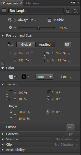
Figure 2: All these properties areactually CSS properties; some of them are basic CSS properties such as color andpadding, but you can also play around with more advanced CSS properties such asproportional dimensions and relative positioning that are, in turn, presets foradaptive layouts
Having said that, in order to addinteractivity and really make the most of this tool, you need to be acquaintedwith JavaScript, the base coding language used by Edge Animate. The good newsis that Edge Animate contains some key functionalities to make coding tasksmuch easier (Figure 3). One of the functionalities that I find particularlyuseful about Edge Animate is the possibility of inserting preconfigured bits ofcode from an Actions Panel to handle events (Figure 4). These could add basicinteractivity to your design, but as you become more confident with JavaScript,you can also use a Code Editor to write your own code (Figure 5).
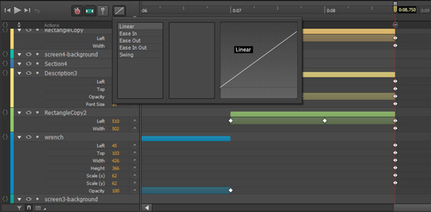
Figure 3: Adobe Edge Animate also includesa number of JavaScript transitions, Eases, that you can apply onto an element
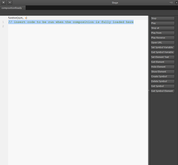
Figure 4: You can employ the buttons inthe Actions Panel to insert snippets of code

Figure 5: In the Code Editor, you canwrite your own code or edit the code produced by Adobe Edge Animate
So far I have explained thefundamental innards of Adobe Edge Animate to help you better understand how itcan assist designers to create web-based experiences. In the next sections, Iwill analyze the features that effectively support the creation of multi-devicecomponents.
Thinkabout proportions instead of pixels
There are two ways to buildresponsive compositions and create more fluid content with Edge Animate: as apixel-constrained composition or as a percentage-based composition. Theadvantage is clear. As Joseph Labrecque explains, our content is capable of adjusting itself to themedium:
“If we choose to build on apercentage-based Stage, we can mix elements with both pixel- andpercentage-based units to create a more responsive design. This will enable thecomposition Stage to fill a certain percentage of its container element whenpublished by the Document Object Model (DOM).”
We can scale a selected elementrelative to the global container, i.e. the stage, or to a specific container,i.e., its parent, and set its size to percent in order to make it moresensitive to its surroundings (Figures 6 and 7).
Moreover, Edge Animate CC includes aresponsive scaling option that you can apply to scale your content up and downso it fits into any screen.
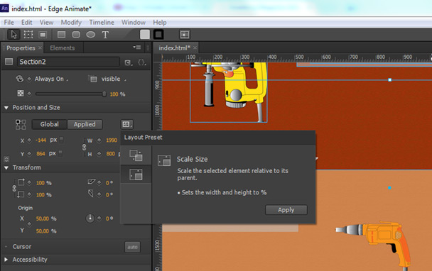
Figure 6: Scaling a selected elementrelative to its parent
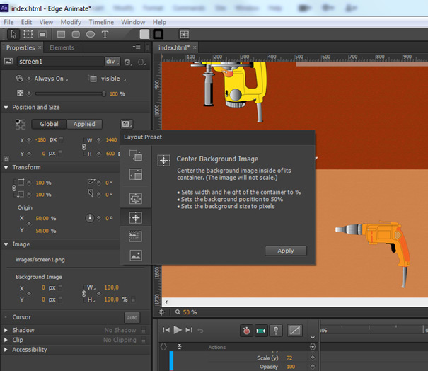
Figure 7: Considering percentages insteadof pixels
Designing for touch interfaces
In Edge Animate, we can enabletouch-based interactivity by integrating touch actions from the Actions panel intoour compositions (Figure 8). (Touchstart: a touch has been detected; touchmove:the touchpoint has moved across an element; touchend: a previously detectedtouch has ended). As an alternative, we can use hammer.js, a JavaScript libraryfor multi-touch gestures (Figure 9).

Figure 8: These are the built-in touchactions in Adobe Edge Animate: touchstart, touchmove, and touchend

Figure 9: With hammer.js, we cantrigger gesture events such as swipeup and swipedown
Supporting media for different contexts
Edge Animate also enables us to manage multimedia assets according to thecharacteristics of the devices that will render our content. It supportsScalable Vector Graphics (SVG), which offer infinite scaling possibilities. Youcan modify SVG images at several different sizes through the mathematicalexpressions they contain in order to respond to different devices’ physicaldimensions and display densities.
Also, the latest update to Edge Animate gives you the ability to easilyimport audio files (MP3 and OGG files) and add them to your composition througha drag-and-drop action.
Simulating various screens
You can simulate various screensizes directly within Edge Animate by resizing the Stage. Also, simultaneouscross mobile-device previewing of our content at early stages of thedevelopment process is possible with Edge Inspect (Figures 10 and 11). Bothprocesses are streamlined ways to quickly test how the different elements inour composition react and so we can make real-time changes to our design ifnecessary. However, it is advisable to always test our design on the realperformance environment and under the real delivery conditions. For thisreason, I prefer using Edge Inspect to get better understanding of how mydesign will render and perform when actually deployed on different devices.
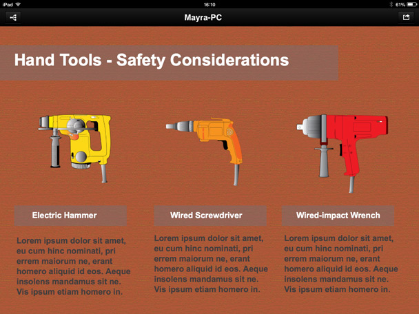
Figure 10: UsingEdge Inspect CC to preview how the composition will display on the iPad
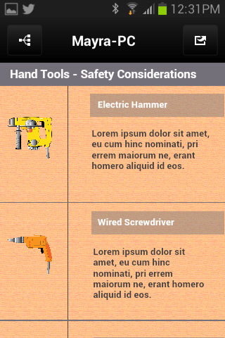
Figure 11: UsingEdge Inspect CC to preview how the composition will display on an Androiddevice
Creating richer experiences
Edge Animate’s integration withother tools can create an ecosystem of solutions that can better supportmulti-device development (Figure 12). It is easy to place an Adobe EdgeComposition within InDesign, Muse, or Dreamweaver projects, and even in iBooksAuthor.

Figure 12: Byimporting an Edge Animate project into Adobe Dreamweaver CC, we can easily addanimations and interactivity to HTML templates or we can take full advantage ofPhoneGap Build to create and test a hybrid mobile app
Conclusion
Theuse of HTML5 and related technologies, the idea of thinking about percentagesand proportions instead of pixels, responsive scaling, the possibility of creatingtouch-based interactivity, and simultaneous cross-mobile-device previewing ofour content are all features that can help us develop enhanced and ubiquitous experiences.
Mobile devices are not just anancillary gateway to content. It’s time to start considering more effectivesolutions for multi-device development. We cannot make decisions on behalf ofour users and prescribe definite conditions. Users will access our contentthrough different devices, and they don’t care about our preferences or the decisionsbehind the design, they just expect to have a seamless experience anywhere.
References
Labrecque, Joseph. Learning Adobe Edge Animate—Create engaging motion and richinteractivity with Adobe Edge Animate. Birmingham-Mumbai: Packt Publishing, 2012.