Using traditional instructional templates for mLearning or forcing old eLearning courses into mobile devices is like standing on the peak of a high mountain and just looking at the ground under your feet. If you don’t dare to raise your eyes and look beyond the obvious, you will miss the whole landscape; you will miss the full potential of that single, unique experience.
After years of designing learning experiences for the desktop, we, as instructional designers and eLearning developers, are used to deeply rooted theoretical assumptions and standard templates that were conceived in the PC times. We thought they would target a sort of perfect learner in an ideal situation: the comfortable quietness of a desk.
However, nowadays, connected mobile learners have new expectations, habits, and preferences that make us rethink our practices in order to effectively tackle the challenge of mLearning design. For this reason, we need to reinvent conventional models, acquire new skills to cater for those needs, and offer engaging experiences through mobile devices.
Rethinking the user experience
There has been much discussion about the difficulties of implementing mobile learning solutions in the workplace. Some of the most common problems include the ongoing debate about whether it is better to use Flash or HTML5, the tension between HMTL5 and native apps, different platforms and different screen dimensions, security and tracking issues, infrastructure and management, and the impact of BYOD (“bring your own device”) in corporate settings. We also need to acknowledge that the most popular authoring tools like Articulate Storyline, Adobe Captivate, and Lectora cannot yet offer us the benefits of responsive design to deploy content across multiple screens, or the possibility of experimenting with mobile device orientations (GoMo 1.6 could take the lead in this regard).
However, it is not my intention to address any of these topics here. Not because they are not important, but because I prefer to bring something new into the discussion: once your organization has successfully overcome all the initial concerns and is ready to pursue a mobile learning strategy, how do instructional designers approach content creation or conversion to offer a mobile-enabled learning initiative?
Our job involves processing and presenting information in a meaningful way, creating purposeful interactions between content and learners in order to facilitate a task completion, and putting forward creative solutions to support skill acquisition or behavioral change. The most suitable approach depends heavily on each training need and its specific context, but at some point, we all will face the challenge of creating mLearning solutions either from scratch or from legacy content.
In any case, we´ll need to consider some fundamental guidelines for mobile user experience (UX) design:
- Luke Wroblewski: “Remove extraneous actions and let users focus on their primary task.” (See References at the end of this article.)
- Minimize the interactivity, because the interactivity is the environment where we are deploying the device.
- Make it brief and straight to the point. Designers should organize content in small chunks and focus on the most relevant facts and pieces of information.
- Leverage mobile users’ most common behaviors to promote learning. Learners use mobile devices to search, get informed, and connect with others.
User interface (UI) prototyping with a mobile app: Blueprint
I completely agree with Julian Stodd when he said “If we try to develop a mindset for mobile whilst applying the same rules that we already use, we will simply create a distribution channel, but mobile should be so much more than that.” Therefore, when we are designing for mobile, we´ll need new UI/UX design patterns and techniques that allow us to reorganize the content and create the type of interactions that really meet the expectations of mobile users.
To achieve that, I try to get away from MS Word and PowerPoint and any other desktop applications to plan my mLearning solution. Instead, I use a mobile tool that can make me experience the power of playing with information and transforming knowledge with my fingertips: groosoft’s Blueprint. (Editor’s note: Blueprint, Blueprint Lite, and Blueprint Viewer run only on iOS devices.)
Amazing creation assets
Blueprint provides a very complete library of iOS widgets (buttons, navigation bars, tab bars, tables, icons, etc.). You can fully customize all these widgets, import your own pictures in your design, and even use the built-in drawing tool to illustrate your ideas. Just by dragging and dropping elements onto each screen, you can design a user interface for iOS mobile devices (Figures 1, 2, and 3).
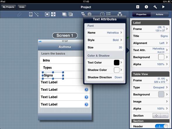
Figure 1: Text formatting options
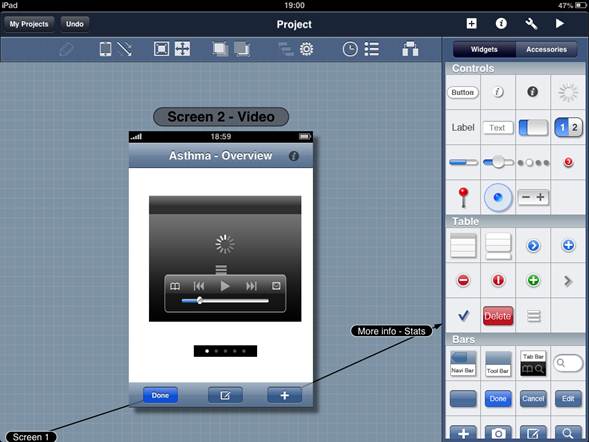
Figure 2: A complete library of iOS widgets
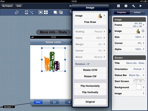
Figure 3: Built-in drawing tool
High-fidelity prototypes
You can customize the objects in your design by adjusting all their properties, and you can assign each object an action: a tap, a double tap, or a swipe (Figures 4 and 5). I find this feature particularly interesting, as it helps me to create common gesture-based interactions for touchscreen interfaces and to never forget that I am designing for mobile. By assigning actions to different objects, you create links between different screens. In Play mode, you will be able to test a clickable prototype of your application workflow (Figure 6).
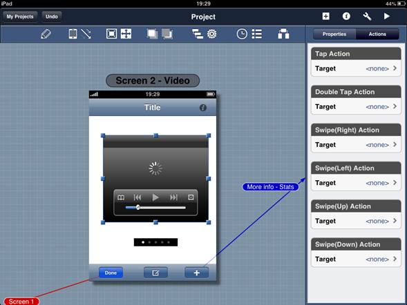
Figure 4: Assigning actions to each object
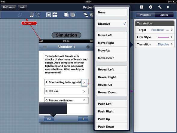
Figure 5: Configuration setting for each action
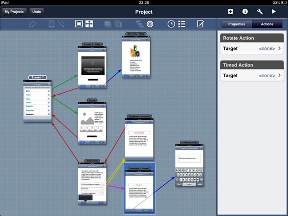
Figure 6: Display of application workflow
Collaboration possibilities
When your prototype is ready, you can email it, export it to PDF and PNG file formats, or use Dropbox to get feedback from your team, clients, or target audience. Your contacts can also test the prototype by downloading Blueprint Viewer, which is a free iPad app. Once your prototype is approved, you can try to recreate as closely as possible the instructional and graphic designs by using your favorite learning authoring tool.
Converting eLearning to mLearning
As a rounding off, I´d like to share with you these images (Figures 7, 8, and 9) that show how I converted an existing eLearning course (illustrated by sketches created with Mockup Builder) into a mobile learning solution by using Blueprint and the mobile UX guidelines I mentioned above:
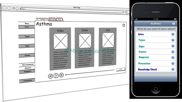
Figure 7: Content is in small chunks that focus on the most relevant facts
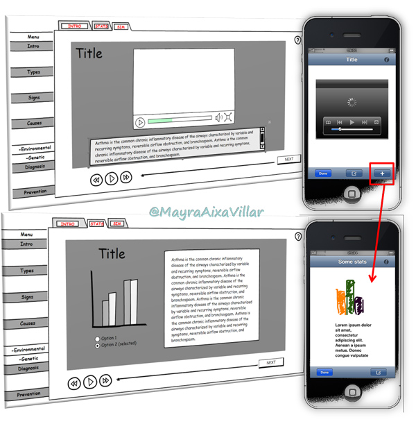
Figure 8: The design removes all the extra screens and unnecessary pieces of information
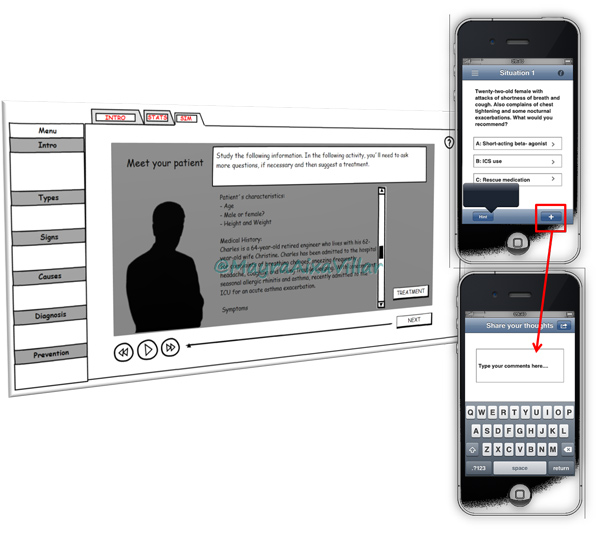
Figure 9: This solution facilitates access to information as well as social interactions
Final thoughts
Prototyping is just the first step towards the real solution, but I think it’s a crucial step towards the adoption of a new vision and techniques to approach mLearning design. The transition from eLearning to mLearning proceeds through constant innovation and experimentation, and tools like Blueprint can help us get creativity started. Therefore, don’t be afraid to leave old patterns. I challenge you to use your mobile devices to create new prototypes, explore original ideas, and test different approaches until you come up with an engaging learning solution that matches mobile learners’ real expectations and needs.
References
Wroblewski, Luke. (2011) Mobile First. New York: A Book Apart, LLC.


