


I’m not a yeller.
I can count the number of times I’ve raised my voice at work throughout my career on one hand. When I was 17, I yelled at the people I was supervising because they were messing around at the end of a long shift. That moment sticks with me to this day as an example of what a manager should NOT do to motivate a team.
There’s one other “loud” moment that’s still stuck in the back of my mind: the time I got into an argument with my boss about the color blue. I screamed “I don’t care if it’s the right blue” at work. It may sound ridiculous, but I still believe the confrontation was justified because I was standing up for one of my longest-held beliefs ...
It doesn’t have to be pretty. It just has to work.
Form vs utility: more exciting than Godzilla vs Kong!
Brand guidelines. Intricate layouts. Custom artwork. They’re all great and certainly have their place. But, they can also lead people to over-emphasize form: how something looks, sounds and/or feels to the user. In practice, form will always come in a distant second to utility: how useful something is to the user.
I know what you’re thinking, especially if you’re a designer: form impacts utility. If a person can’t properly read, hear, or view an object, how useful can it possibly be? You’re 100% correct. Great design can improve utility. Specifically, it can reduce cognitive load, thereby making a video easier to consume or a job aid easier to apply. Unfortunately, many form-related decisions are not made to enhance utility. Instead, they actually reduce utility in exchange for meaningless aesthetics and interactivity.
Form vs utility isn’t an L&D concept. You likely slam into this tradeoff every day. Have you ever tried to watch a YouTube video, but the graphics, music, and editing quickly became distracting? Have you clicked into a promising article only to get frustrated by the need to click NEXT over and over again to reveal content rather than simply scrolling to the end? Are you an Apple mouse owner who still can’t understand why the charging port is on the bottom of the device, rendering it useless when low on battery? (See Figure 1.)
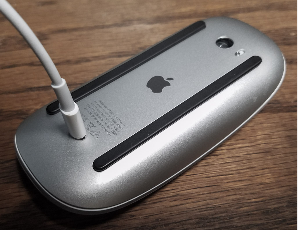
Figure 1: Why is the charging port here?
The frustrating impact of prioritizing form over utility hit home for me over a decade ago when I was forced to contend with “the template".
The slide template of doom
I’m not a fan of templates. I’m sorry. That’s not quite accurate. I HATE TEMPLATES!!! That’s better.
Templates are intended to help people with limited time, resources, and skill create better content. In practice, they make people force their information into unrelated, distracting visual and functional shells. Rather than put in the extra effort to figure out how to best convey a message, we default to the most related slide design. This is especially true when templates are mandated by an organization for brand purposes.
I faced this challenge in my first role as a content designer. Marketing mandated that every slide, including instructor-led training and eLearning, had to use the company template. I don’t have the actual image anymore because I mentally destroyed it in an imaginary dumpster fire. It looked something like Figure 2.

Figure 2: The company template
I then had to fit my information into the circular space in the middle of the slide. So, instead of a simple yet branded image like Figure 3 …
Figure 3: Why not keep the template simple?
… I had to build visuals like Figure 4 …
Figure 4: Branding over actual information
I was fighting against my own background to get people’s attention. I quickly realized I was being forced to make a trade. The emphasis on form (branding) was making it harder to provide utility (easily-consumed information).
The cubicle test
I was stuck. I couldn’t just say NO and design whatever I wanted. I had to build my case, especially as a new team member. I considered citing proven learning design principles from people like Julie Dirksen and Ruth Clark. However, my stakeholders didn’t know Julie or Ruth. Plus, they were more focused on brand awareness than learning science. If this was customer-facing information, I might have understood their position. In this case, I refused to accept that employees needed to be reminded about where they worked and what our logo looked like.
So, I performed the cubicle test. I walked around the office early one morning and took photos of the items pinned to cubicle walls. I asked peers at other locations to do the same. I then compared the photos to identify the most commonly-posted information. Interestingly, none of these items used templates, watermarks, or logos. That’s because they weren’t created by L&D or marketing. The most postable (useful) resources were “homegrown". Someone on the team had created job aids and emailed them to peers. It didn’t matter that they were ugly and didn’t follow brand guidelines. People found them so helpful that they printed and posted them on their cubicles for easy access.
My cubicle test findings helped me justify shifting away from the company template. We managed to restore the utility/form balance in our learning content design. The company info was still on every slide, but it was in a corner, in 9pt font.
I still perform this test today. However, rather than stalking cubicles, I review knowledge base analytics and Slack pins to figure out what’s most postable nowadays. This keeps me focused on providing resources people find useful rather than always building what I believe should be the best solution.
Clark Quinn once said ...
“JD, you’re funnier on Twitter than you are in person.” Well, Clark did say that to me once, but that quote isn’t quite as relevant to this topic as another of his verbal gems. “Do as little work as you need to in order to solve the problem.” When my L&D team shifted the balance to focus on utility over form, we were able to deploy more solutions more quickly. We also maximized our limited resources so we could tackle more problems and help more people.
I’m not a great designer. My core framework (Figure 5) is represented by one of the least visually appealing images that come up when you Google “learning ecosystems".
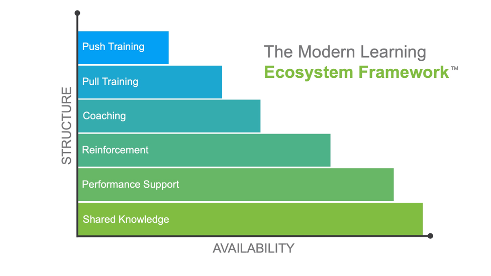
Figure 5: My core framework
I just focus on being as helpful as possible. When time and resources permit, I partner with great designers to improve my look and feel. Otherwise, I lean on insights from smart people like Julie and Ruth to make sure I know just enough so the next time someone puts too much emphasis on a shade of blue, I’m ready to counter with proven principles and avoid an unnecessary screaming match.
Be safe. Be well. Be kind to the frontline.