


Have you ever viewed an instructional graphic that made a subject more confusing? Did you ever study a diagram again and again until you were completely baffled? Finding a disconnect between what is intended in a graphic and what is interpreted by the learner is not uncommon in our field. And perhaps we are all guilty of conceiving or creating a poorly-thought-out graphic at one time or another.
For the sake of our audiences, we need to stop the proliferation of muddy graphics. In this article, I focus on ways to improve the graphics we create for e-Learning courses and informational products, in order to enhance clarity and comprehension.
As you design an instructional or informational graphic, a crucial concept to keep in mind is that pictures are information . How individuals perceive and understand this information is related to the complex interactions of their visual perception, existing knowledge, and expectations. There are specific ways to design, modify, and adapt graphics so they are aligned with each of these interacting elements. It is important to learn to take advantage of the processes that occur during the early stages of vision. This can help ensure that viewers and learners perceive and interpret your graphics accurately from the start.
Early vision organizes sensory data
A key facet of visual perception occurs early in the vision process. This is when visual mechanisms convert patterns of light arriving at the eye into organized and coherent sensory data. Without this ability to organize and structure sensory information, we might see a picture as a jumble of dots and lines. According to many perceptual psychologists, the mechanisms of early vision establish the limits and capabilities of visual perception. It is during these moments that the viewer performs two basic types of perceptual organization: discriminating the basic or primitive features of a picture, and grouping visual information into meaningful units. The processes of discrimination and grouping begin preattentively, before a viewer is consciously aware of paying attention to something in the visual environment.
By exploiting the processes of early vision, you can predispose viewers to discriminate features and to group objects and symbols as you intended the viewers to see them. Ideally, this jumpstarts the comprehension process, setting things up so viewers are more likely to extract the correct meaning from a graphic, and less likely to misinterpret it. Some of the principles that can help you achieve this are based on the work done by Gestalt psychologists in the early twentieth century. Although there was not empirical proof at the time for all their theories, findings from modern controlled experiments have validated many Gestalt principles. In addition, many new principles based on Gestalt theories have come to light.
Visual perception is holistic
In general, Gestalt psychology revolves around the idea that the brain perceives and understands objects and events as global and holistic. In terms of visual perception, it means that people perceive and understand objects as whole forms more so than as individual parts. This is because during perception, visual stimuli acquire new and different properties depending on the whole in which they happen to be. In Figure 1, the individual circles take on the emergent feature of the arrow shape, even though none of the circles alone exhibits that property.

Figure 1 We tend to perceive objects as a whole unit (arrow) rather than as individual parts (circles).
Accordingly, there are numerous Gestalt principles, or laws of perceptual organization, that determine the way in which people perceive objects during early vision. You can take advantage of these laws to help learners organize and structure graphical information. Very relevant to instructional and informational graphics are the principles related to grouping, which are surprisingly powerful for facilitating comprehension. James Pomerantz, Professor of Psychology at Rice University, noted that grouping seems to be the result of perceptual glue that binds elements so strongly they are difficult to divide. (See Reference section at the end of this article.)
Grouping provides cognitive advantages
Grouping gives meaning to a graphic, because it tells viewers which individual parts go together. It also communicates the relationship of visual elements to each other and to the whole. When a viewer perceives specific objects, symbols, or shapes as a group, these elements become one perceptual unit . Think of a perceptual unit as any group of marks, among which one's attention is not divided. For example, when we perceive three lines intersecting at 60° angles, we perceive one perceptual unit — a triangle.
Perhaps you are getting a sense of the cognitive advantages of grouping. Because viewers process fewer units of visual information when they are grouped, it increases the speed with which someone can scan and search a graphic. This makes visual communication speedier and more efficient. Grouping also reduces the demands placed on working memory because there are fewer units of visual information to analyze at one time. Finally, grouping assists in extracting accurate information from a graphic because it clarifies the associations between elements.
Some of the Gestalt principles that promote grouping are based on the laws of proximity, similarity, closure, and common fate. Although, in practice, designers often use these laws in combination, you can get a sense of their power by examining each one individually.
Law of Proximity
The proximity of elements to one another affects human visual perception. When we see elements that are in close proximity, they appear to be part of a group. As part of a group, viewers will assume the elements relate to each other. This encourages the viewer to make comparisons, look for similarities, and make connections. The force with which our perceptual system groups elements in physical proximity is so absolute that it is nearly impossible to visually break the group apart. Conversely, elements that are farther apart will tend to be seen as unrelated. They will be considered as individual elements, or as objects that are outside the group.
The principle of proximity is the cause of many a ruined photograph. When an object in the background of a photograph appears to be in close proximity to a person in the foreground (due to the foreshortening of depth), our innate insistence on grouping makes it look as though the object is coming out of the person's head. Be sure to keep the principle of proximity in mind on your next photo shoot.
Applying the Law of Proximity
To show a relationship between elements of a graphic, it is important to place the parts close together. The closer together they appear, the more likely they are to be perceived as a group. Though this may seem obvious, it is surprising how often the principle of proximity is not achieved. You can apply the law of proximity to all types of information graphics, such as graphs and diagrams. For example, if you want viewers to compare the bars of a bar chart, place the bars in close proximity. (See Figure 2.) If you want viewers to associate the labels on a map or pie chart with specific regions, ensure the labels are close enough to their corresponding parts that they form a perceptual unit.
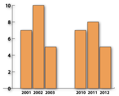
Figure 2 The Law of Proximity: Notice that the bars close together in the bar chart invite comparison because we mentally group them together.
You can also use proximity to associate objects or people in illustrations and photographs. In a training illustration of how to repair a transmission, use an exploded diagram with the parts in close proximity so they will be perceived as belonging to the same component. If you want to express that people are part of a group or related in some way, be sure they are standing close together in the photograph.
Law of Similarity
The human brain continually seeks patterns and naturally finds them by grouping elements that have similar properties. Nearly any attribute will have this grouping effect on perception. Forms of similar color, shape, size, brightness, line orientation, spatial location or movement will encourage the viewer to perceive them as related. Of course, the objects must have a common conceptual foundation to form a perceptual unit, such as related components on a circuit board illustration or the wedges of a pie chart. In some cases, the perceptual force is so strong you may find that it difficult to selectively attend to just one element of a group with similar features.
Applying the Law of Similarity
Using the Law of Similarity, you can facilitate comprehension by ensuring that associated items in your graphics have similar properties and a common structure. Practical applications include using a similar texture to associate countries in a map or a similar color for the icons in a pictograph. (See Figure 3.) This is also true for bar charts; when the bars are the same color, viewers will know the bar values should be compared.
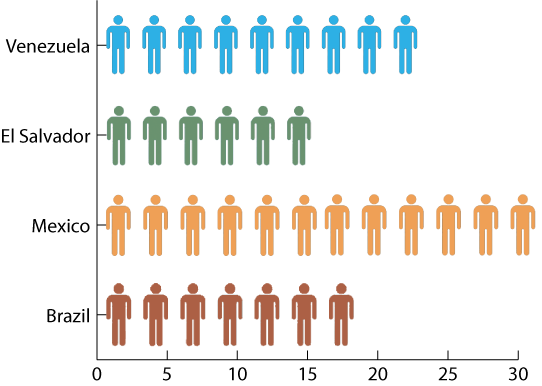
Figure 3 The Law of Similarity: Viewers will assume the similarly colored icons are associated in some way.
You can also apply the law of similarity to simplify the perception of a graphic. For example, if you are creating a hierarchical organization chart, there may be no reason to vary the colors of the boxes. By making the boxes one color, the viewer will perceive the elements as one perceptual unit and process the graphic more quickly than if it were multi-hued.
You can take advantage of the Law of Similarity in reverse. If you want to draw attention to a particular part of a graphic, design it with features that are dissimilar to the surrounding elements. The more it contrasts with the surrounding elements, the more it will stand out. To get the most from the similarity principle, you'll find that proximity can enhance the perceptual effect you are seeking.
Law of Closure
Because we are compelled to find meaning in the visual environment, we have a tendency to perceptually close up or complete objects that are incomplete. In essence, the brain fills in missing information in the visual field to complete a shape or form. When you draw a partially completed circle, the brain fills in the missing segment and considers it a circle. Proximity can affect the success of the closure principle. Areas that are nearly complete, or elements that have smaller gaps between them, are more likely to be seen as a closed unit than lines and shapes that are farther apart.
Occlusion is another aspect of the principle of closure. This refers to the overlapping of objects you see in a perspective drawing or in certain information graphics, such as a Venn diagram. We have a strong perceptual tendency to complete shapes that are obscured by other objects. This is one reason we can understand a Venn diagram. Interestingly, when we mentally close a contour drawing, such as a partially complete or partially obscured circle, we will perceive the shape as having an inside and an outside. This is not as likely to happen with a more angular shape.
Applying the Law of Closure
With a good understanding of the Law of Closure, you have the freedom to leave shapes open when this approach works best in your design. (See Figure 4.) You can also make use of this principle to simplify a screen or a graphic when necessary. For example, if a screen is overcrowded, some objects can be rendered as incomplete forms. If the gap is small or if the object is occluded, you know that the visually literate audience will fill in the missing parts. This works best when you use familiar shapes or forms, making it easier for a viewer to quickly fill in the missing information that is accessible from long-term memory.
Figure 4 The Law of Closure: We tend to group lines and shapes that are partially complete into a complete shape or object.
The law of closure provides opportunities to convey more complex information by exploiting the brain's ability to complete shapes obscured by overlapping regions. Some of the more complex diagrammatic formats, such as an area or bubble diagram use this approach.
Law of Common Fate
Dynamic lines and shapes in a graphic convey a sense of directionality. They move the eye around the screen. When lines or shapes appear to move together in the same direction, we tend to perceive these objects as a group. They have a common fate. This creates a sense of unity and conveys the message that the objects are related or connected in some way.
Conversely, when lines and shapes appear to be moving in different directions, they tend to be perceived as individual and unrelated elements. Lines moving in opposing directions also cause visual tension. Grouping by common fate works in both static and animated visuals. In animation, grouping occurs when the shapes move in the same direction and at the same speed.
Applying the Law of Common Fate
Use the law of common fate to associate and connect lines and shapes. For example, in a line graph it is easy to interpret that the lines trending in the same direction belong to a common data set. (See Figure 5.) Conversely, do not place lines and shapes in conflicting directions unless your purpose is to show that data is not related. When lines and shapes are placed in opposing directions, you may create a sense of uneasiness or confusion.

Figure 5 The Law of Common Fate: This graph conveys that the data is associated, because the lines are moving in the same direction.
Common fate is also an effective approach for directing the viewer's eyes to an area or region on the screen. When objects are perceived as moving in the same direction, the viewer's eyes will naturally follow this path. Directional arrows working in tandem are a good example of this. The law of common fate works for depicting perspective too. If you want to convey that a road extends into the distance, use two diagonal lines meeting at the horizon. In context, these lines will appear to be moving in the same direction and grouped together as a road.
Take advantage of perceptual organization
A benefit of understanding the Gestalt laws of perception is that they can help you avoid communicating an unintended message. With knowledge of how viewers construct perceptual groups, you can ensure that objects are separated by an appropriate space if they are not related. You can also bring associated objects closer together. You now know that if you want the viewer to make a connection between objects, giving them similar features will enhance your purpose. Using dissimilar features will convey that objects are unrelated.
Paying attention to perceptual organization will help your learners make correct and accurate visual interpretations. And that's a goal all designers are seeking.
Reference
Pomerantz, J. R., & Pristach, E. A. (1989). Emergent features, attention and perceptual glue. Journal of Experimental Psychology: Human Perception & Performance , 15, 635-649.